New Personal Logos
I've been wanting to create a logo using my name "NING" for a long time.
Finally, I've made five different variations!
I'm not
entirely sure which one should be the main logo, but I'm leaning toward
the smiley or the chat bubble. If you have any feedback or comments,
please let me know.
(I'm also working on perfecting my
personal color scheme, but it will be something similar to what I've
shared.)
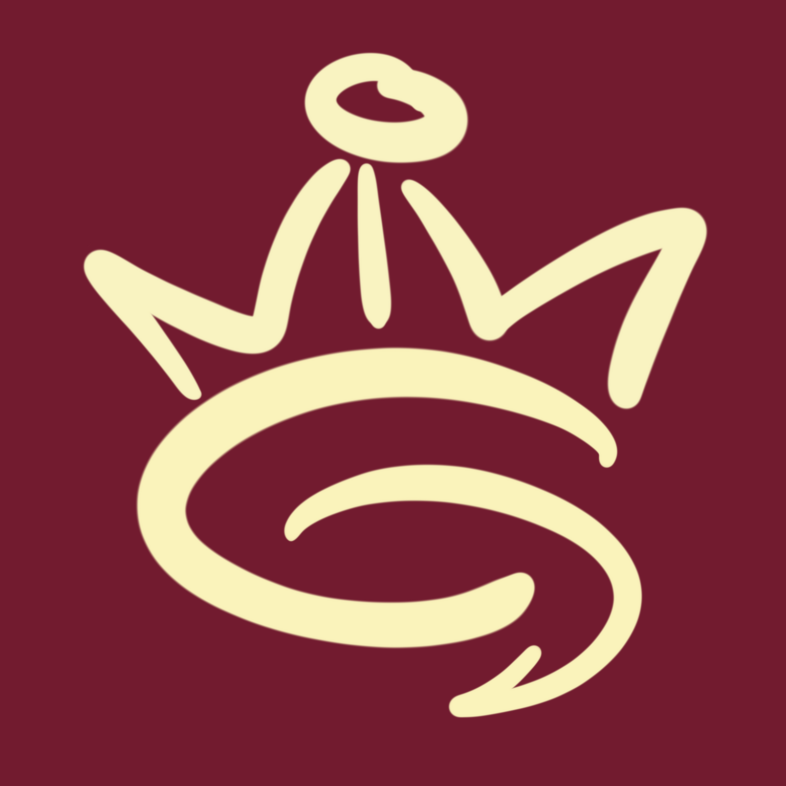
1st version: Minimal
It's a simple design
using just the alphabet. The NiN turned into a crown, while the G got
flipped. I could have gone for perfect symmetry, but I prefer the fluid
lines to give it a lighter feel. 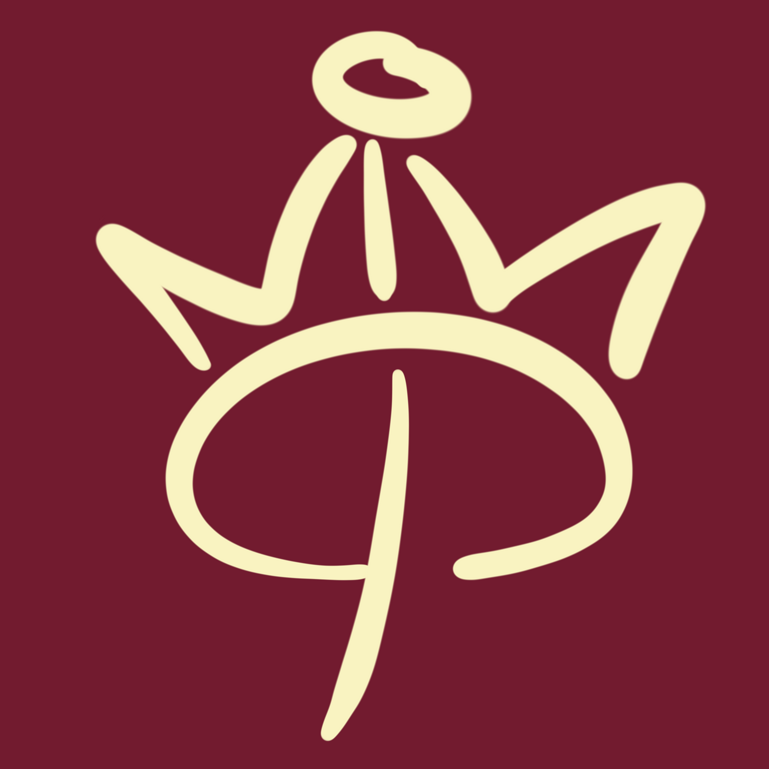
2nd version: Person
I experimented with the
G and noticed that it could resemble a person with right angles, so I
played into that idea. 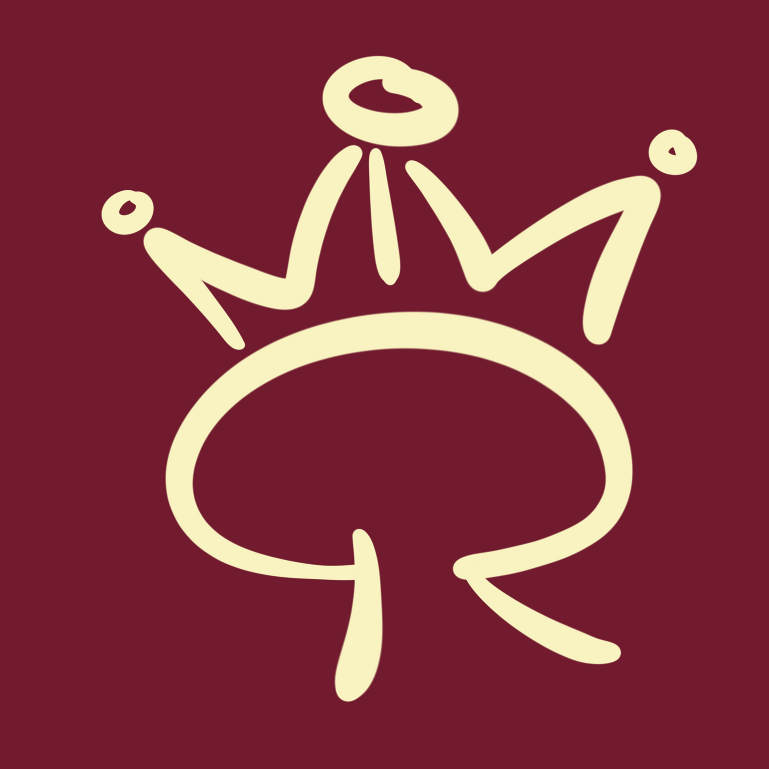
3rd version: Smiley
When you have a human
figure, why not add a face, right? I love this one, but no one can read
the word NING. It's also not a professional-looking logo, but it's so
fun! 
4th version: Arrow
To make it look more like
a G, I tried drawing an arrow instead. It could symbolize growth.
However, the arrow might make it too bold and clash with my personality.
I also don't like that it feels heavy on the right side.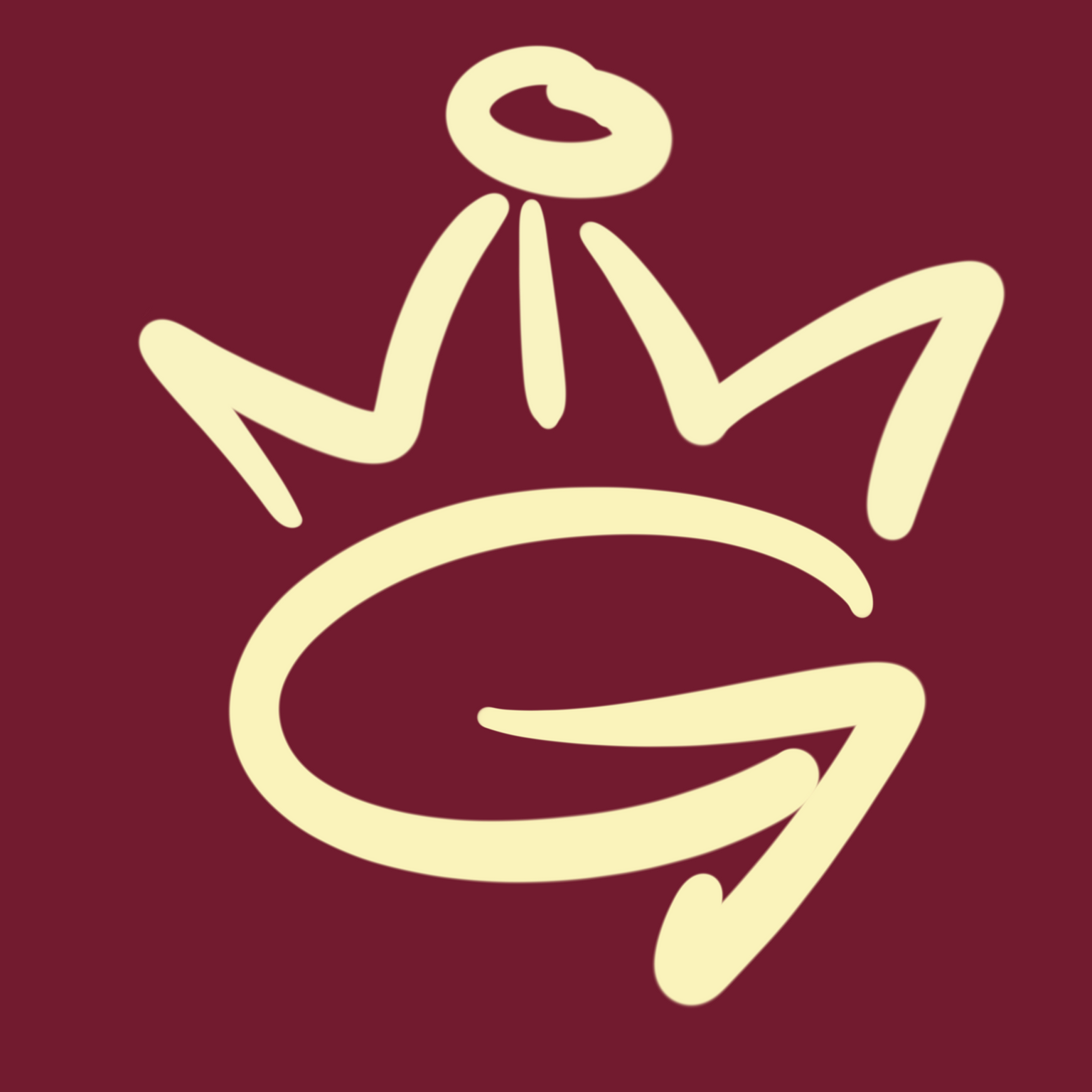
5th version: Chat Bubble
I decided to switch
to a more rounded G, which resembles a chat bubble. I think it's the
most eye-catching option for a logo, besides the smiley one, of course
:)
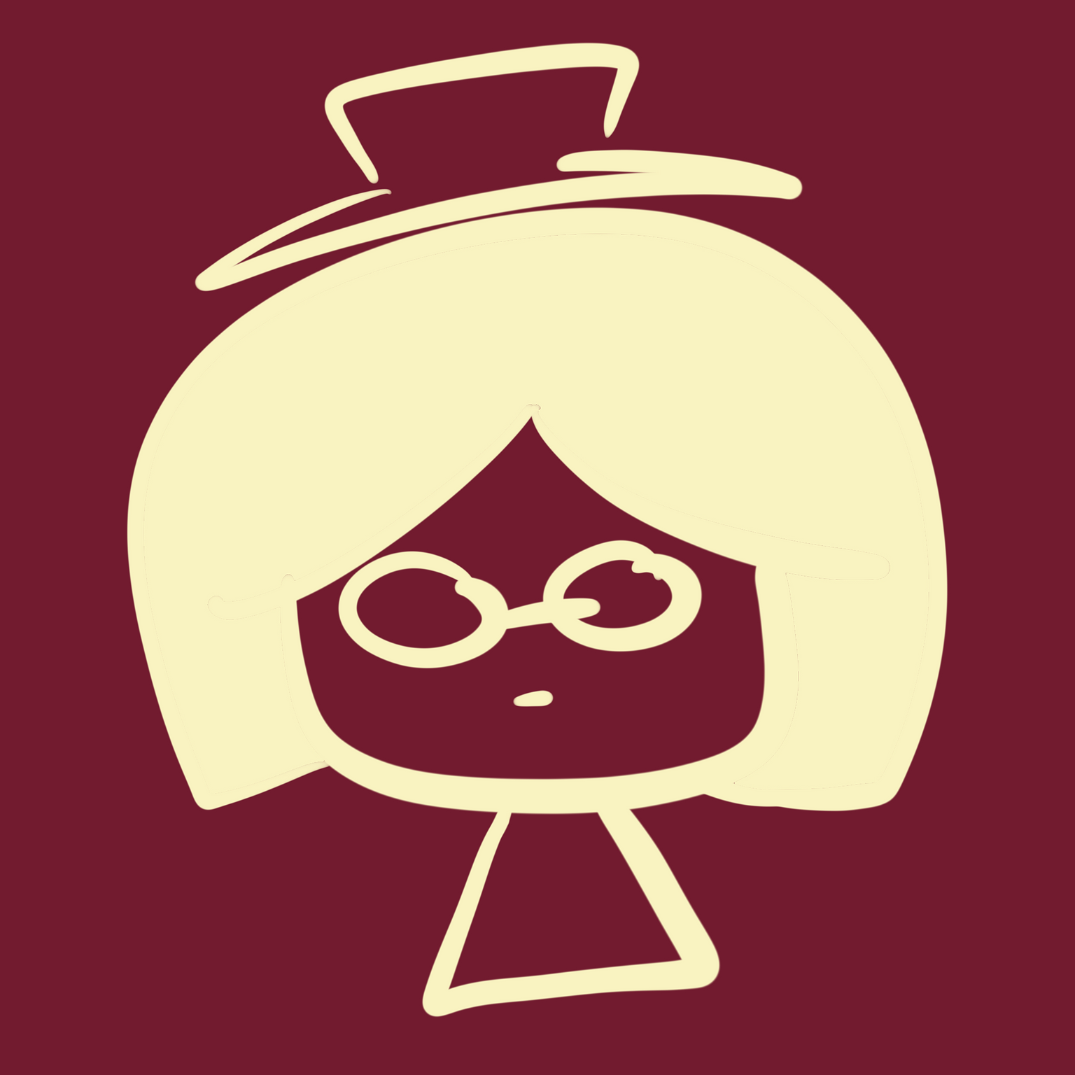
Bonus: A drawing of myself in a sleepy eye style I used for half my
life.