The Commission 00005-Strathmere Leather by Aaron Aiken
Once again commissioned by Aaron, I was tasked with designing a logo to serve as a website header for his brand, "Strathmere Leather." This time, the goal was to create a logo that embodies the entire brand identity, moving beyond the product-specific design of the previous Ocean Front logo. The challenge lies in balancing simplicity with the luxurious feel of handmade leather craftsmanship.
Initial Concepts and Inspirations
Designing the Monogram
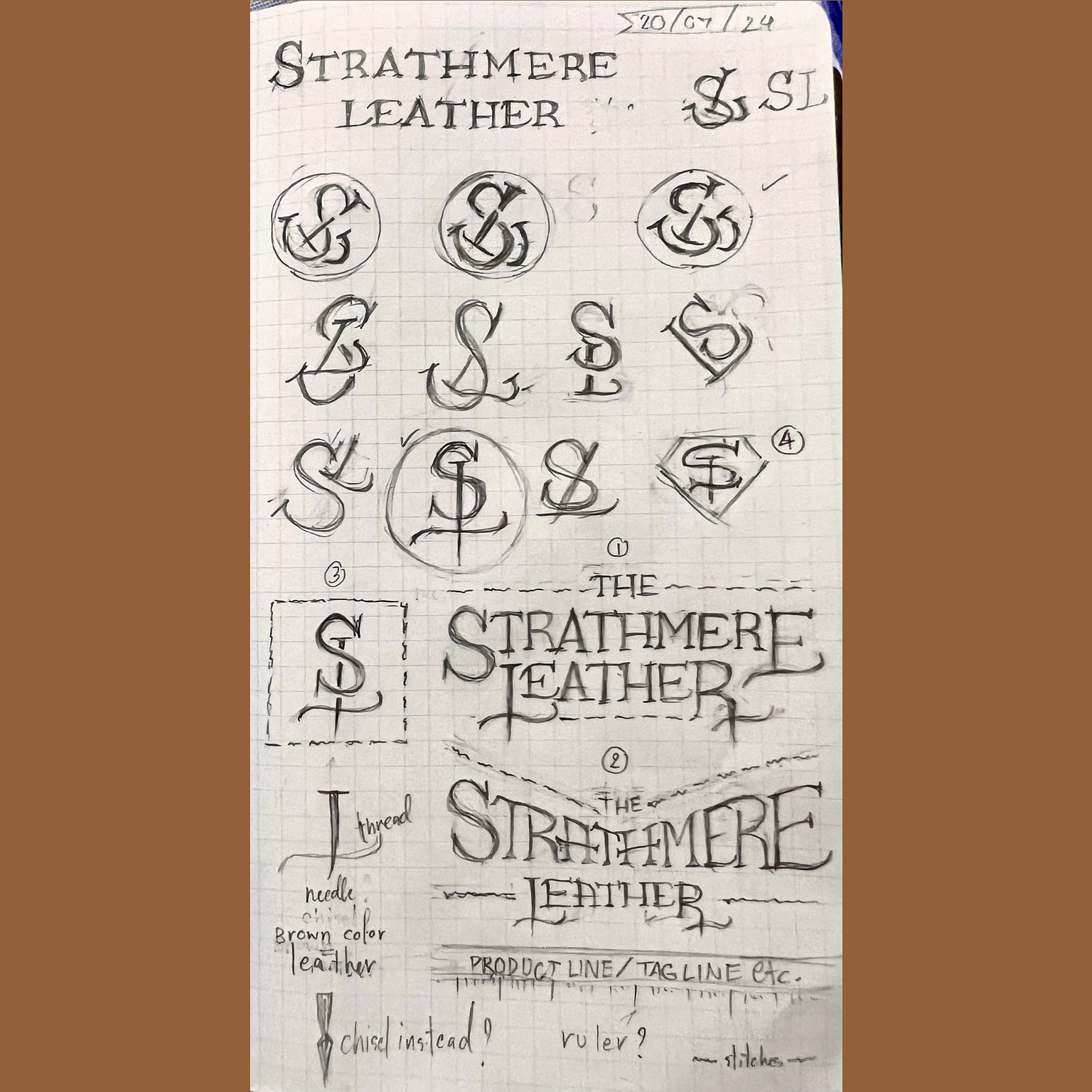
I began by exploring the initials, initially aiming for a clever SL monogram. However, I soon realized that simplicity would be more meaningful, appropriate, and effective—especially if the logo were to be used for embossing leather. As I envisioned the logo, thoughts of leather texture, tags, chisels, threads, and needles naturally came to mind. These elements subtly influenced the design.
Crafting the Wordmark
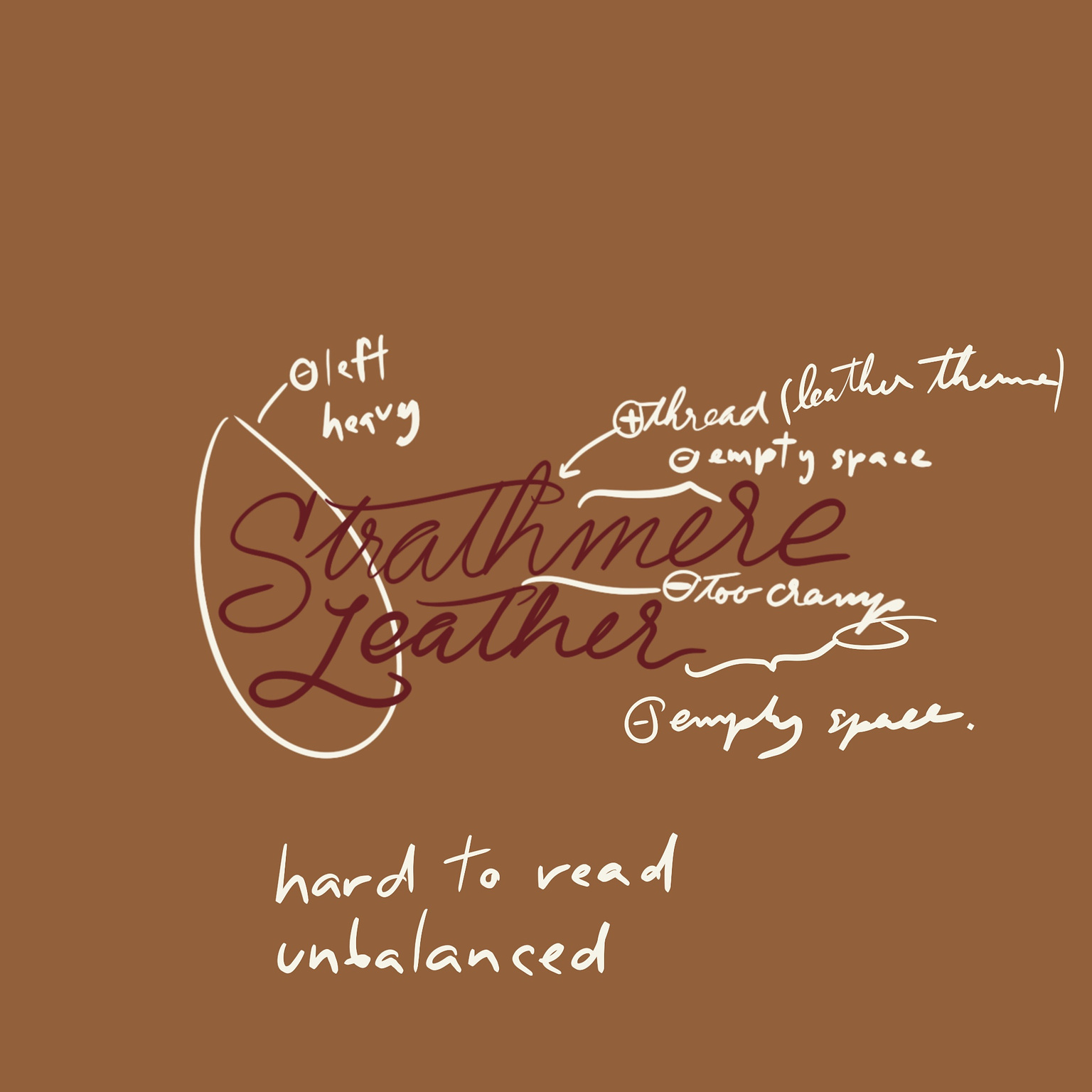
Next, I focused on the wordmark logo. Since it would feature prominently on the website header, it needed to be readable and instantly convey the brand’s vibe without overcomplicating matters.
Images of Western-style leather and cowboys inspired me to consider slab serif typefaces. However, since Strathmere Leather aims for a luxurious feel, I opted for an elegant serif typeface with a rugged appearance instead.
Fortunately, the brand name "Strathmere Leather" consists of many box-shaped letters and repeating characters, making it easier to implement a rugged aesthetic without creating an entirely new typeface system. Different alphabets would have required rules for each stroke, akin to developing a new font!
Finalizing the Design
Presenting Concepts
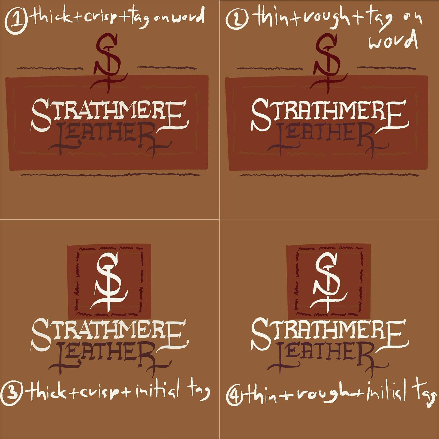
I shared various logo concepts with Aaron—ranging from simple to
decorative—incorporating rough ink and crisp flat brush designs in
different placements.
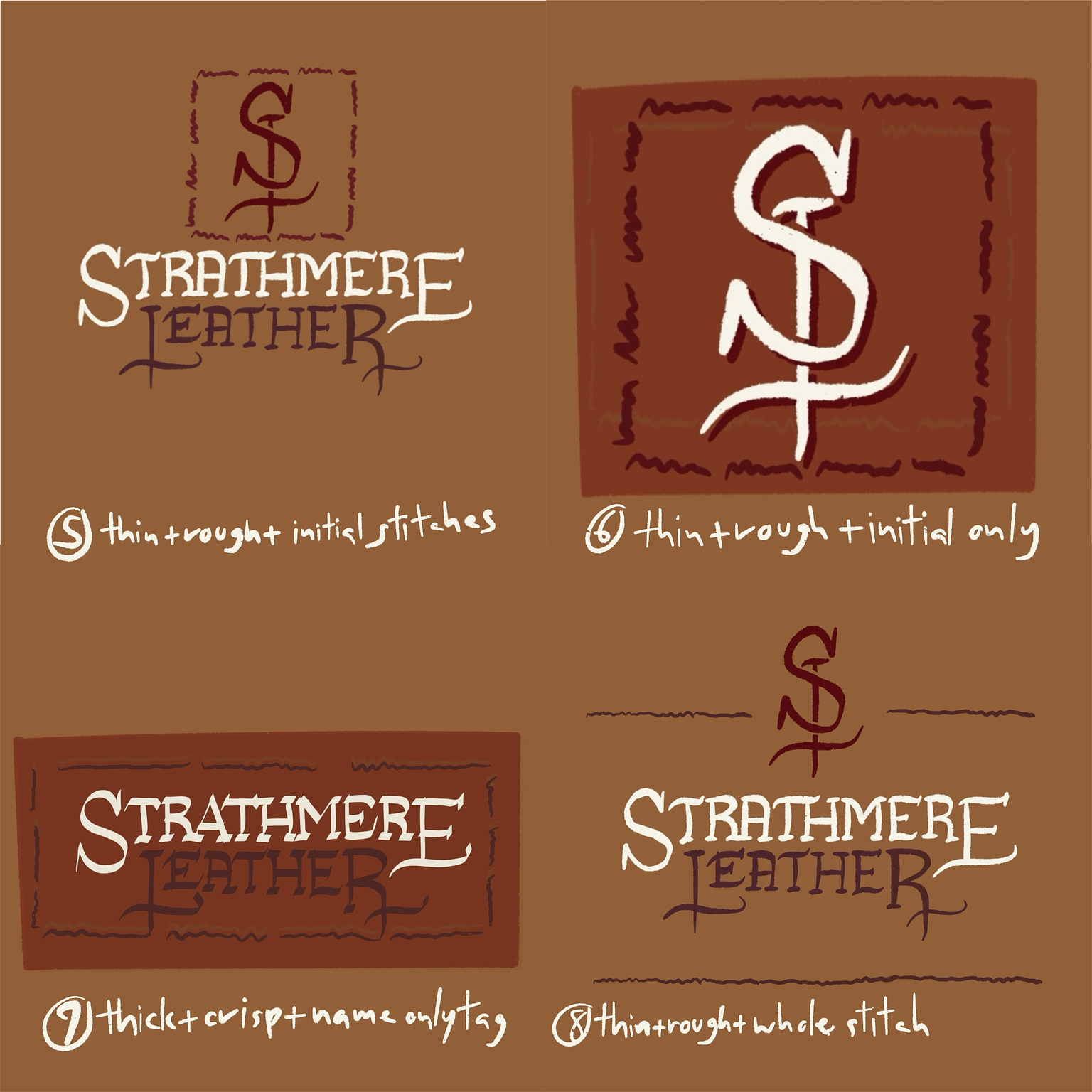
Aaron preferred concept number 8, featuring a simple style with rugged lines but also requested a more sophisticated approach.
Refining the Details
Initially, I considered a script style for the lettering; however, it disrupted the flow of the name. Therefore, I opted for thinner lines as an alternative for him to choose from.
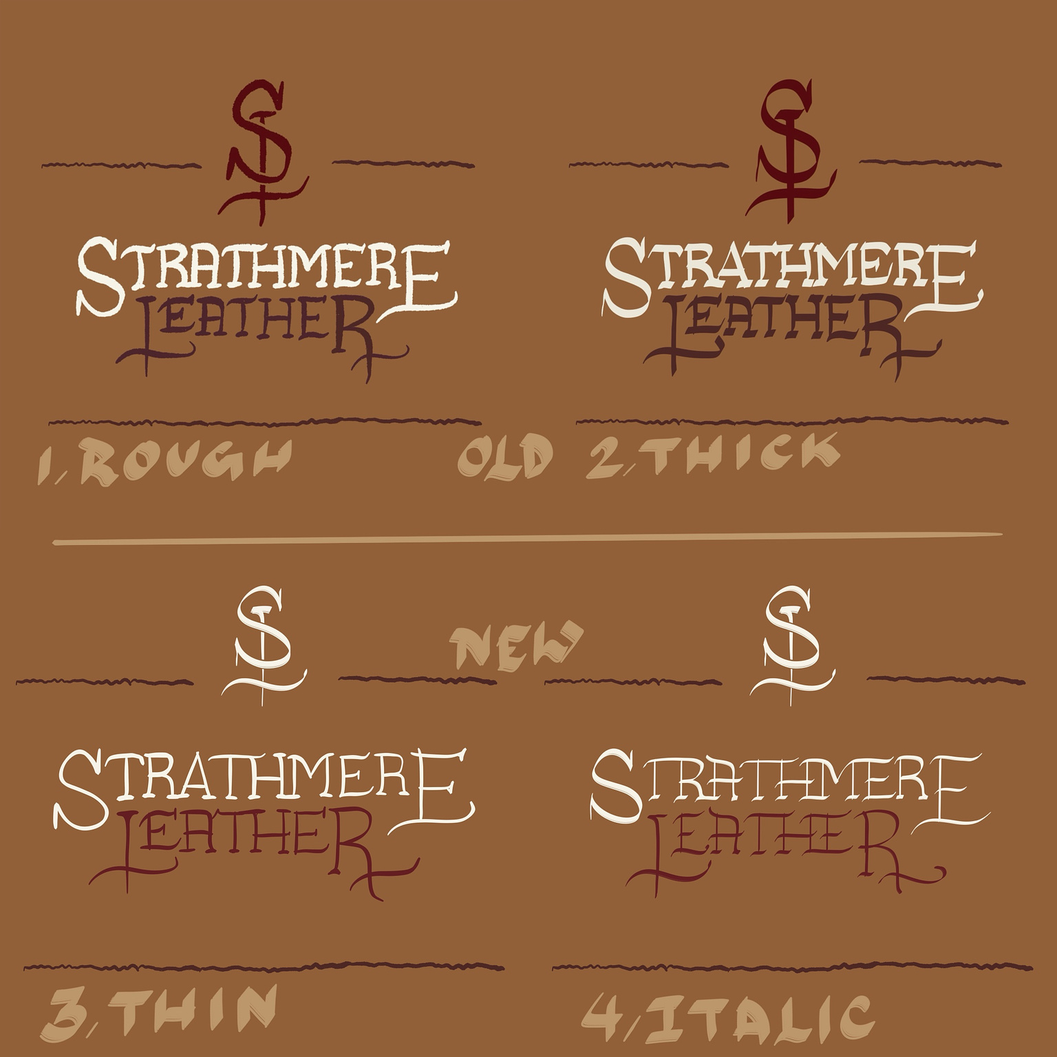
To ensure this aligned with his vision, I created additional drafts with varying line thicknesses while maintaining the same brush texture. I explained that thicker lines would enhance the rugged look but diminish the luxurious feel.
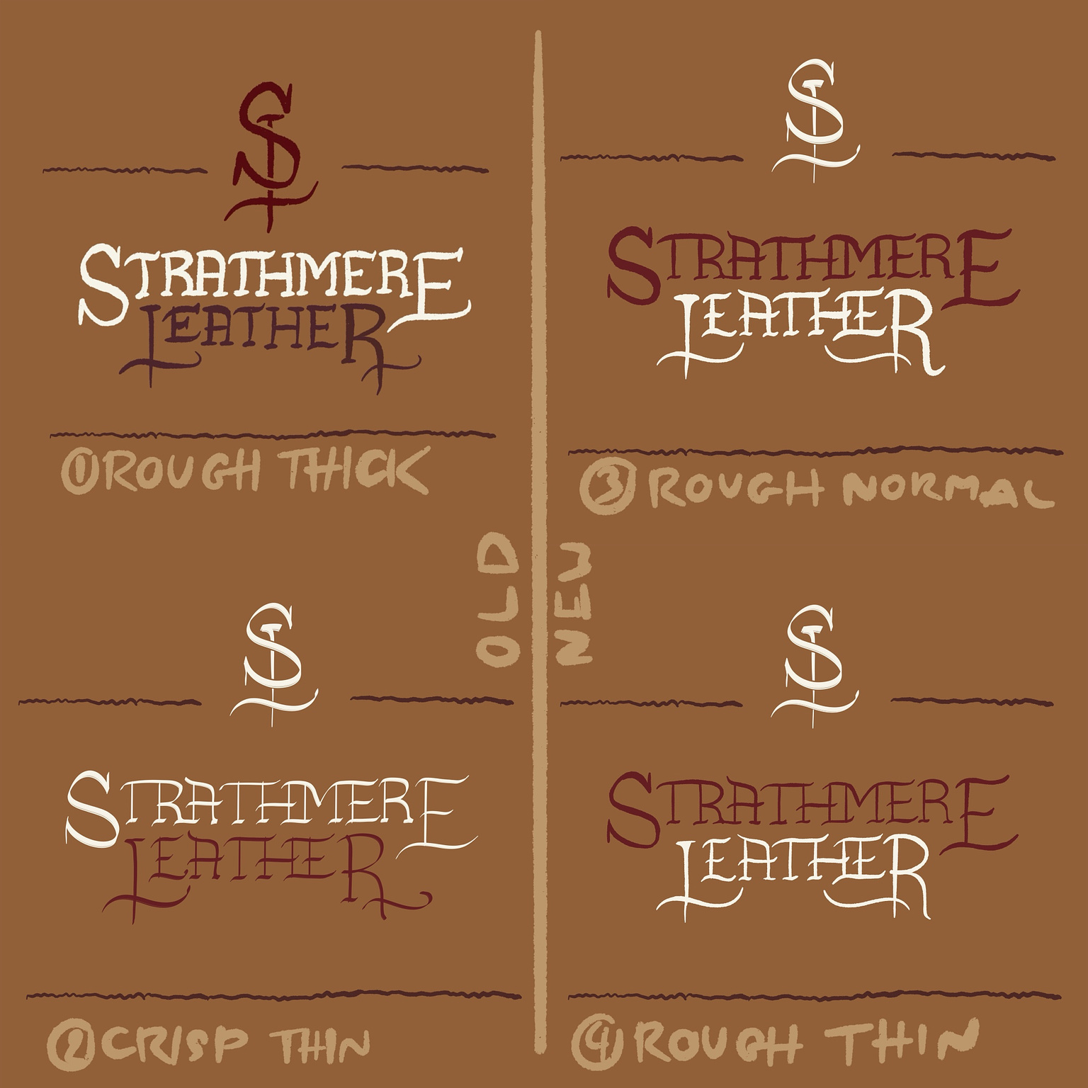
Ultimately, Aaron preferred the rougher, thicker lines from my initial proposal.
Thus, the real work began…
Harmonizing, Hierarchizing, and Balancing
When crafting the lettering, three key aspects emerged: harmony,
hierarchy, and balance.
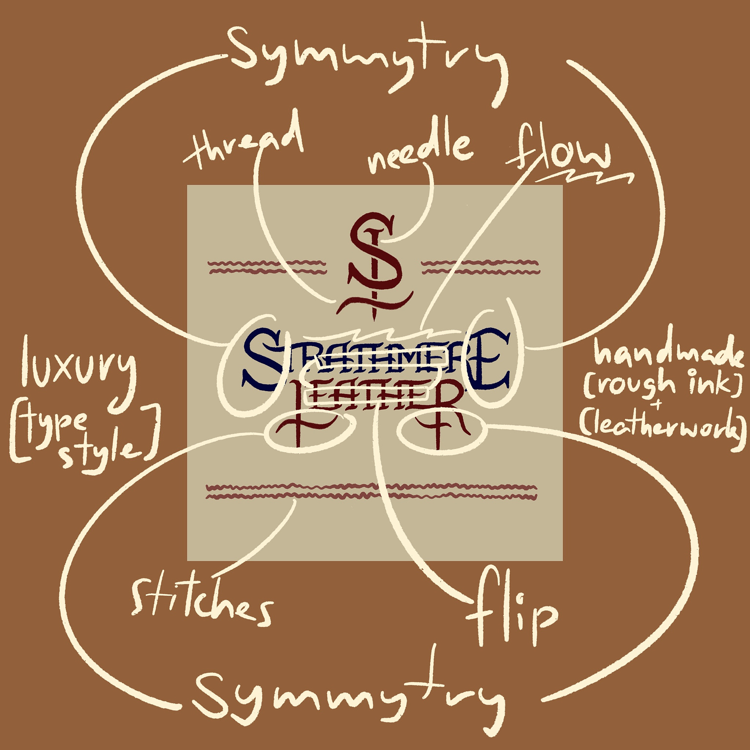
Harmony
Harmony stems from consistency within the typeface system; each letter should adhere to shared rules and elements as much as possible. I meticulously drew each letter and reused lines to maintain consistency.
Hierarchy
Typically, an industry name might be subordinated to the main brand name in branding situations. However, for Strathmere Leather, both components required equal emphasis to avoid confusion about whether the brand related to leather products or the city of Strathmere.
Balance
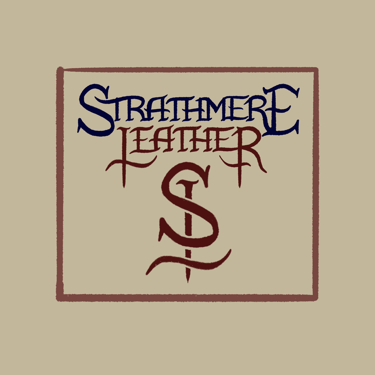
To emphasize elegance, the logo needed to be as symmetrical as possible to ensure it appeared carefully crafted and designed. I even mirrored the "S" to form the "E," making them essentially identical in shape while maintaining their distinctiveness. To add dynamism, I flipped the crossbar direction of "Strathmere Leather," creating a wavy flow in an opposing direction.
Choosing Colors
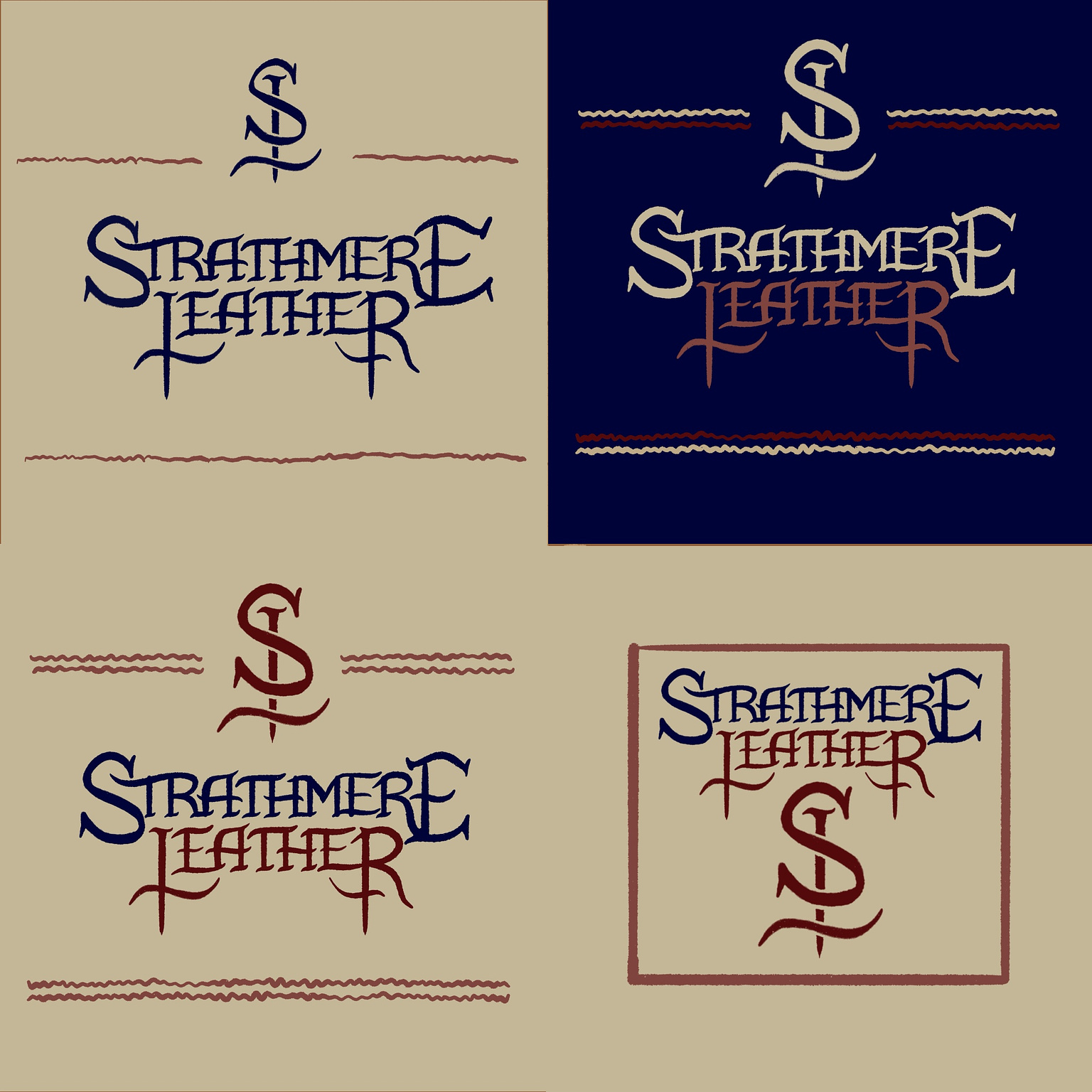
After finalizing the lettering, selecting colors became the next critical step. I incorporated some of Aaron's existing colors while blending them with my own choices to achieve an earthy tone reminiscent of leather. These colors provided sufficient contrast for accessibility—essential for the website header—and included an alternative scheme for a dark mode version of the site.
Conclusion
And that's it! The final Strathmere Leather logo combines both a logomark and a wordmark, embodying the brand's luxurious yet rugged essence of handmade leatherwork.