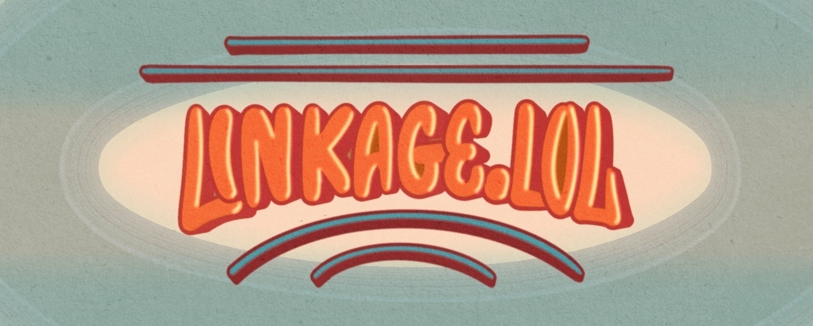
The Commission 00006-Linkage.lol for Lou Plummer
After the stress of designing business logos, I finally had the
opportunity to create a fun lettering style, thanks to Lou Plummer who writes a blog specifically for app
reviews!
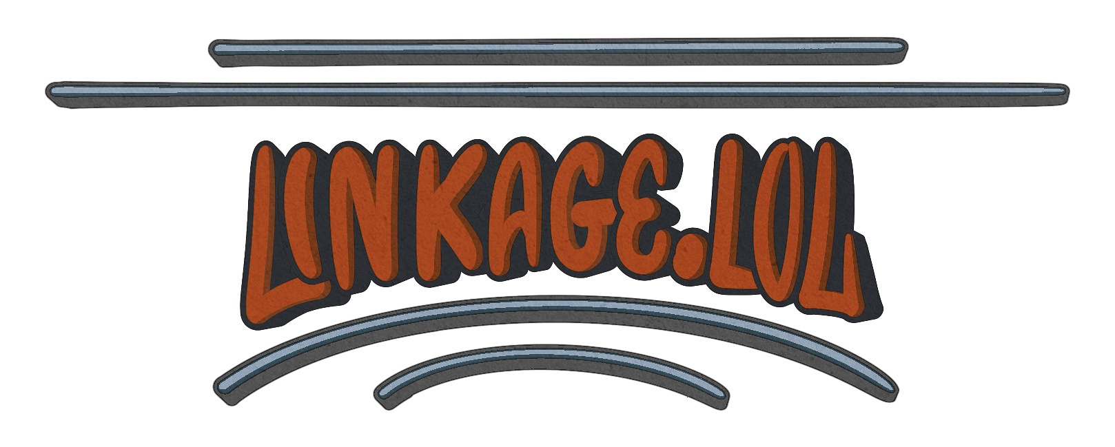
The task was straightforward: a website header for his other blog linkage.lol.
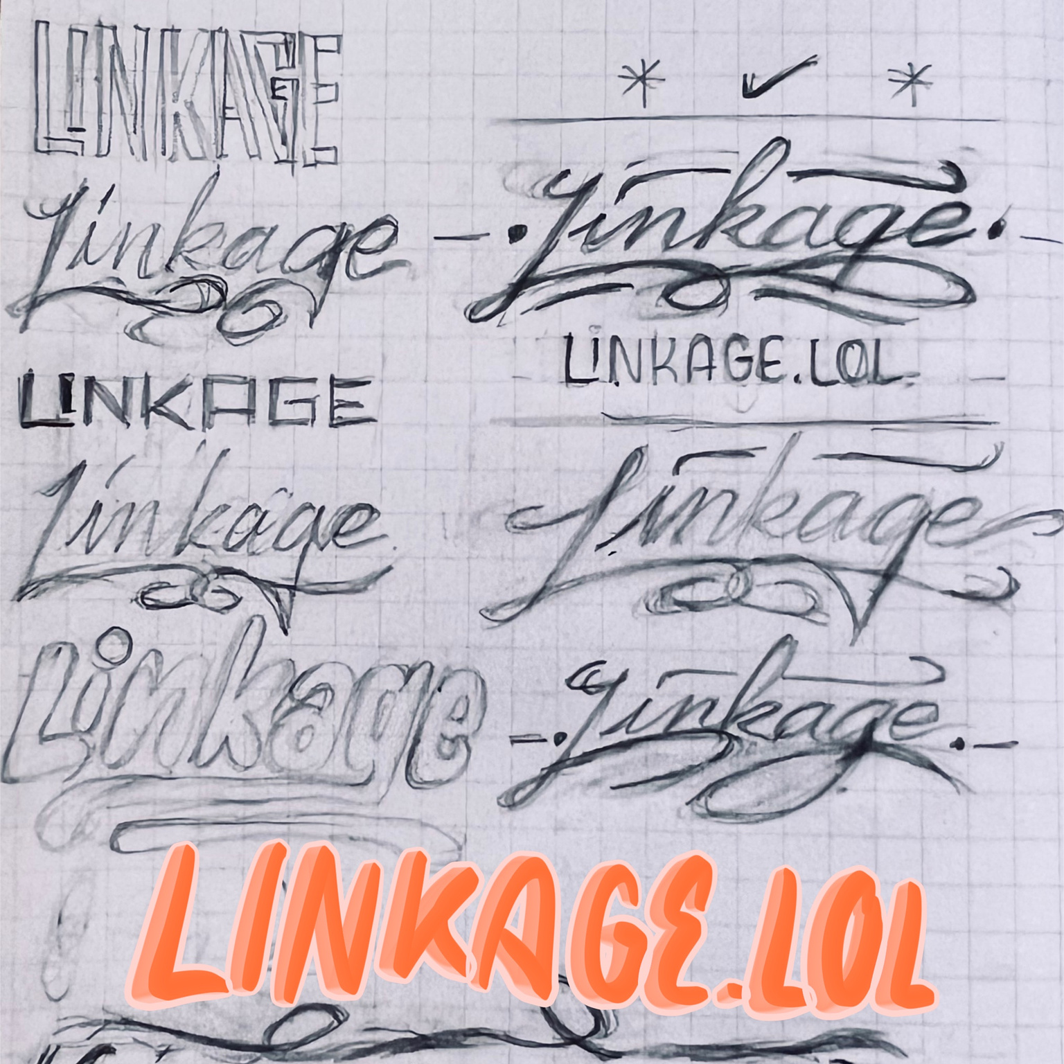
I drafted several lettering styles and sent them to him for
selection. As much as I love script styles—finding them much more
enjoyable to design—he preferred the simple styles with all caps. I
understand his choice; they sure are more readable.
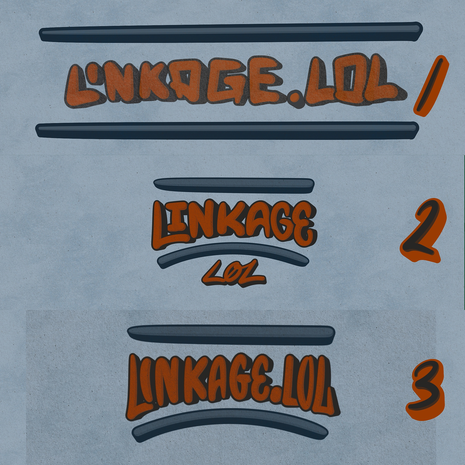
Once we settled on the style, it was pure joy. There was nothing
complicated about it—just drawing each letter to conform to the arch
line, adding lines to emphasize the arch shape, and selecting vibrant
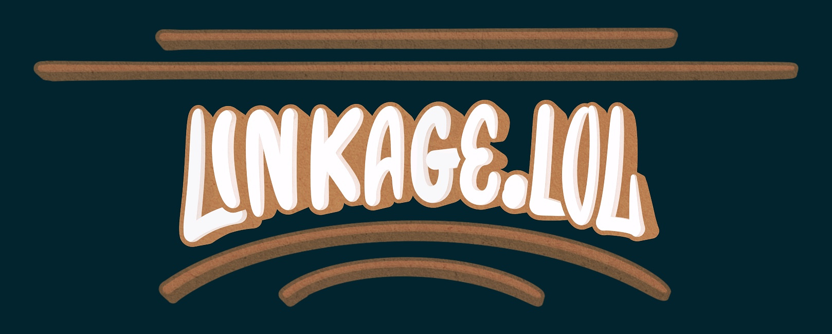
colors. I also created another color scheme for dark mode!
That’s it!
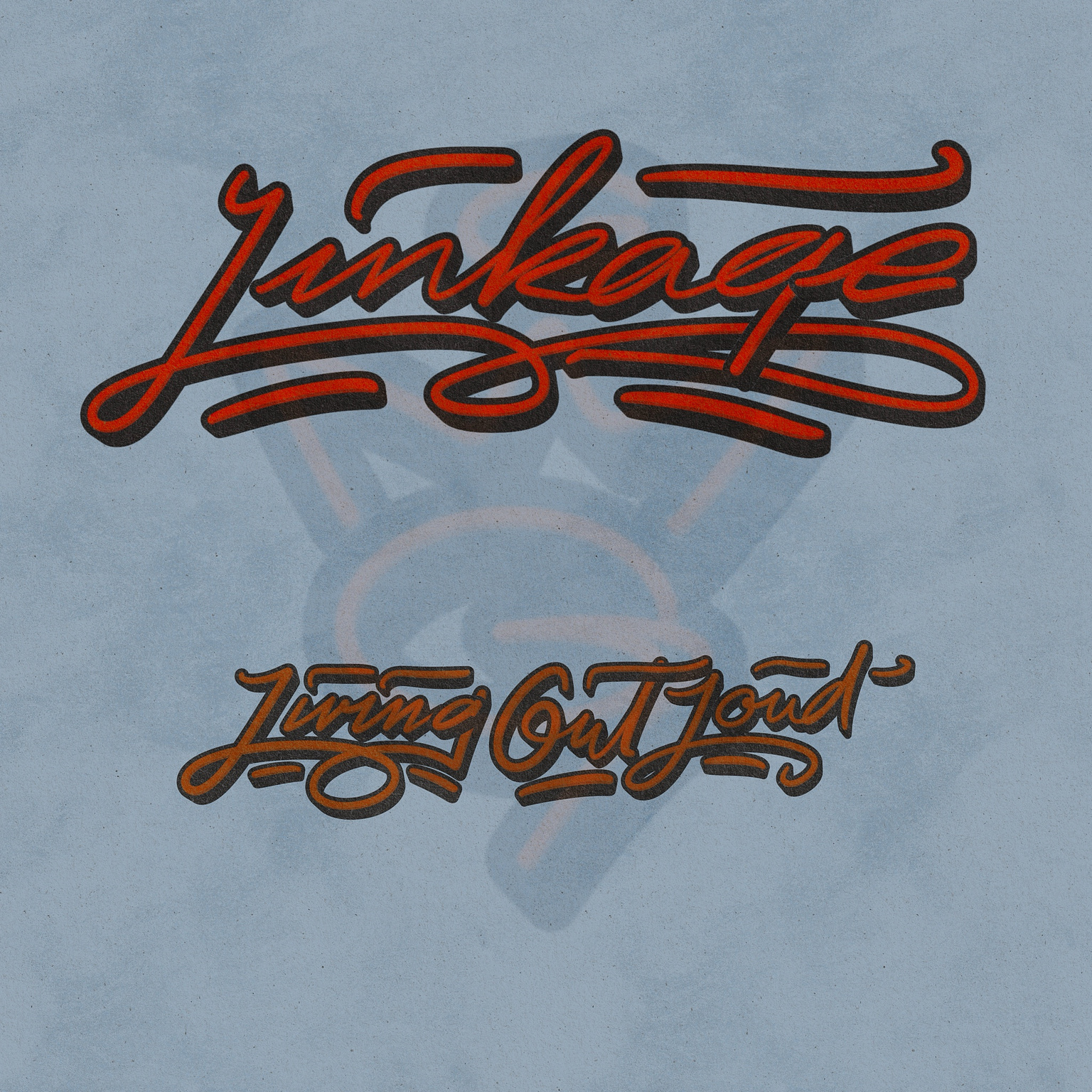
Additionally, I made the script version just because :)
If anyone is looking for a simple lettering design for their blog or website, feel free to reach out, and we can discuss it!
///Updated: I just knew that implementing the dark mode logo was challenging. So I decided to update another color scheme also made it more fun in the process and sent it to Lou :)
💬 Comment About My Work or 🖌️ Get Your Own Lettering