The Commission 00009-Knowledge Flow Consulting by Pratik
Knowledge Flow Consulting
Pratik
reached out to discuss creating a logo for his new business, Knowledge Flow Consulting,
which focuses on research consulting services for educational
sectors and non-profits.
This project presents a series of intriguing challenges for me. Given
that it's a research consulting business and operates on a
Business-to-Business (B2B) model, I needed to set aside
my playful approach to lettering, tapping instead into my
branding and typography skills. (In case you were
wondering, I hold degrees in Marketing, Branding, and Communication
Arts.)
Additionally, the name "Knowledge Flow Consulting" is quite long, so
just doing a cool wordmark isn’t gonna cut it. The logo needed
to include an icon that could be easily recognized at a glance and
memorable enough for people to recall later.
Luckily, I've been learning and practicing icon mark designs since
August, so this project presented an excellent opportunity for hands-on
experience.
The Brief: Designing Under Constraints
The brief I received from Pratik can be summarized as follows: - Trustworthy, reliable, yet friendly. - A clean
look with a sense of fluidity. - Targeting
small to medium businesses, particularly in the
education and nonprofit sectors. - Emphasis on the flow of
information and collaboration.
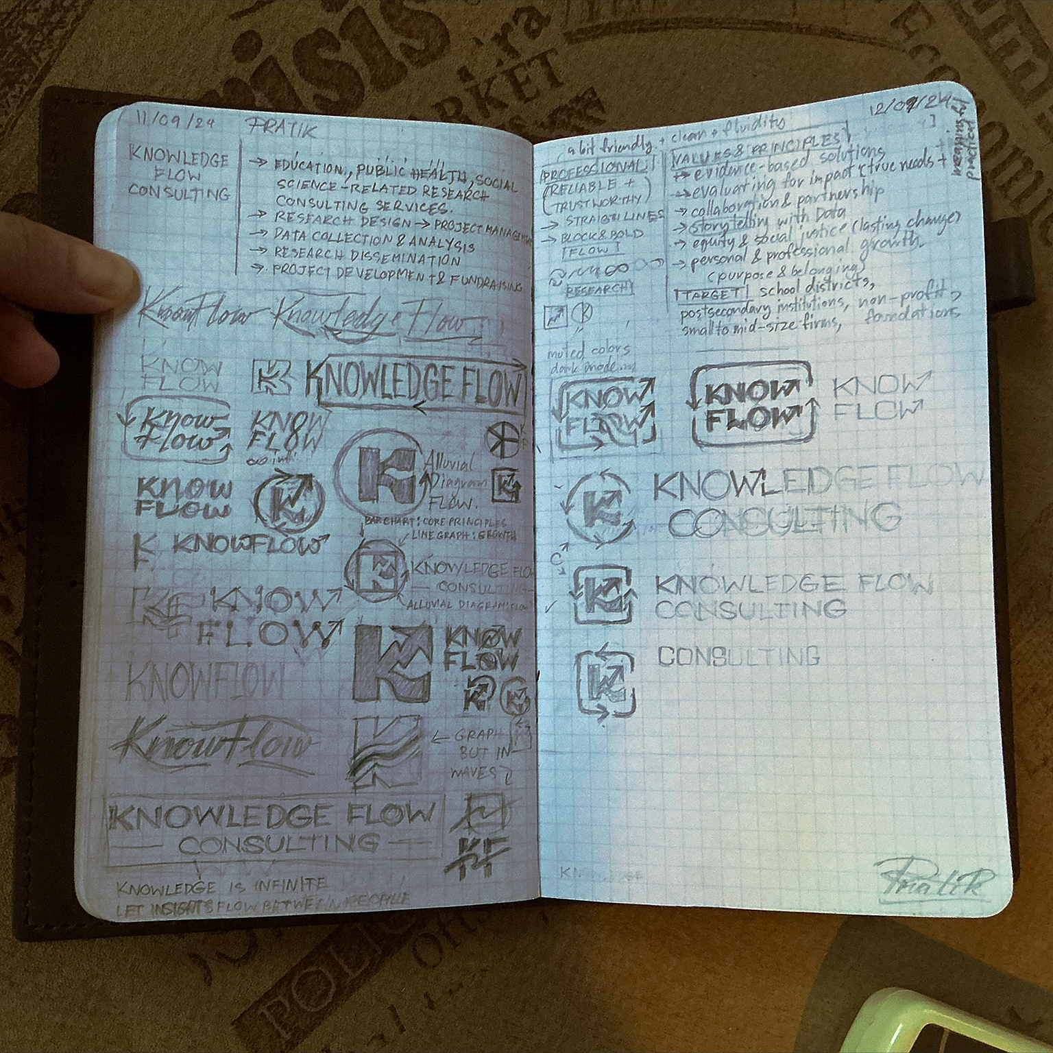
After reading all the information on Pratik's website and noting down
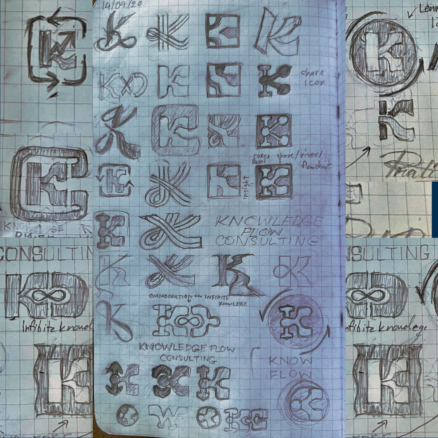
key points alongside the brief, I began sketching out design ideas to
get my creative juices flowing.
The Initial Concept That Failed
I must admit that I grew fond of my initial concept; however, in
hindsight, I completely understand why he rejected it.
I went too heavy on the research vibe and missed the collaboration angle, which is one of the main values Pratik has mentions. Also, it ended up looking too rigid and corporate, not fitting for the educational crowd, despite my plan to round the corners. Plus, it didn’t capture the concept of growth Pratik envisioned as the perpetual cycle of change.
This is what happens when you try to be clever and become too attached to your own concept without fully embracing the brand identity and its target audience. This should not happen to someone who has specifically studied this subject.
I humbly accepted my mistake.
Lesson learned: Follow the brief, understand the audience, and keep your ego in check.
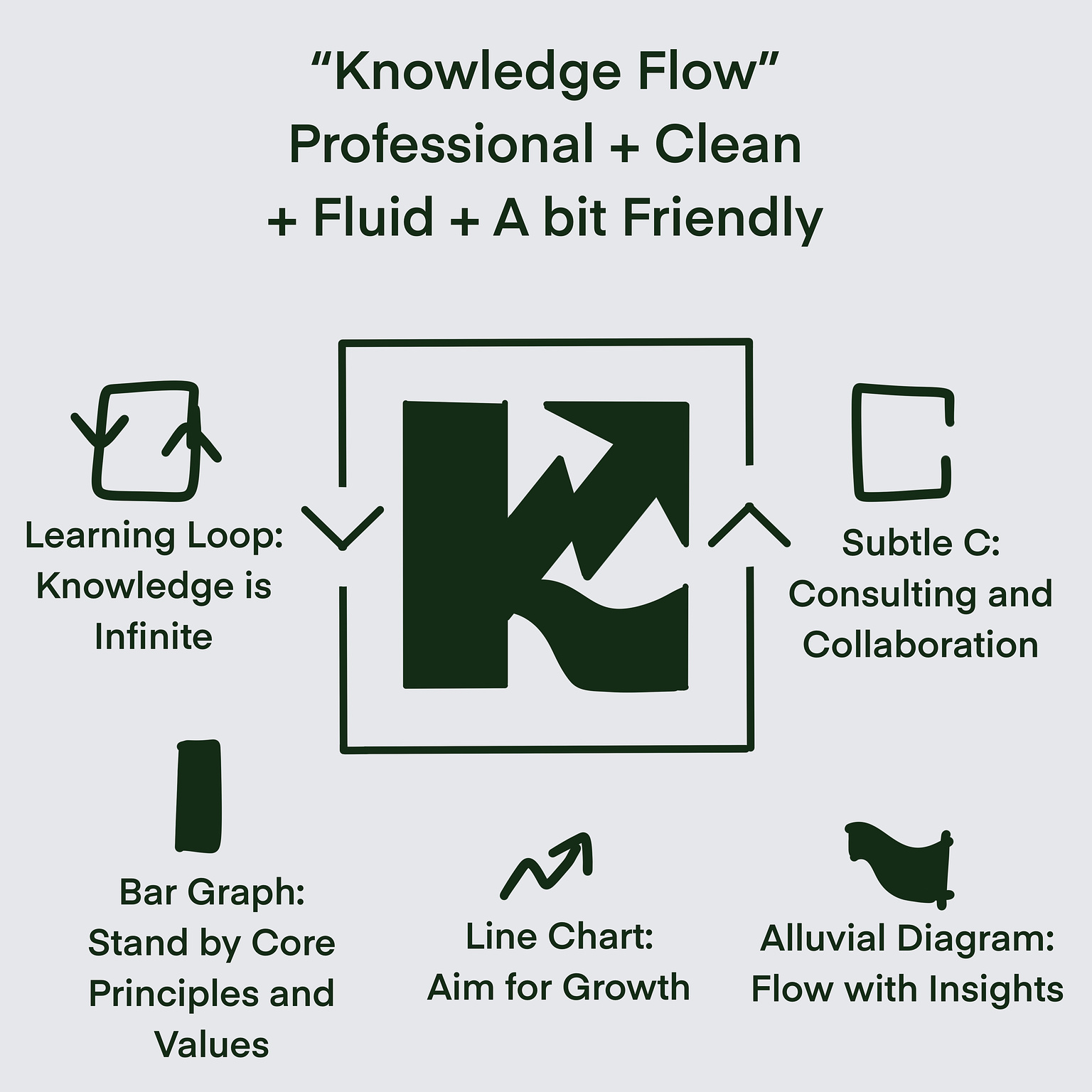
The Knowledge Must Flow: Conceptualizing the Flow of Knowledge
Back to the drawing board for the Knowledge Flow logo. My focus will be on capturing the brand essence more accurately and ensuring that the knowledge must flow, as intended in the brand’s mission. I focused solely on symbolizing the flow of knowledge in the simplest way possible.
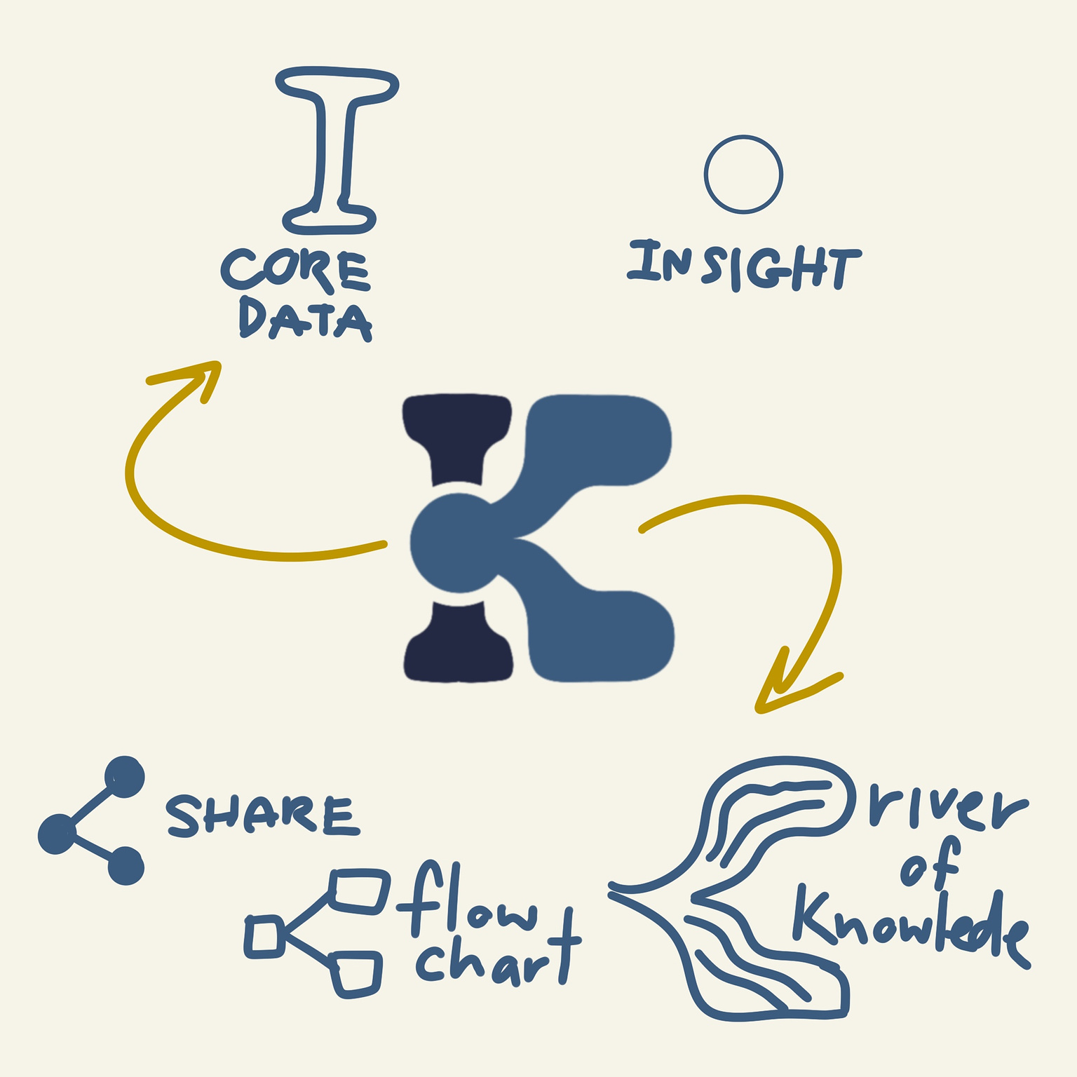
I came up with the concept of a river of knowledge and insight, flowing seamlessly from one point to the other, and explored different ways to incorporate it into an icon.
I found some ideas that I liked, but they didn’t fit well with the overall brand identity. So, I chose a design that looks clean, elegant, and appropriate for both the brand and the audience. It’s simple but, in my opinion, the most effective.
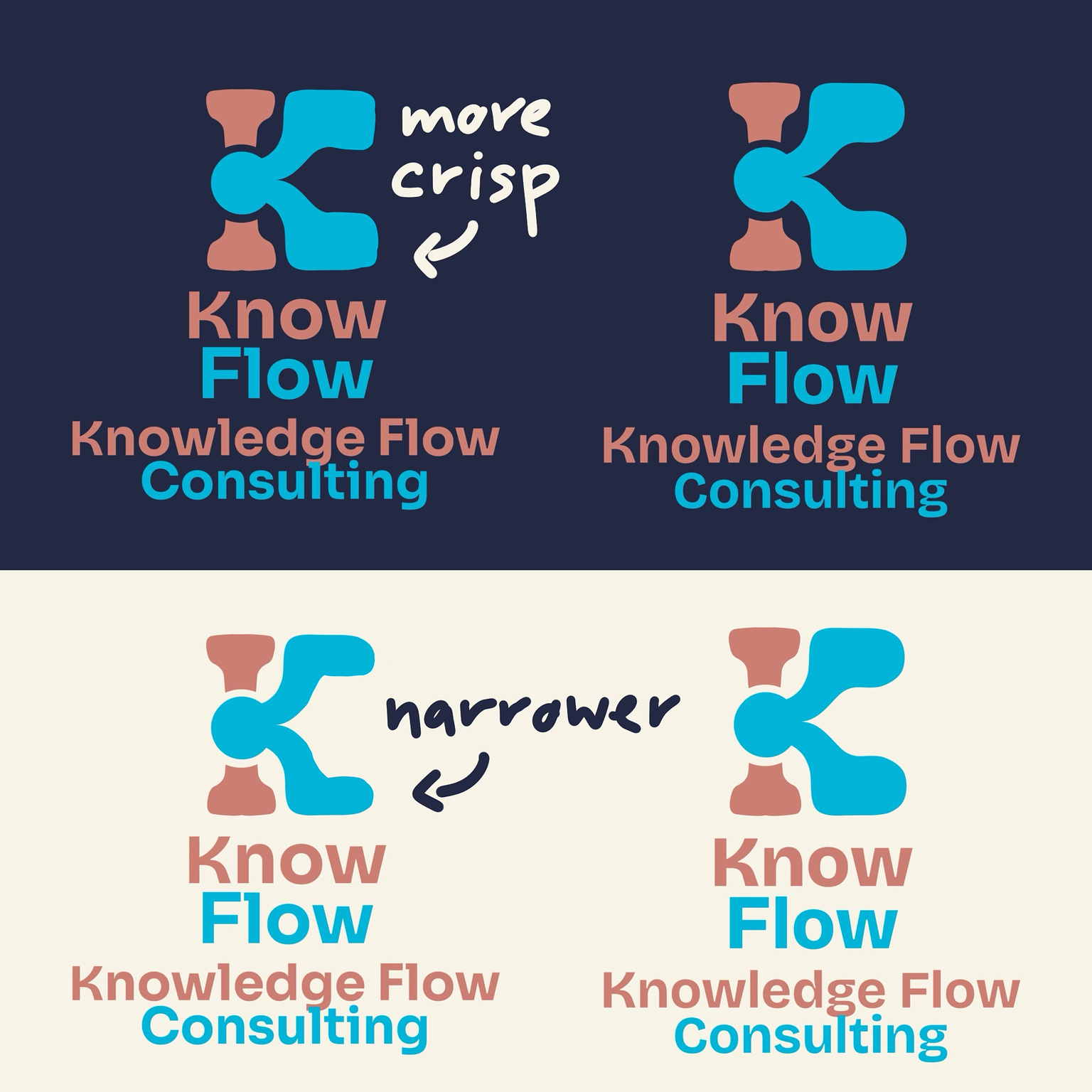
Pratik seemed to like it too, but he had one criticism: it looked too bulbous and round, like Mickey Mouse’s hands. Perhaps I was too close to the design to see it myself. Nevertheless, I was willing to adjust by sharpening the corners and reducing the size slightly to avoid any hand associations. To be honest, I also thought it would be cool to visualize “helping hands” in the icon—but alas!
Typography Is Half the Battle: Choosing Typography
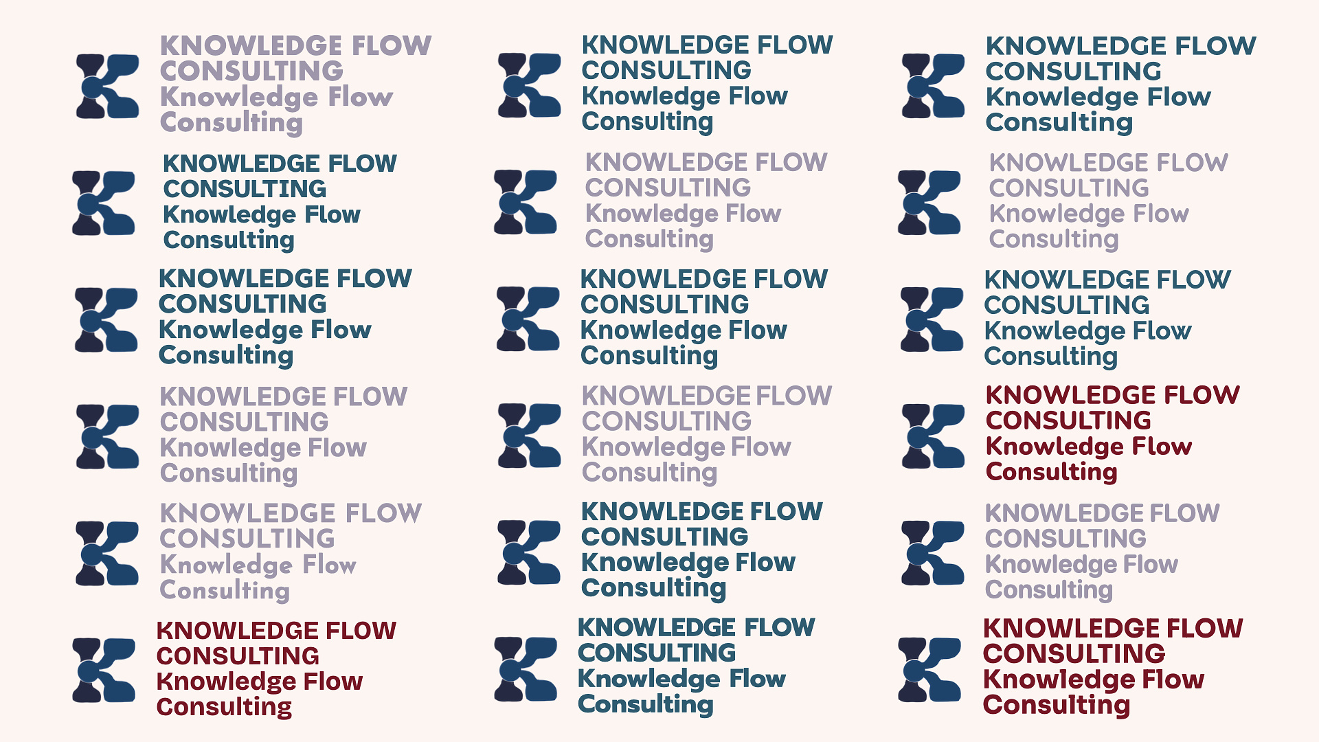
Typography, as we all know, is half the battle in creating a compelling logo. Choosing the right font is crucial. I went through my entire catalog, picked out the ones I liked, and thought would fit the brand identity. I then weeded out those that appeared too generic or did not align with my vision to create a shortlist.
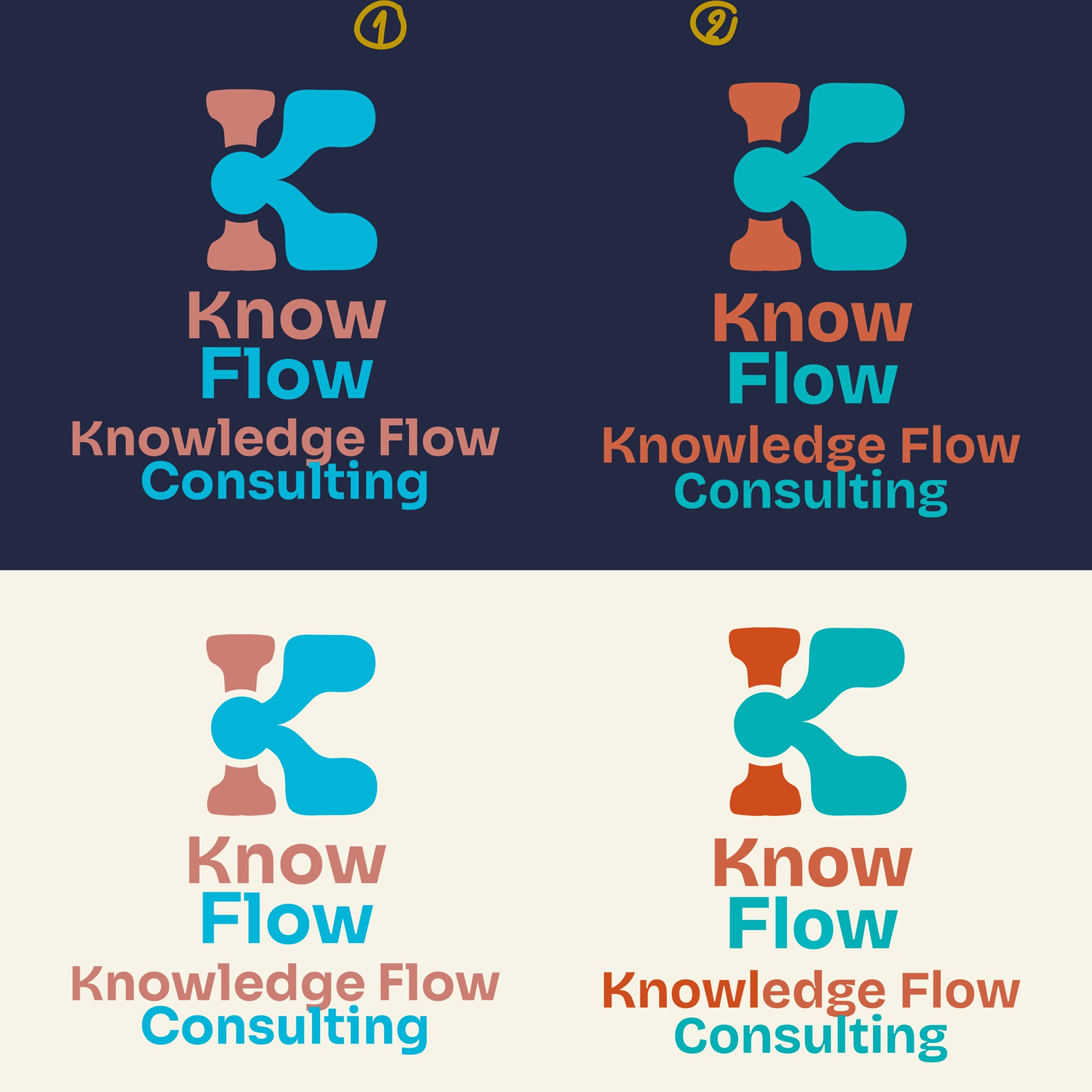
Next, I analyzed both capital letters and lowercase letters—especially K and O. The K needed to harmonize with the icon while ensuring that O was as round as possible to convey friendliness and evoke a sense of perpetual change cycle.
The left is Sora, The right is Bricolage Grotesque
I loved the K in Bricolage Grotesque; it resembled my logomark nicely.
However, I preferred Sora for its friendly in a logical way. So, I decided to pair the “K” from Bricolage Grotesque with the rest of Sora’s typeface. And voila! I had a base for my logotype that would represent the brand identity. This combination seemed to strike the right balance between individual letter design and overall coherence.
Another reason for choosing Sora was its lowercase g. I immediately saw an opportunity to incorporate underlines to symbolize the flow in the logotype.
Just in case he found Sora too plain, I also pitched Bricolage Grotesque. But I really hoped he’d go with Sora—and he did! Yay!
Note: Bricolage Grotesque would also have been a great choice if the brand had aimed to emphasize unique insights instead of collaborative efforts.
Setting the Mood with Colors
Colors were crucial in setting the brand’s tone. The objective was to make the brand appealing and fitting for its primary audience. Since this primarily targets educational sectors and nonprofits, the best approach is to ensure it appears as friendly as possible. We don’t want people perceiving Knowledge Flow Consulting as having a rigid corporate culture; rather, we want them to see us as trustworthy partners for meaningful collaboration
I wanted the river analogy to be clear, so blue was a must. Initially, I considered using yellow as a representation of golden nuggets gleaned from insights within the stream of knowledge. However, this wouldn’t work well against light backgrounds. I needed something versatile enough for both light and dark backgrounds to enhance logo usability.
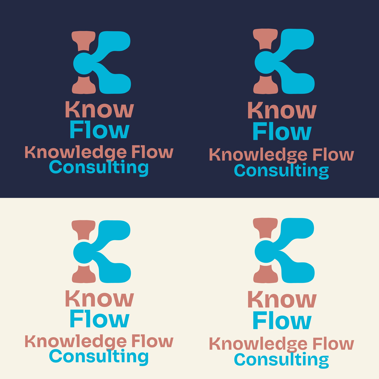
So, I went with pink and blue—classic choices for educational and youth-focused brands. I picked the shades that work in both dark and light backgrounds and make the flow the focal point.
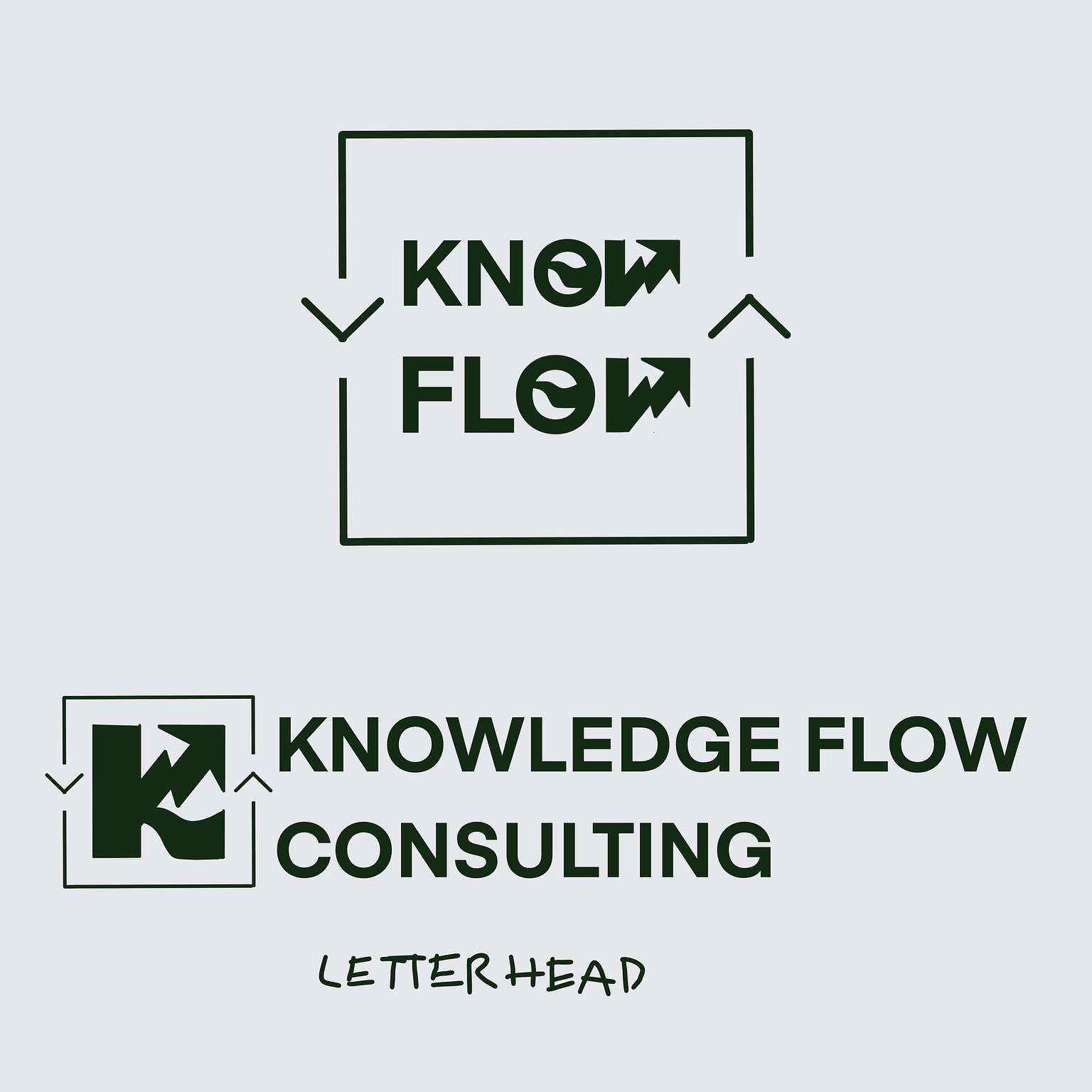
Mock-ups Are Time-Consuming: The Bridge from Concept to Reality
Next up, mock-ups. Honestly, this process felt just as time-consuming as designing itself. However, it’s crucial because this is how ideas become reality while revealing both strengths and weaknesses in designs.
They also served as a safety net in case the initial designs didn’t resonate with Pratik. By preparing multiple mock-ups, I ensured that we had options to pivot to if needed. This step is something I’ll definitely factor into my fee structure in the future, given its significance in the design process.
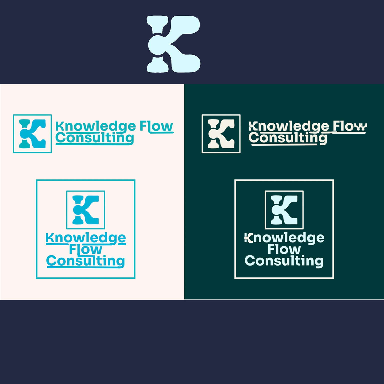
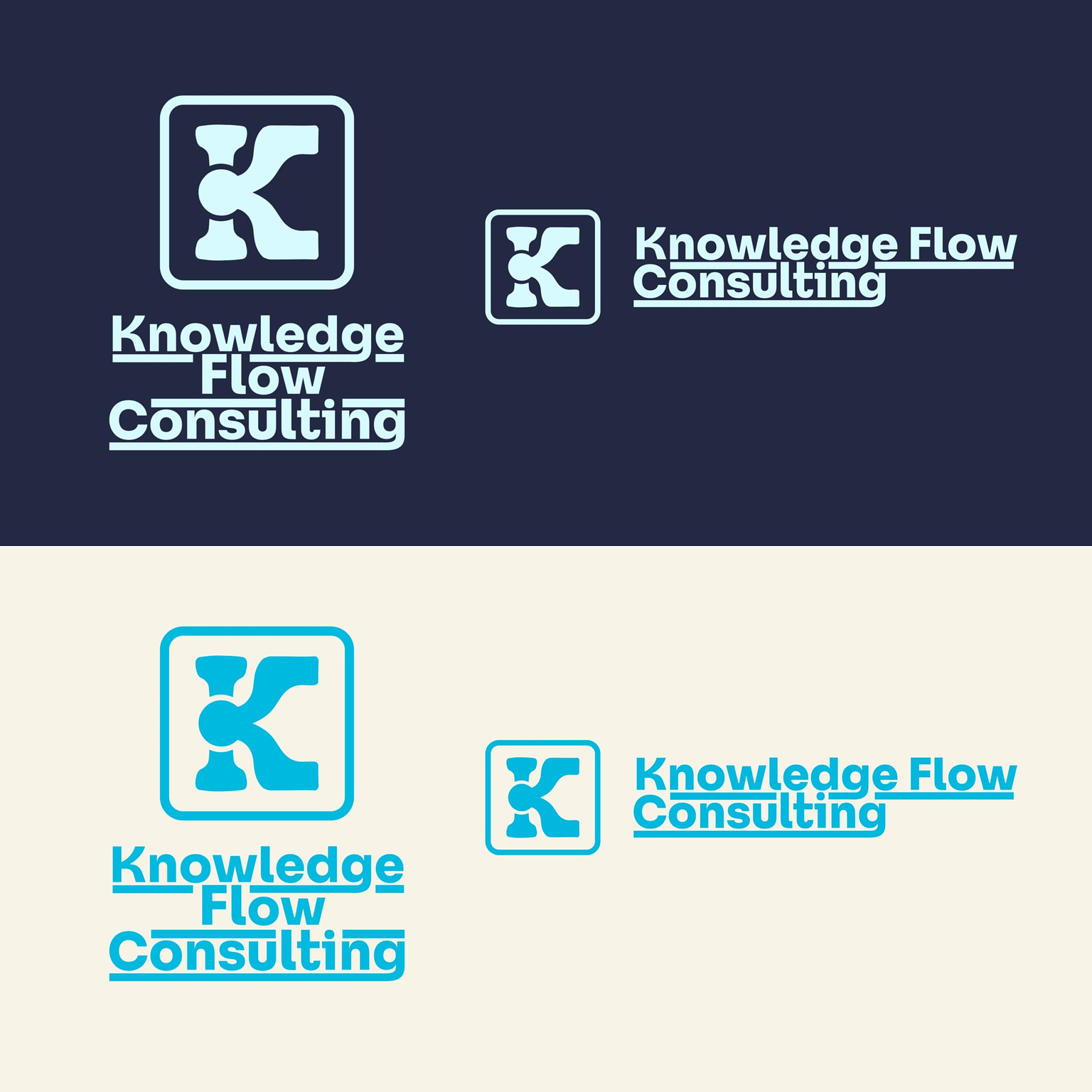
Final Design: Bringing It All Together
After several rounds of feedback and adjustments, we eventually landed on this design.
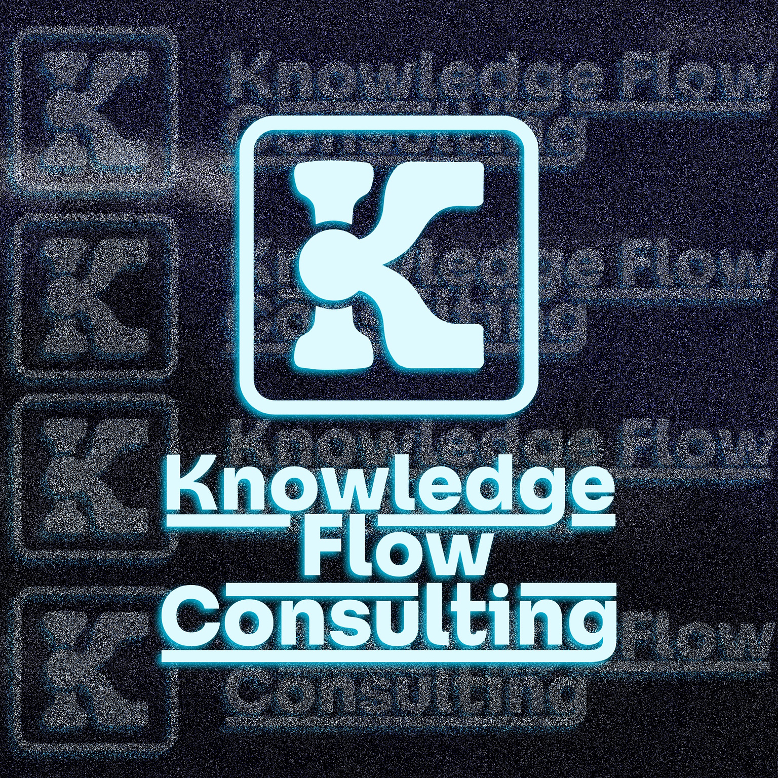
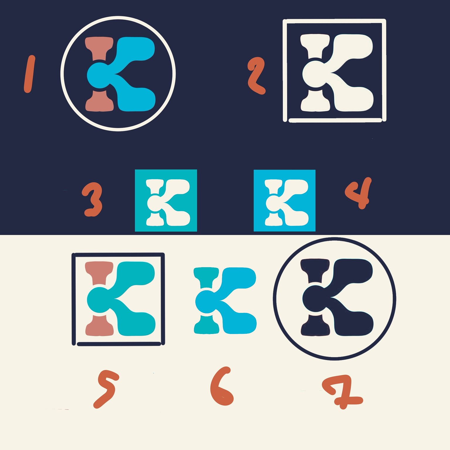
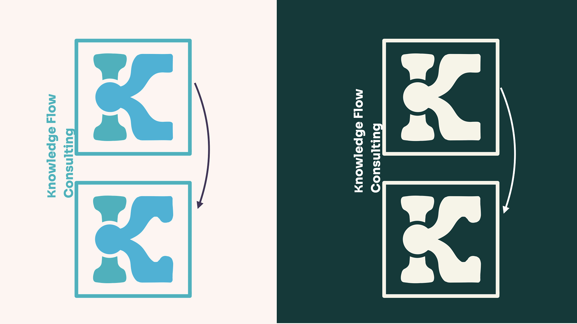
I used a round-cornered square to make the brand more approachable and added underlines to reinforce the concept of flow, a feature I was eager to incorporate from the moment I discovered the Sora font.
We decided to focus solely on the river theme, eliminating the peach pink, though I hope to revisit that version someday. We also made alternate color version by created a white version with a tint of blue, further enhancing the river of knowledge theme.
Now, I believe this truly represents Knowledge Flow Consulting’s brand identity: friendly yet professional; clean with fluidity—the kind of partner educational sectors and nonprofits seek when they need collaboration to uncover insights from thoughtfully gathered research.