The Commission 00010-The Zuiker Chronicles Branding
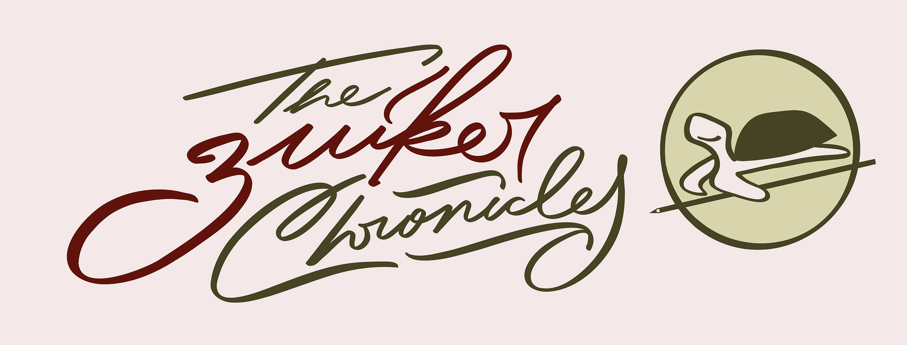
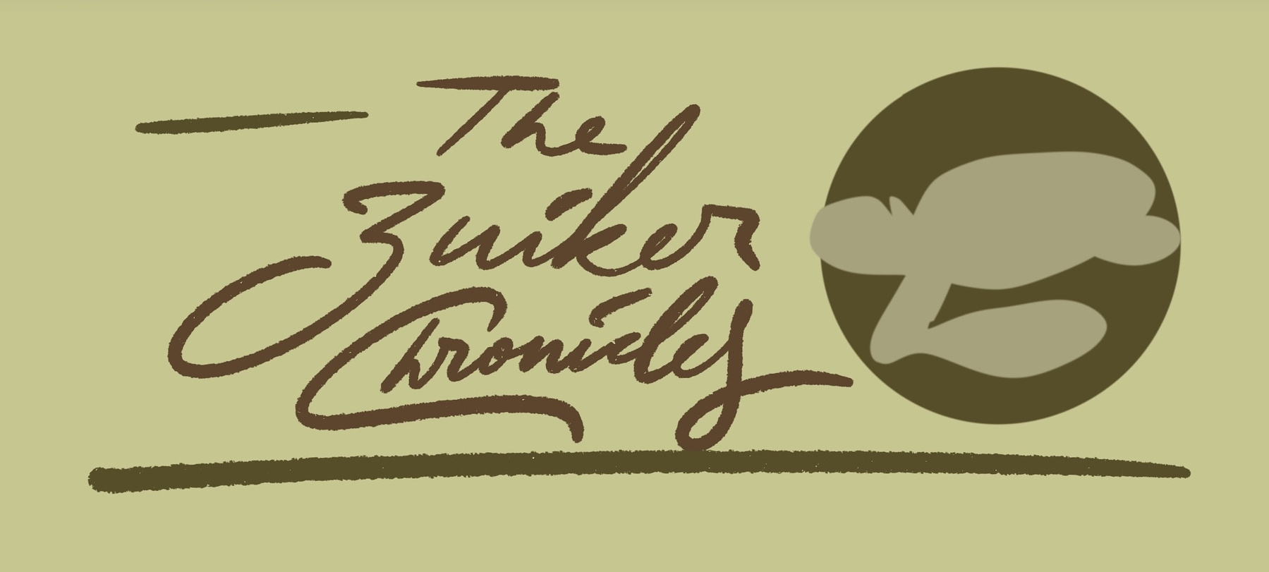
The logo of The Zuiker Chronicles
Anton Zuiker approached me for a
commission, after a referral from Pratik, my
former client (Thanks for the shout-out!). He provided a
comprehensive brief with references, which I greatly appreciated.
The Brief
The brief was straightforward: he wanted a logo for his personal
website that would also serve as his personal branding. He
requested a website header image incorporating both a wordmark
and an icon mark, as well as brand guidelines for colors and typography
to make it a complete branding package. For the icon, he chose
a turtle to reflect his love of nature and passion for
turtle photography.
He wanted the turtle to function as a favicon as well.
After reading the brief, I envisioned a clear direction for his brand.
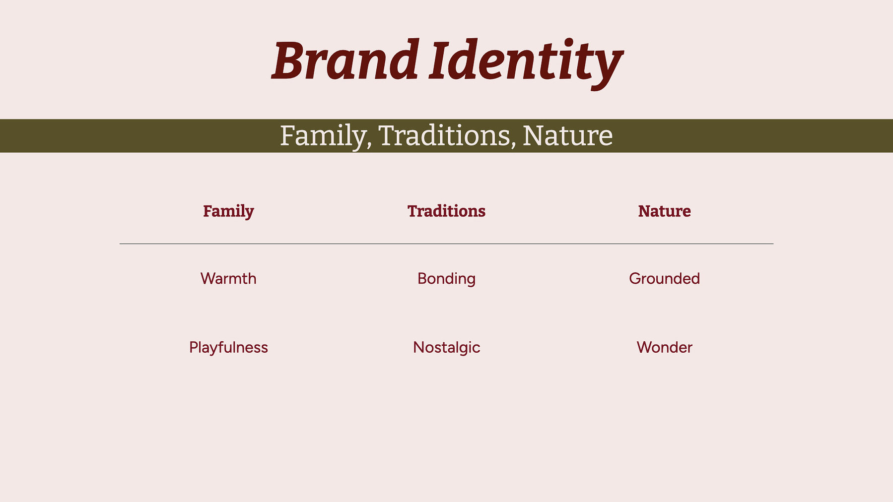
His identity is deeply rooted in nature, family, and traditions.
The name "The Zuiker Chronicles" has been a family
legacy since his grandfather's time.
With nature as the central theme, I began forming ideas for the
commission. I immediately knew it should be a script logo with a
handwritten feel—my specialty. Natural colors
would be essential: primarily green, reflecting the turtle theme,
complemented by brown and touches of light yellow. A serif
font also seemed perfect for the typography.
The Vision: The visual brand identity can tell a story of who you are
After studying Anton's bio and blog posts to understand his identity and
visual branding better, I noticed a disconnection between his identity
and current branding more clearly. Moreover, his initial concept and
references, however, used red and black with a blocky sans-serif font,
were significantly different from my vision.
When client and designer visions diverge, it is crucial to align
them towards a cohesive direction—every design needs one clear
voice. I needed to assess how open he would be to exploring new
directions and approached these differences carefully.
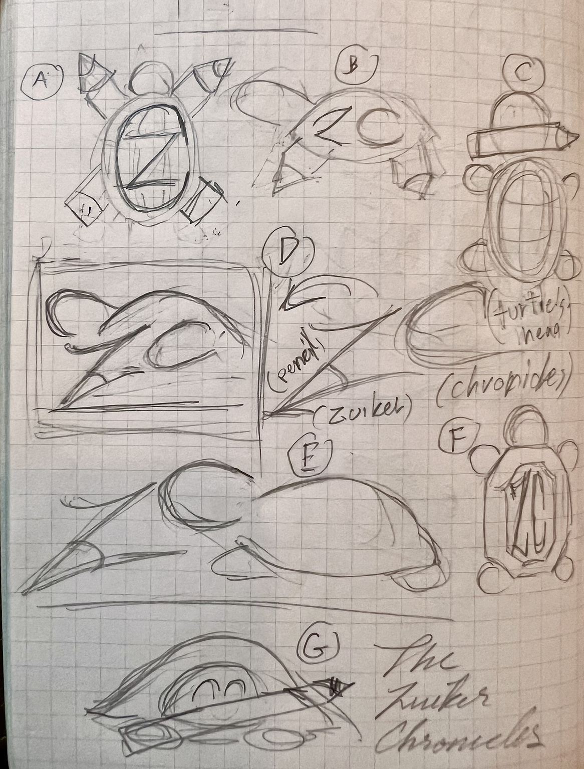
Design directions for brandmark (The turtle)
My first step was to create multiple design directions to help
understand his preferences for both the icon and wordmark.
Often, clients' stated preferences shift when they see actual
designs, so offering a variety of options was essential to finding a
clear visual direction.
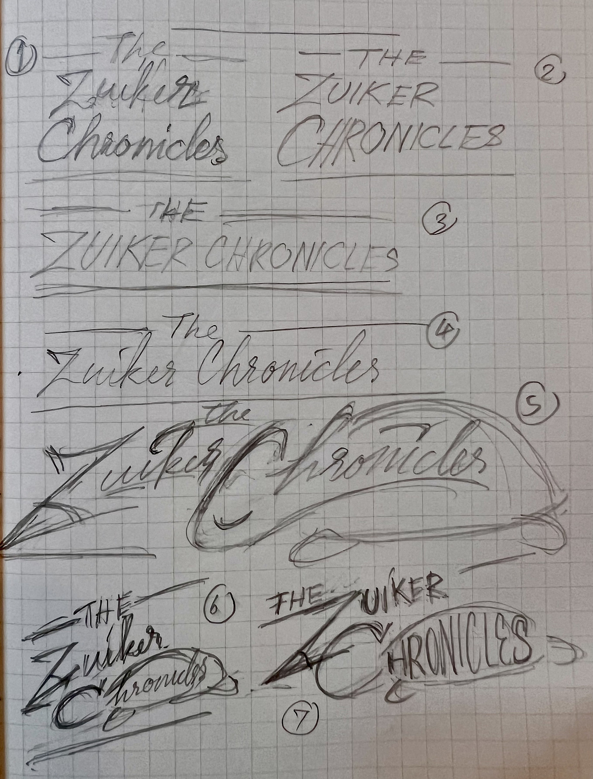
Design directions for wordmark.
Fortunately, he proved to be very open-minded and considered my
suggestions thoughtfully. Once I understood his preferences (E, G, 5, 6,
7), which helped steer us toward a clear vision, I could better cater to
his taste.
The Wordmark: Preserve the legacy
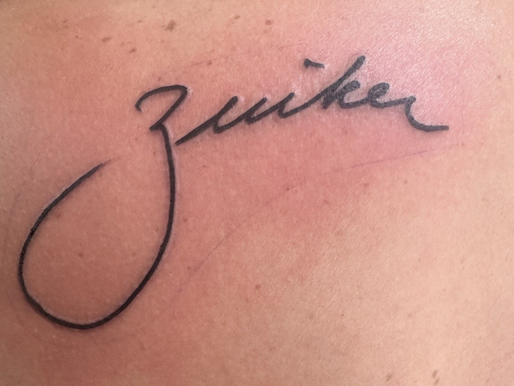
a Zuiker tattoo based on his grandfather's signature.
I discussed the concept of a hand-lettered wordmark, and he provided
samples of his grandfather's signature and a journal entry as reference
material for the logotype. These pieces were a valuable addition to the
project, and I felt personally connected with the project more deeply.
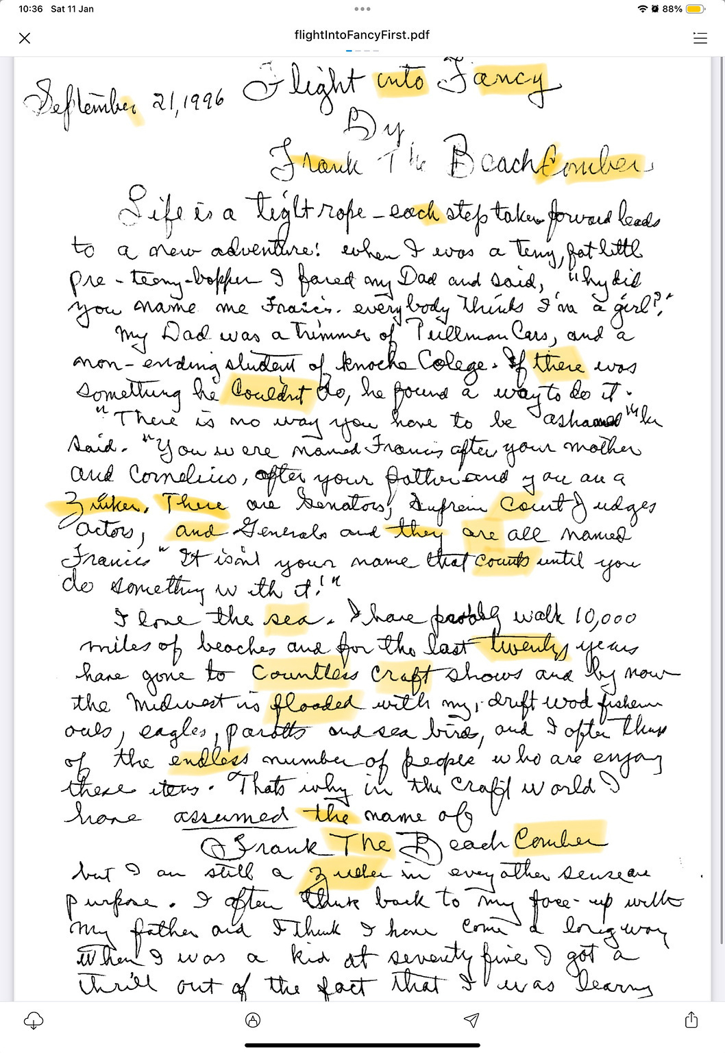
A beautiful journal entry he provided for me as a handwritten sample.
I carefully analyzed each letterform in the handwriting samples, noting
variations and selecting the best elements to compose a cohesive
wordmark.
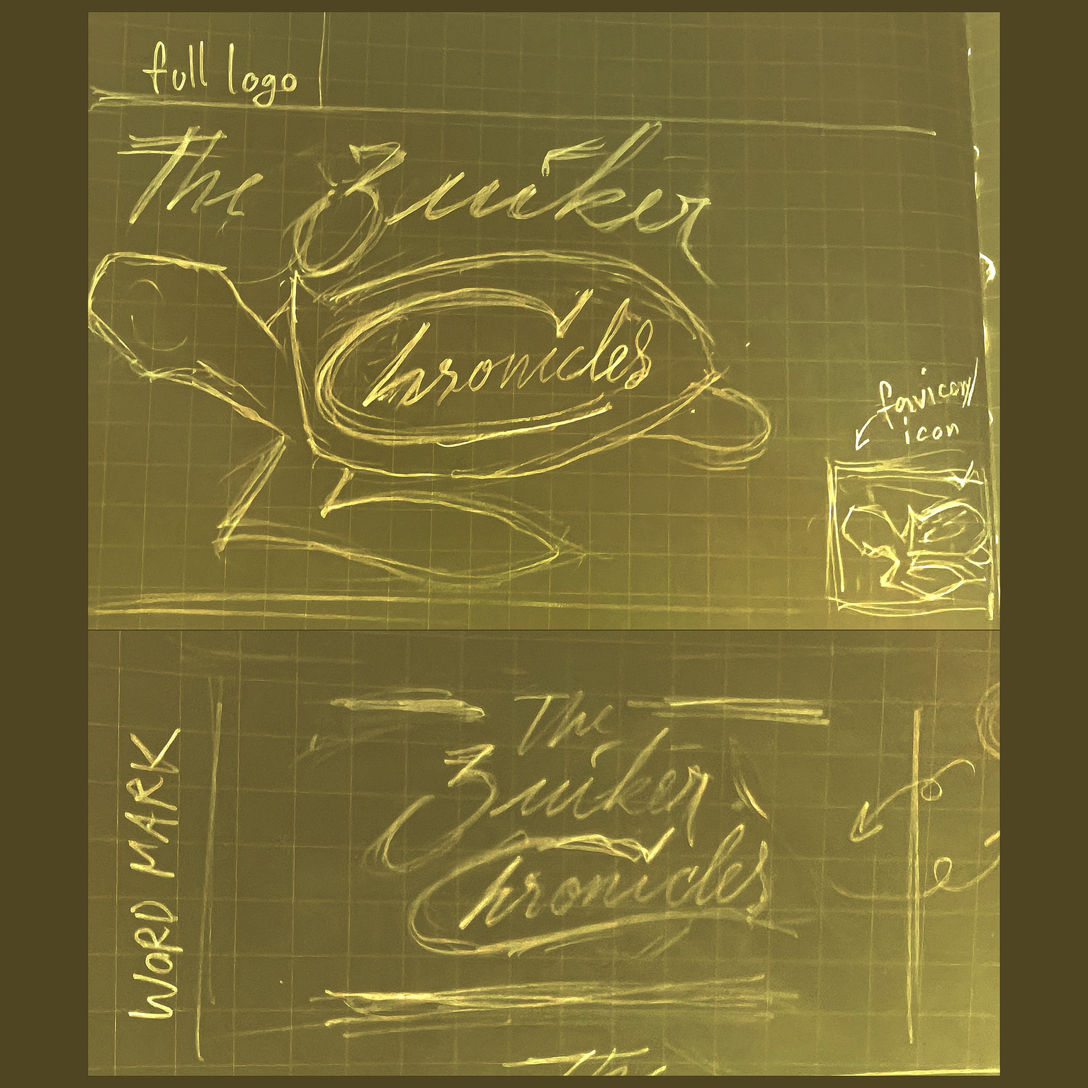
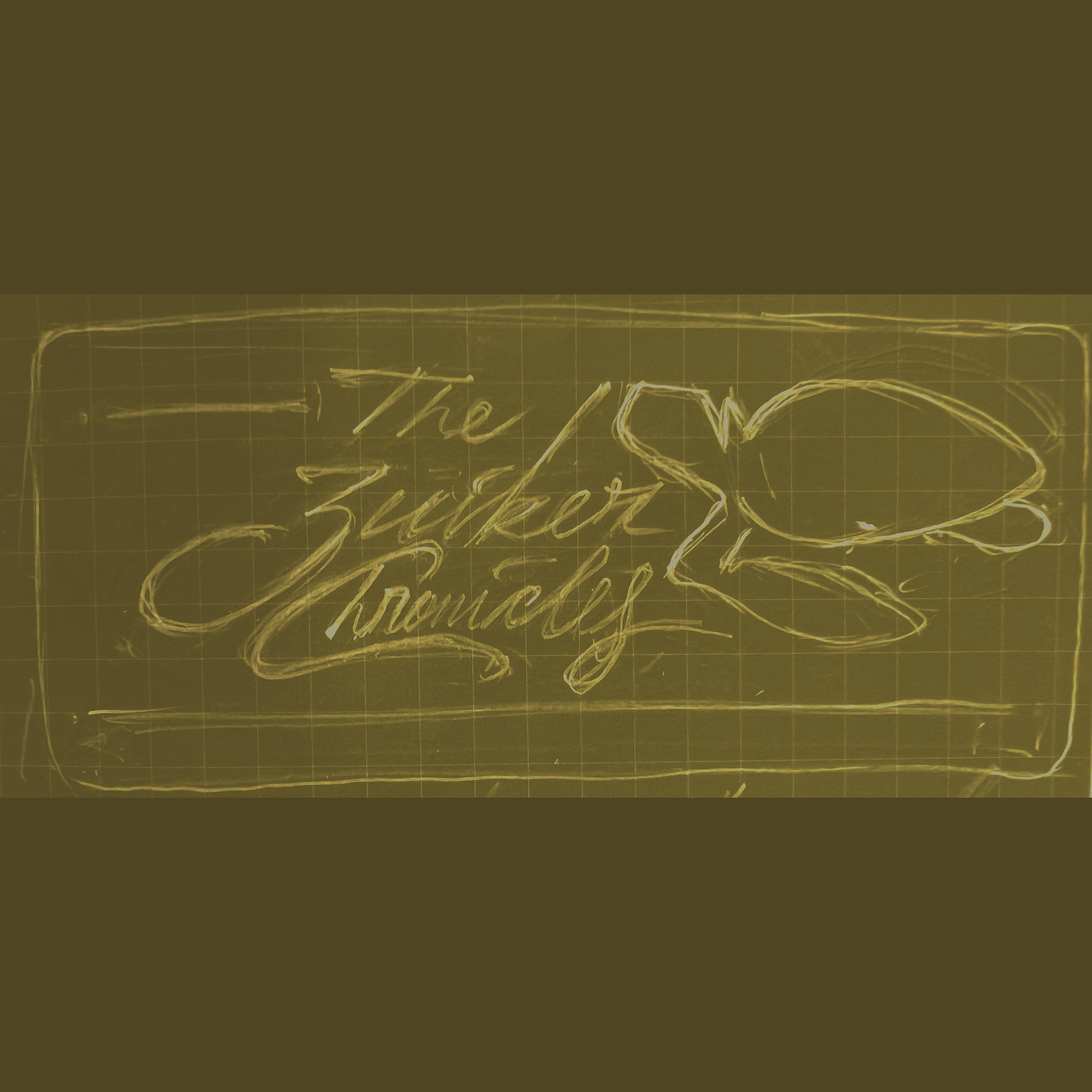
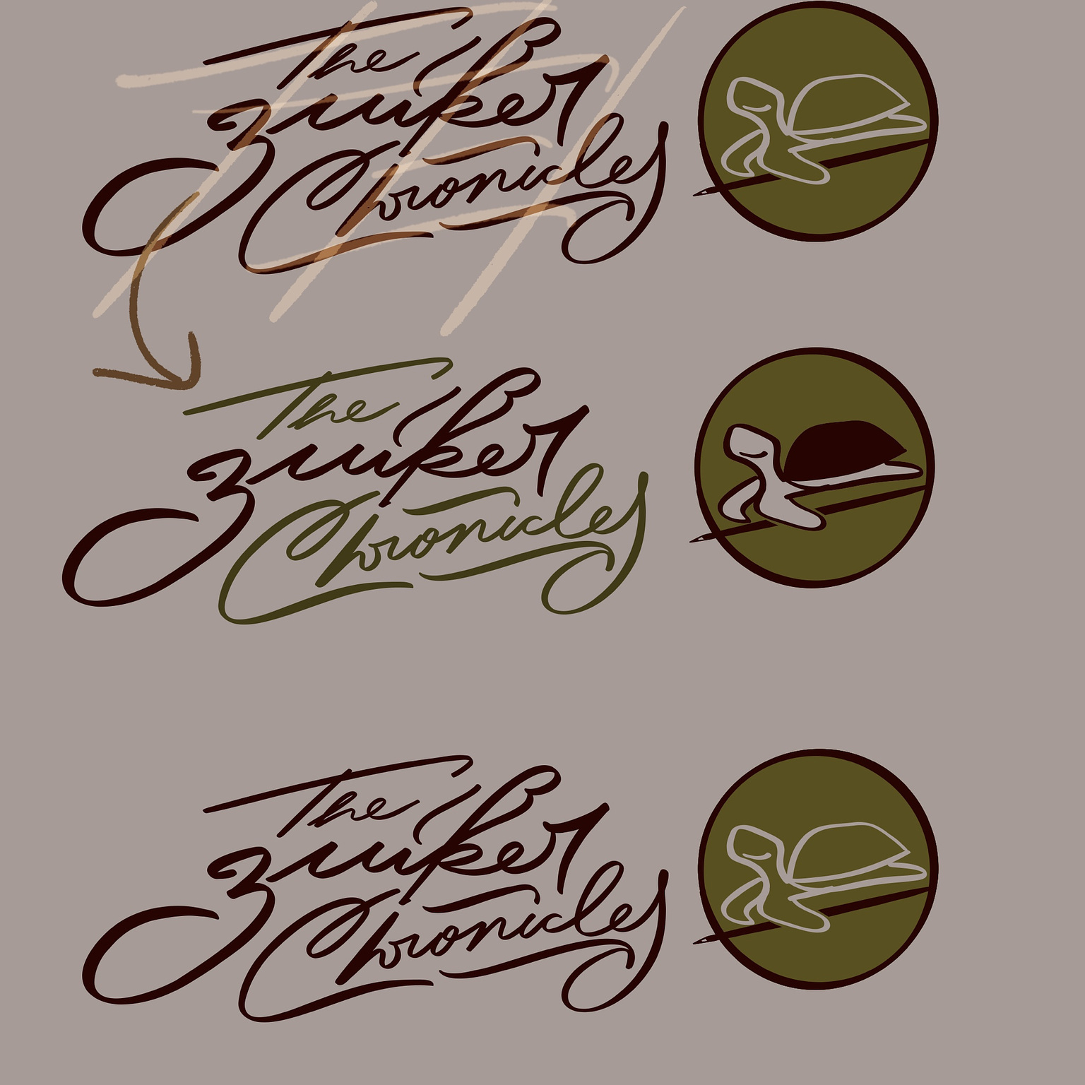
The first drafts of The Zuiker Chronicles
My first digital draft for th wordmark
I considered integrating the “C” in “Chronicles” as a turtle’s head. However, after sketching this concept, I realized it did not align with the brand vision that well. Consequently, I focused on creating a signature-like logo with harmonious rhythm in every line and stroke.
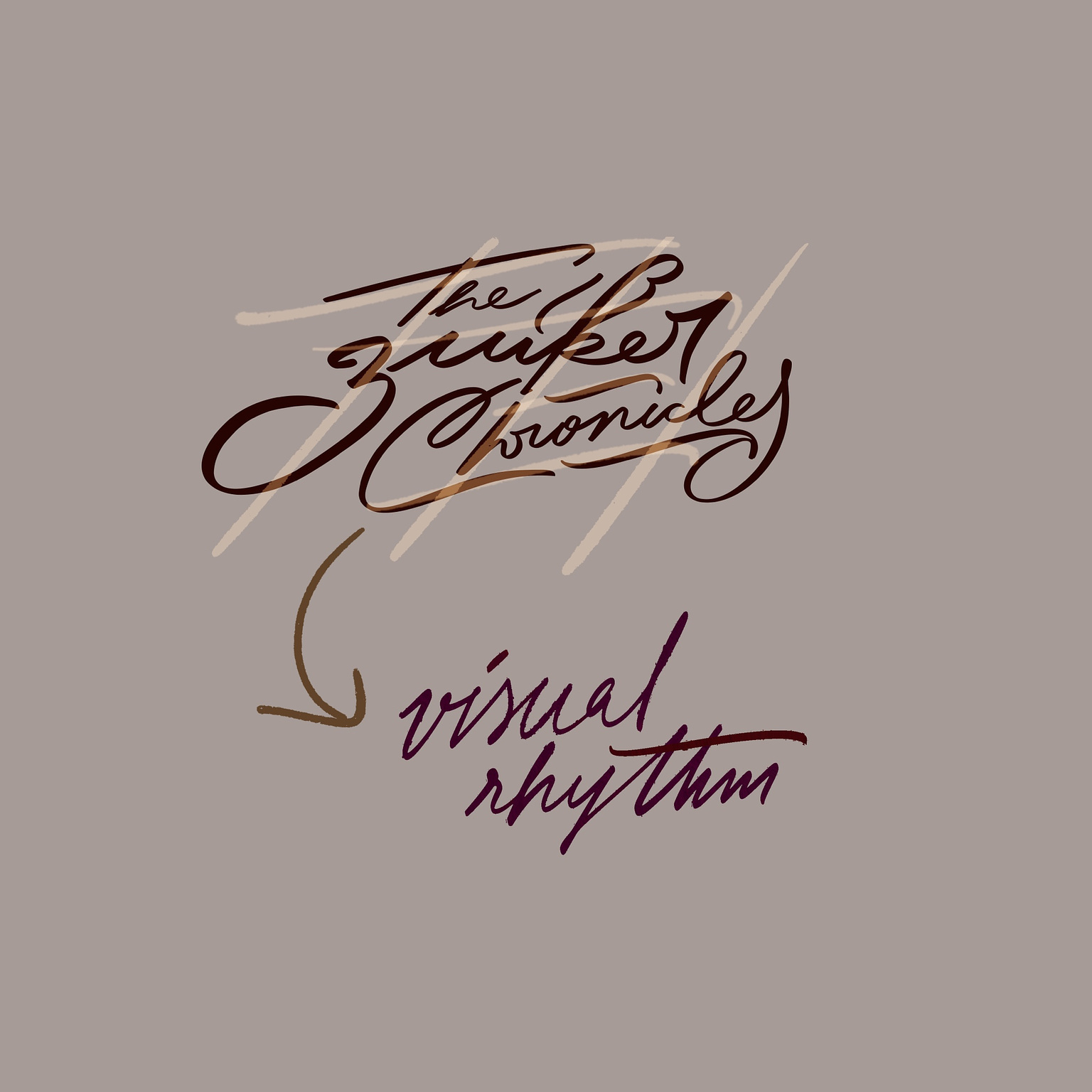
The visual rhythm for both vertical and horizontal lines
My aim was to seamlessly blend his grandfather's handwriting style with my interpretation while maintaining a consistent rhythm throughout the letters and lines. The logo required flowing horizontal and vertical rhythms, reflecting the subtle flow of nature.
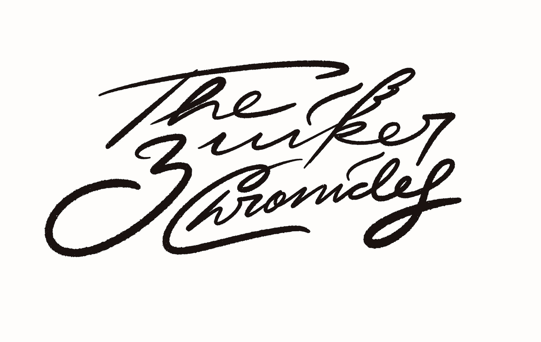
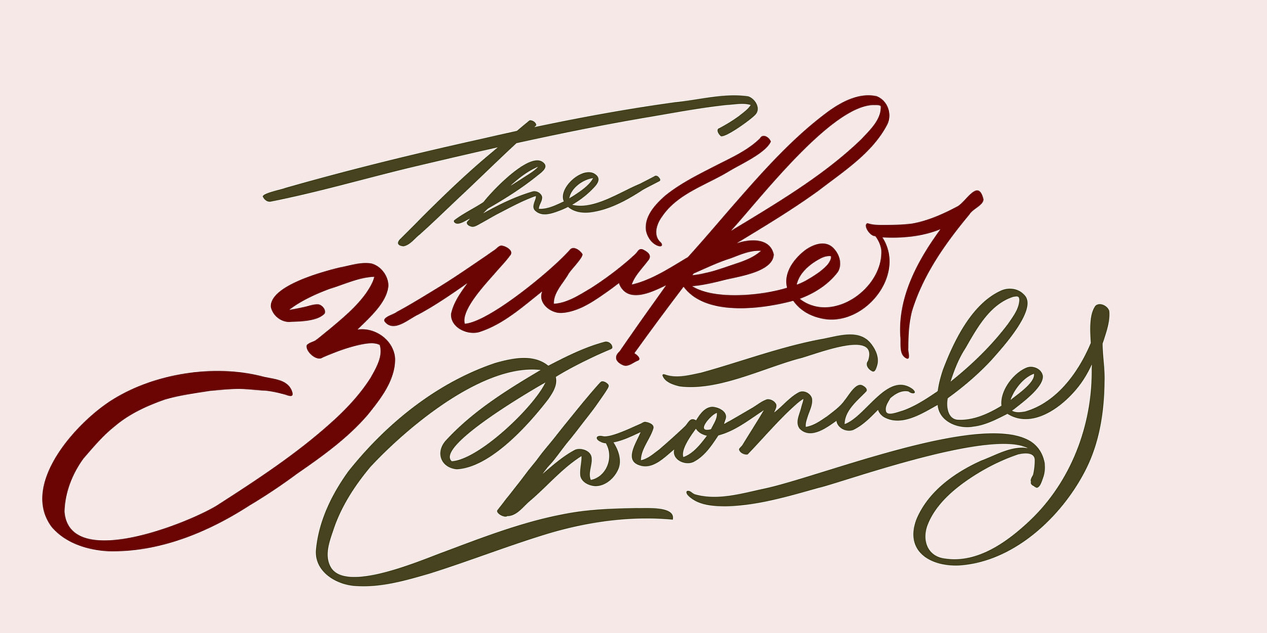
The final design for the Wordmark of The Zuiker Chronicles
The Turtle: a turtle that smiles at you
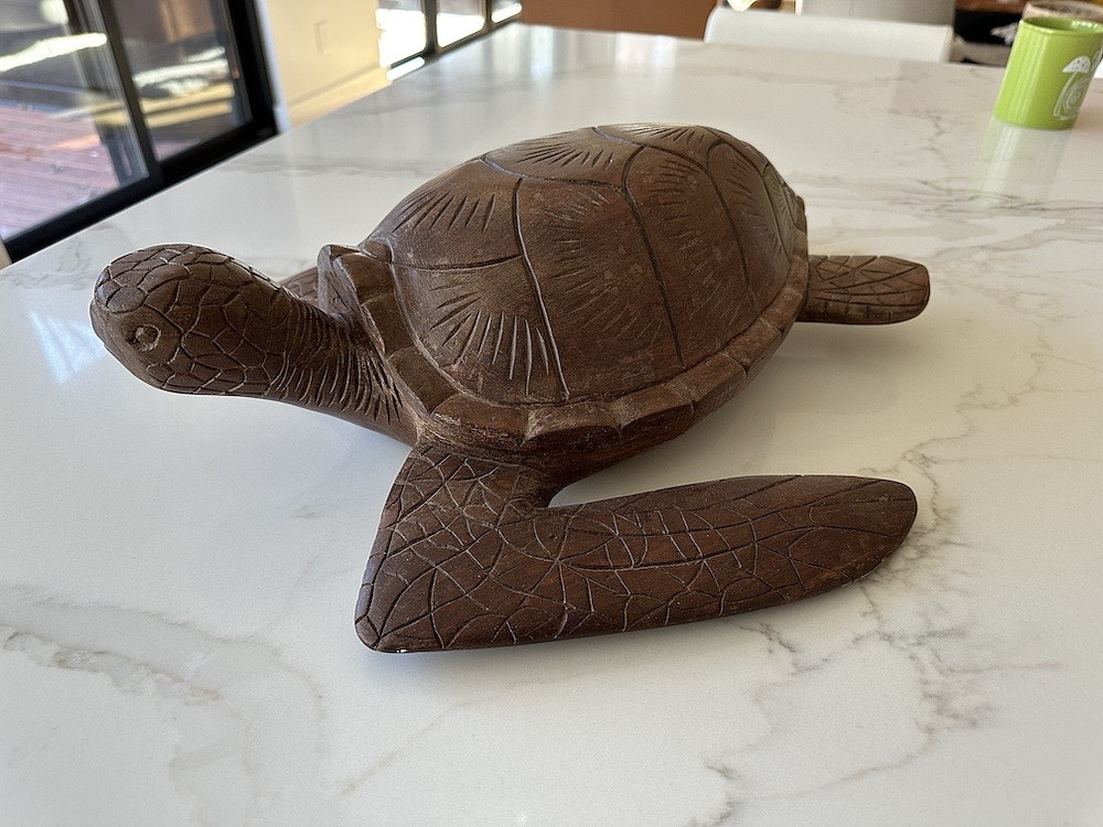
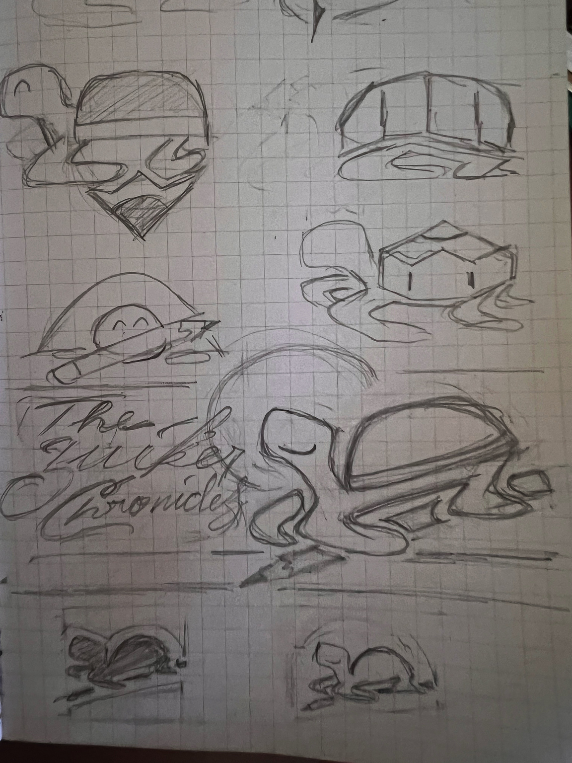
The carving turtle
Anton also provided a sea turtle carving from his home as a reference material. Although I initially drafted a design based on it, the result felt a little bit wrong for what I actually envisioned.
The first draft of the turtle
The failed attempt in capturing the brand essence
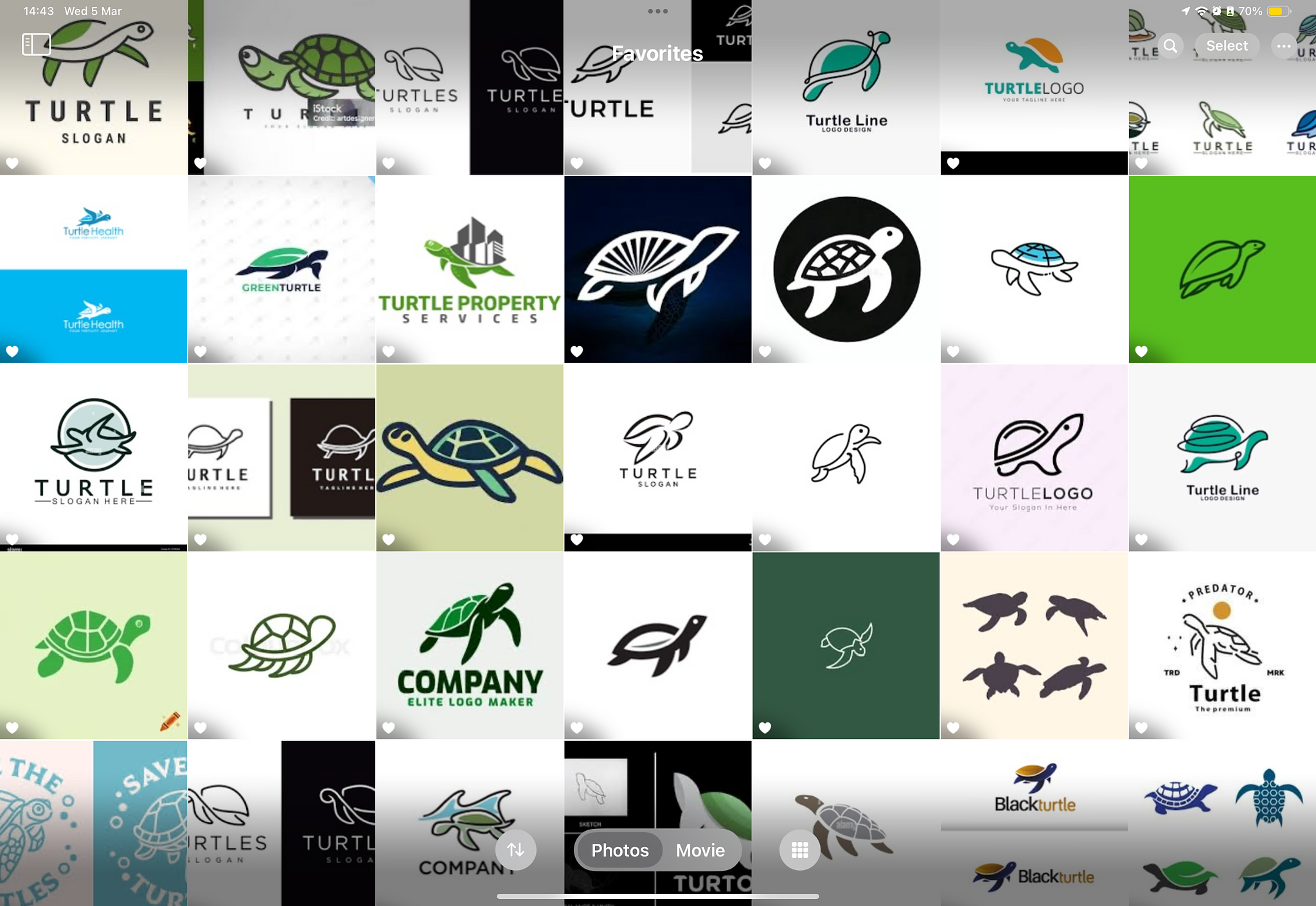
This prompted me to refine my approach. I researched numerous turtle logos and vector styles, seeking fluid line movements that could capture the essence of a turtle without appearing too rigid or childish.
Some reference of turtle designs
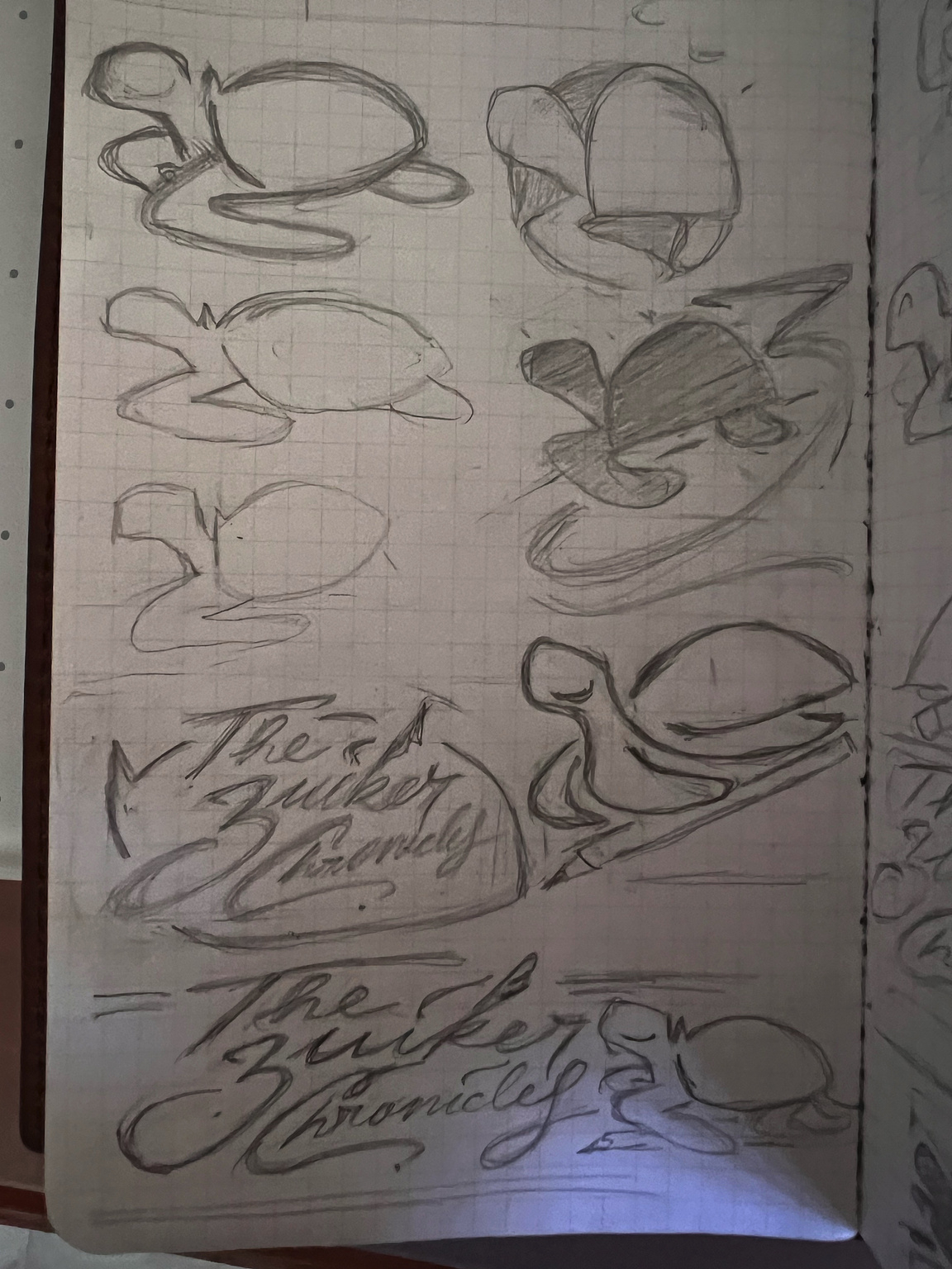
After several hours, I also had the insight to incorporate a pencil into the turtle design, adding a narrative element of Anton’s passion for writing with pencils.
The first brainstorming session for the turtle
I really liked the idea of a turtle that smiles at you, making the logo unique and friendly, so I tried to lean on this idea.
The second brainstorming session for the turtle
Through multiple iterations, I settled on a simple yet elegant concept: a turtle "writing" with a pencil. This evolved into the idea of the turtle blissfully signing "The Zuiker Chronicles." The elements began to fall into place, each carrying meaning and visual rhythm. Once I refined the turtle design, I paired it with the "The Zuiker Chronicles" wordmark, positioning them to enhance the writing signature concept. The combination felt harmonious—this was the logo.
My proposed design for Th Zuiker Chronicles
Anton’s feedback led to the removal of the quill from "The Zuiker Chronicles" signature. He also wanted the turtle to appear more accurate than the carved reference.
The new design after Anton's feedback
Although I attempted a more realistic version, it appeared too digital rather than hand-drawn, despite its natural accuracy. After reviewing the revised wordmark and turtle icon, Anton preferred to revert back to the original turtle design.
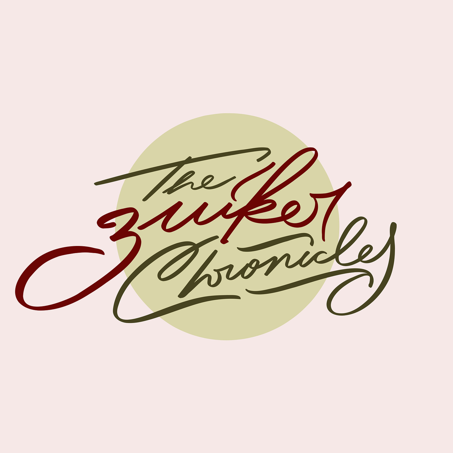
The final design of the brandmark for The Zuiker Chronicles
Color Palette: Emotions at first glance
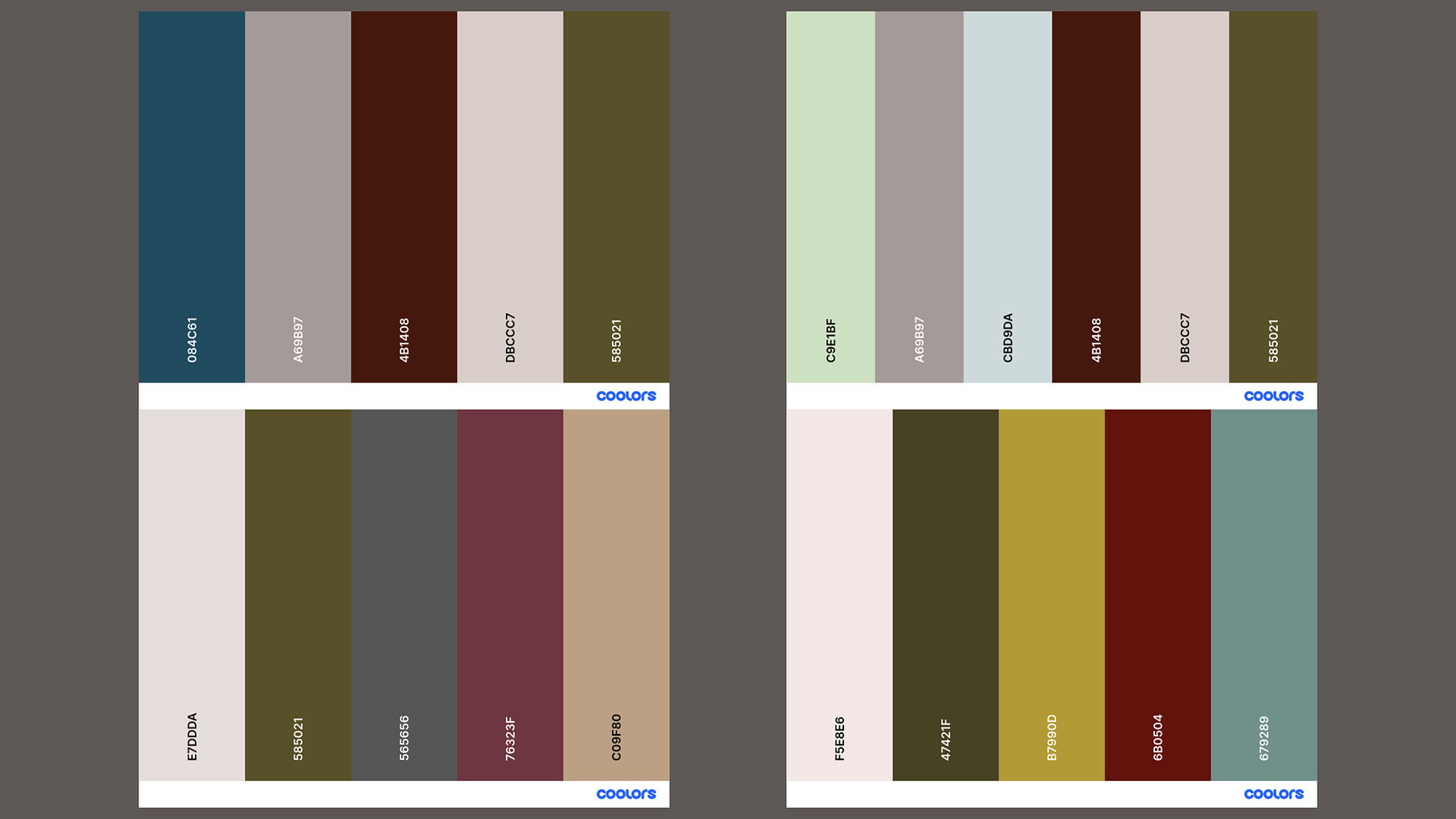
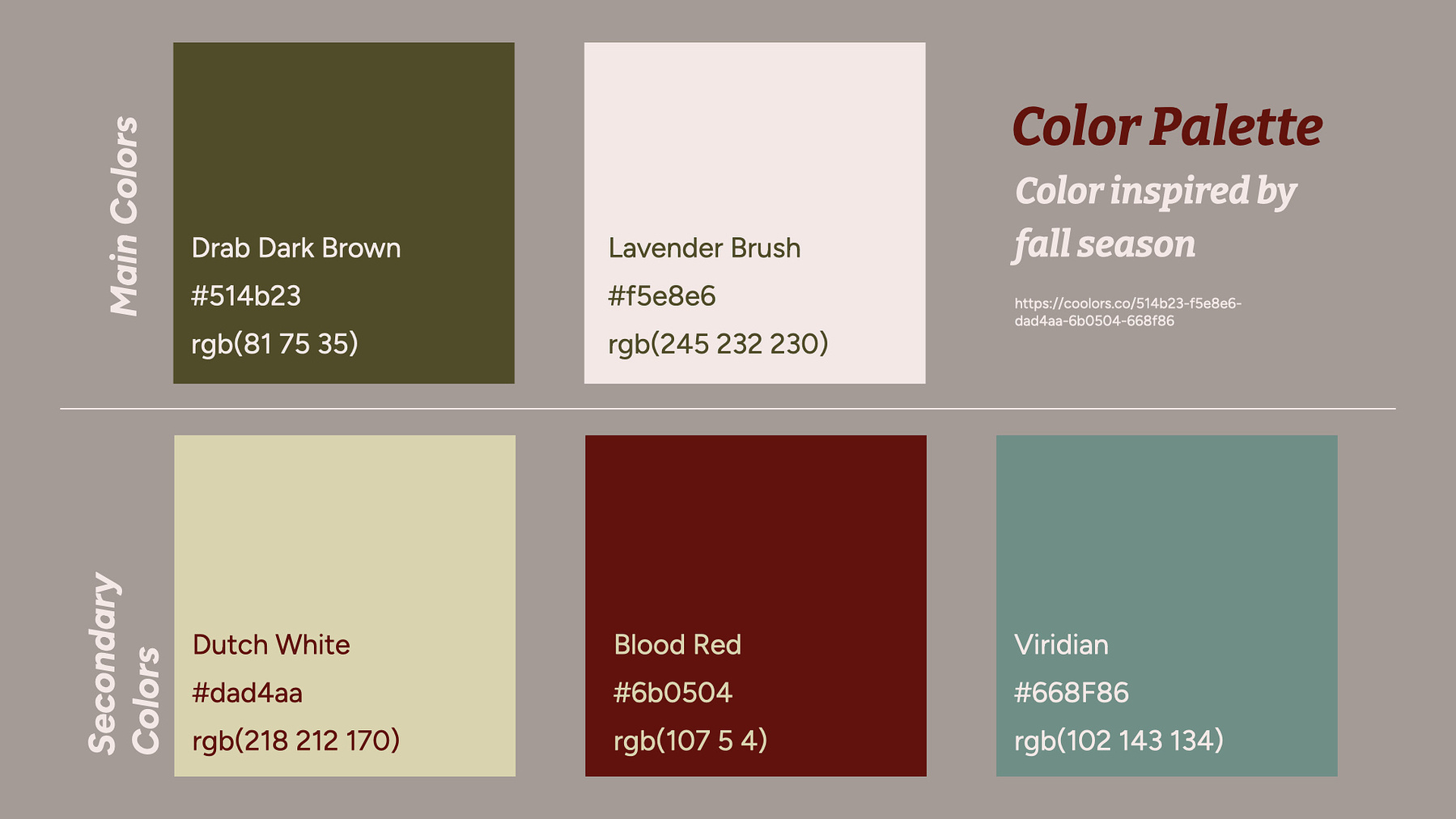
We then addressed the color palette. Since the original colors weren’t suitable for his brand identity and the website’s requirements, I developed new options. Rather than relying on preset palettes, I explored various combinations to discover colors that represented the brand while ensuring strong contrast for accessibilty. I used coolors.com to experiment with different palettes. The site allows for random color selection shade customization, and contrast checker for accessibility until the perfect match is found. My aim was to create a color palette that evokes a sense of warmth while maintaining a playful essence of nature, as if jumping around in the woods during the fall season.
Some color palletes I have tried
Although the process seemed straightforward, it required considerable time to perfect the colors. This included considering value, contrast, and hierarchy for the wordmark, icon, and website. Each element needed to harmonize, all while maintaining a clear visual hierarchy.
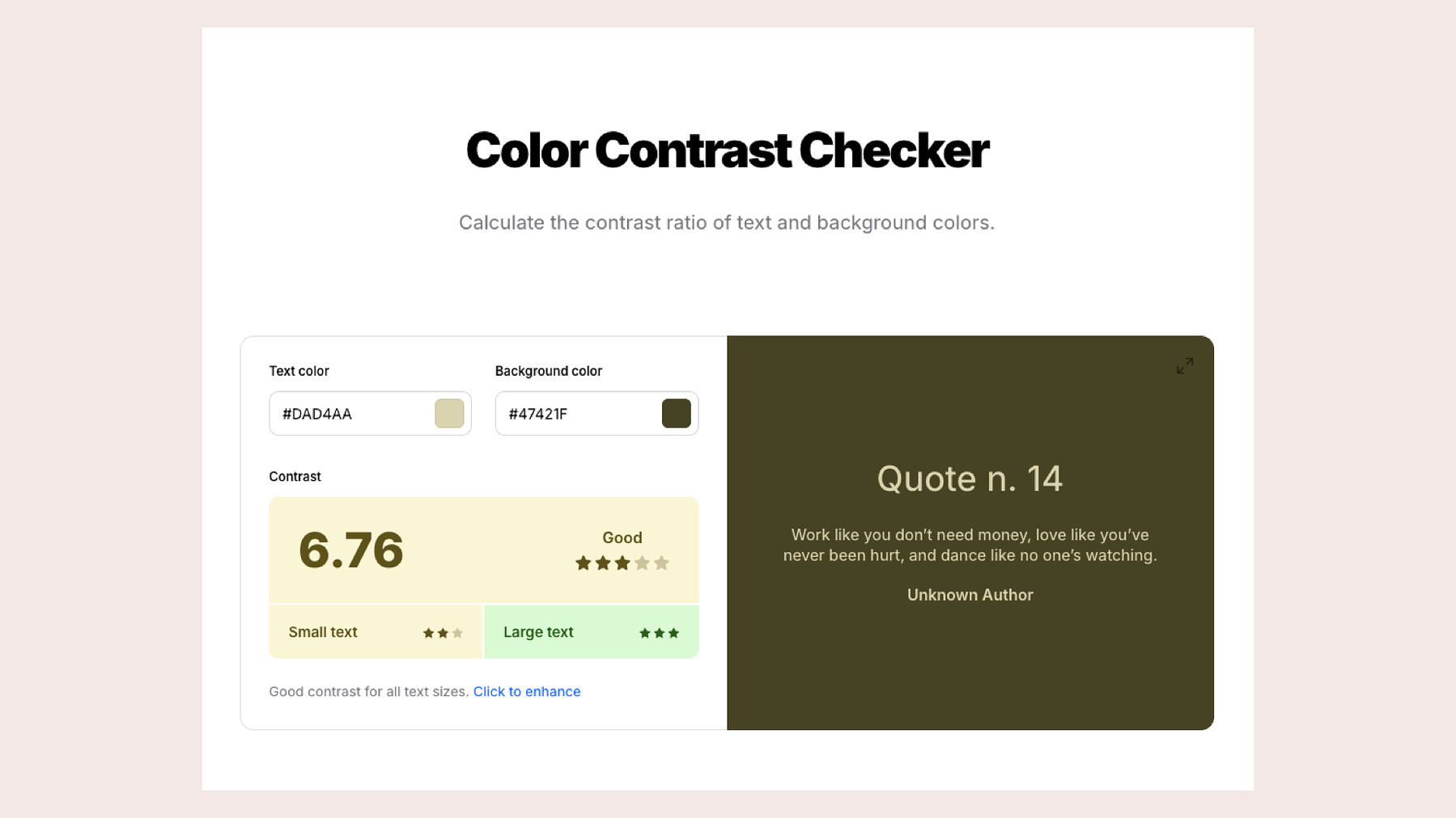
My dozens tries at making the color contrast works for website
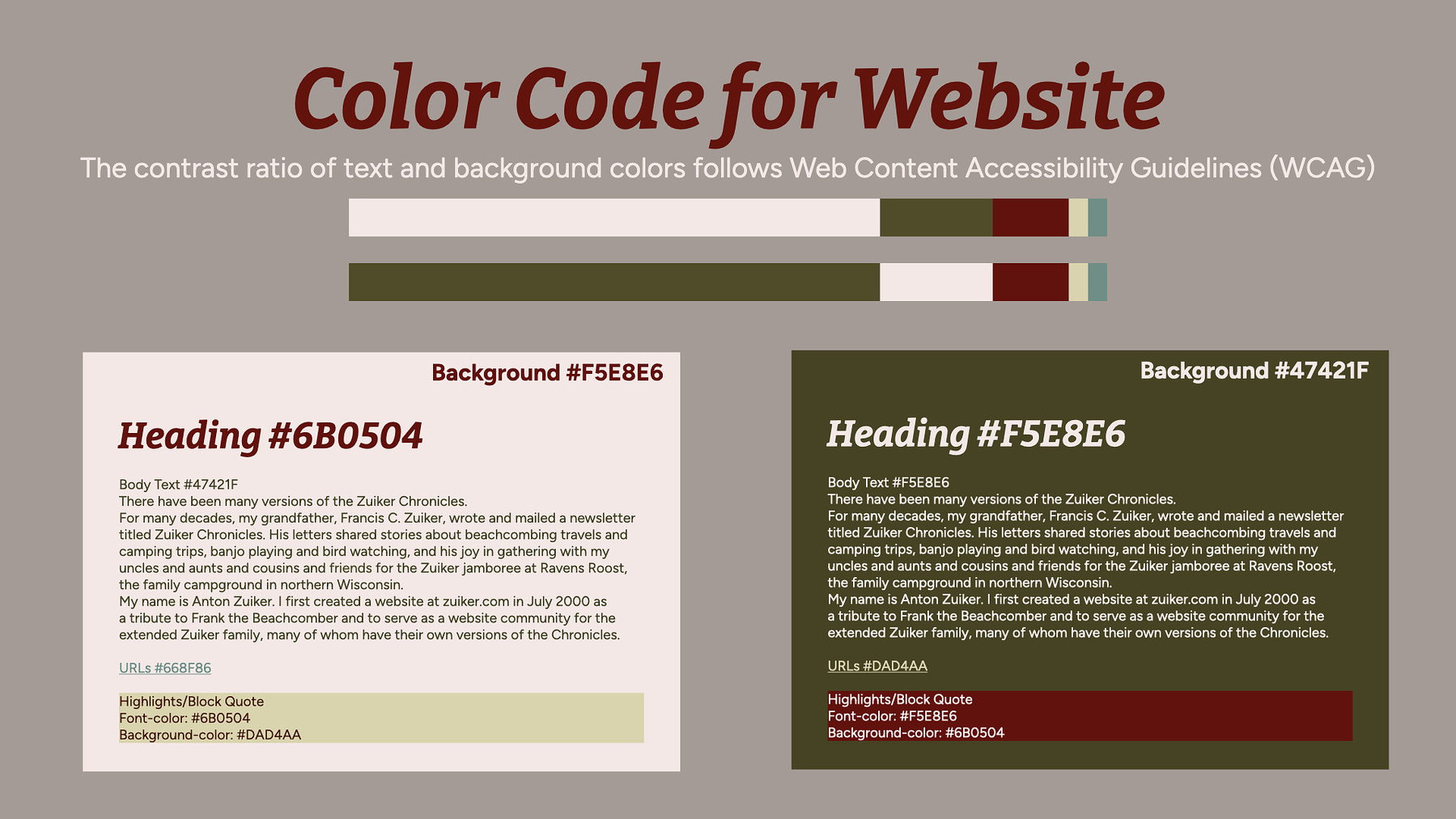
Hex color code for website in each element
I spent nearly ten hours fine-tuning the colors and their ratios for both the light and dark versions of the logo and website. I am beyond happy with the final color treatments, and Anton loved the color palette I presented as well.
The color palette for The Zuiker Chronicles.
Typography: Personalities in harmony
The final component was typography. Anton wanted to use typefaces from SimpleBits, known for their approachable, distinctive, hand-drawn characteristics. Although I was somewhat hesitant about their usability, I understood his desire for personalization beyond mainstream fonts. He also preferred to retain his existing fonts—Equity and Concourse from MB Type—on his website, if possible.
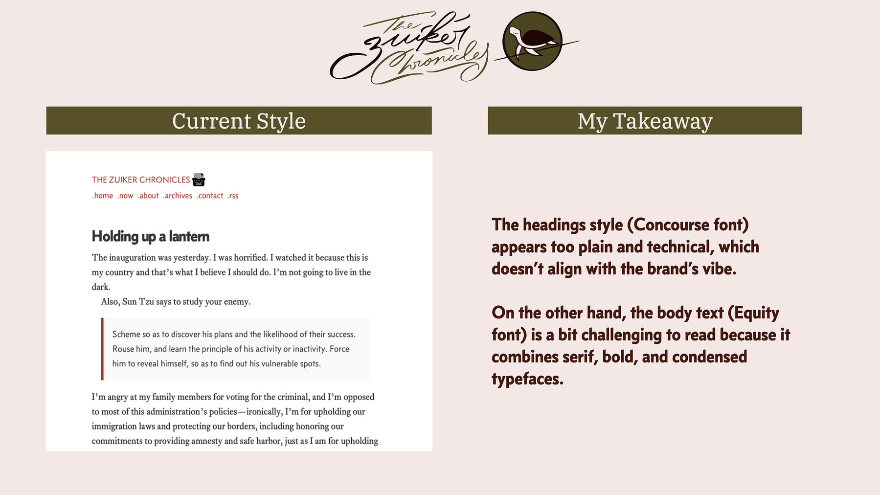
My analysis on current the old typefaces used on his website
The old typefaces used on his website looked too rigid, a bit hard to read, and didn't align with our new brand identity. The headings style (Concourse font) appears too plain and technical, and the body text (Equity font) is a bit challenging to read because it combines serif, bold, and condensed styles.
My proposed typeface suggestion.
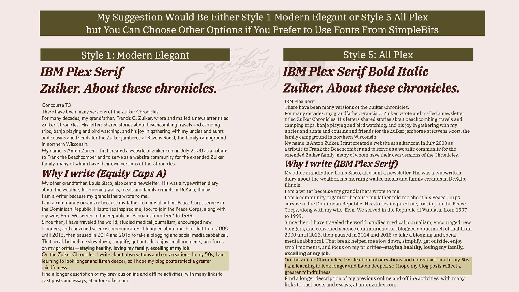
Despite my personal preferences, I made an effort to accommodate his preferences by exploring combinations that would meet his requirements. I suggested eight variations from the typeface selection he favored. Additionally, I recommended the addition of IBM Plex Serif, which I believed would align with the brand identity and either complement the Concourse font effectively as headings, or as body text for SimpleBits typefaces.
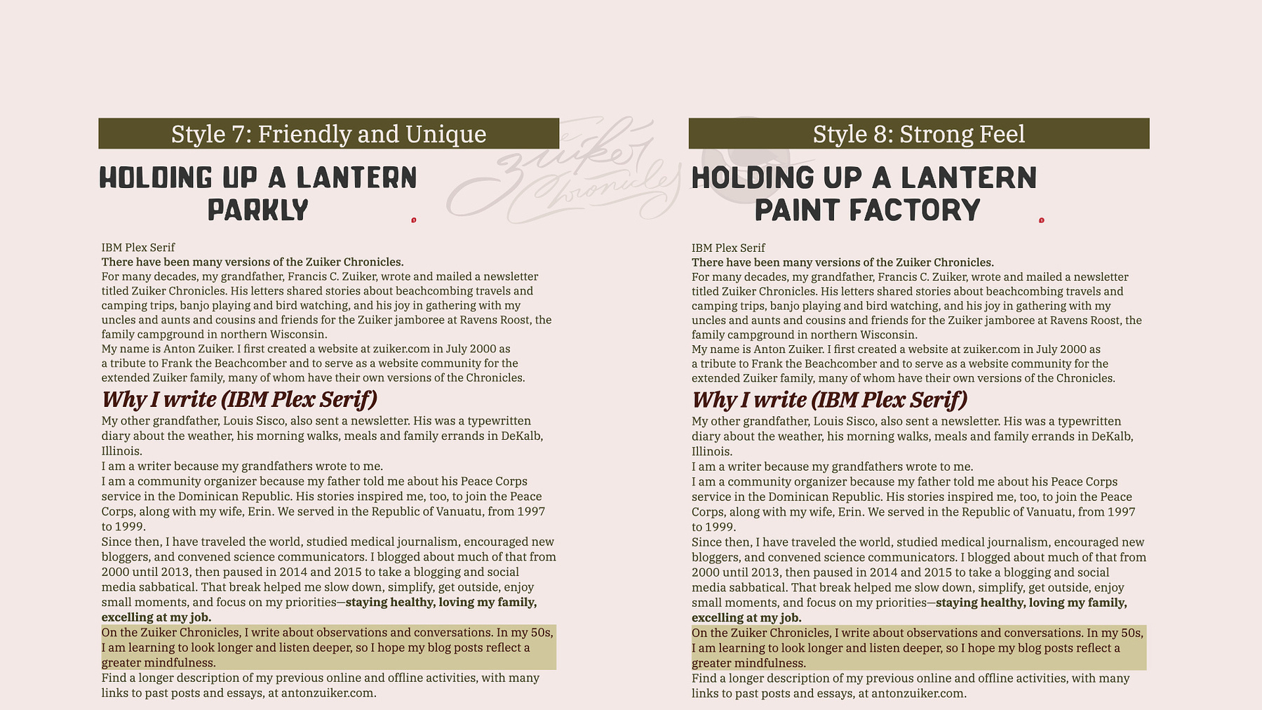
Alternative suggestions, using SimpleBit typefaces as titles
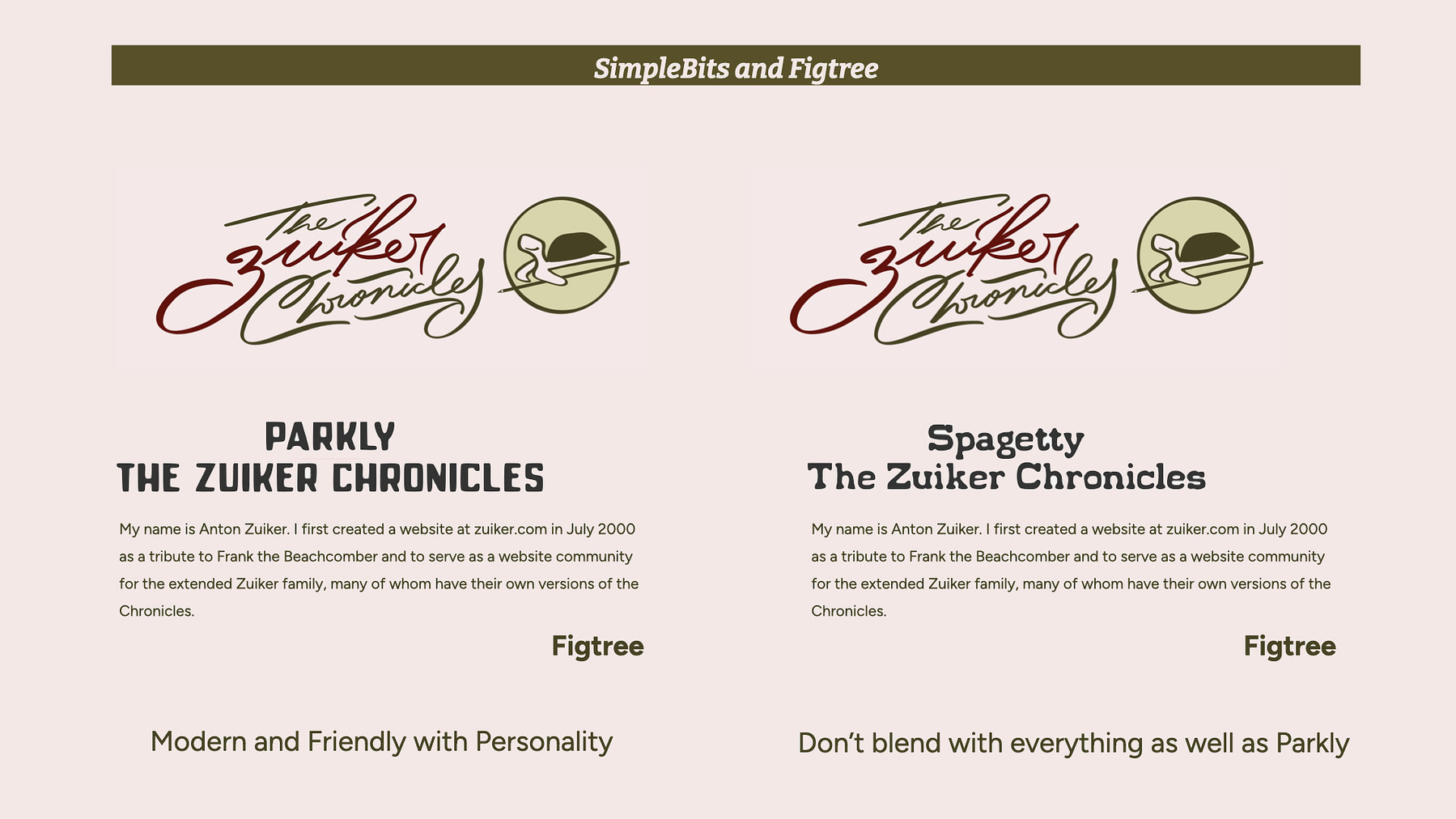
Later, he suggested the Figtree typeface for body text, which I agreed with, since I believe it is much more suitable for body text than his current font choice--Concourse. However, when he proposed using a Spagetty font for headings, I honestly advised against it, explaining that its Western style would overshadow the current design.
The comparison between using Parkly and Spagetty as headings
My proposed typography for The Zuiker Chronicles
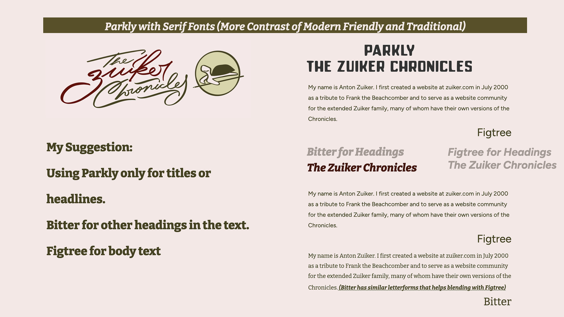
Instead, I suggested alternatives that would better complement the logo, colors, and overall branding. I supported his choice of the Figtree font for body text and recommended Parkly from SimpleBits, instead of the Spagetty font he proposed, as it evoked the imagery of turtles and nature. I also suggested Bitter, a typeface that pairs beautifully with both Parkly and Figtree. Its character and proportions, similar to Figtree, make it ideal for headings, while reserving Parkly strictly for titles and headlines.
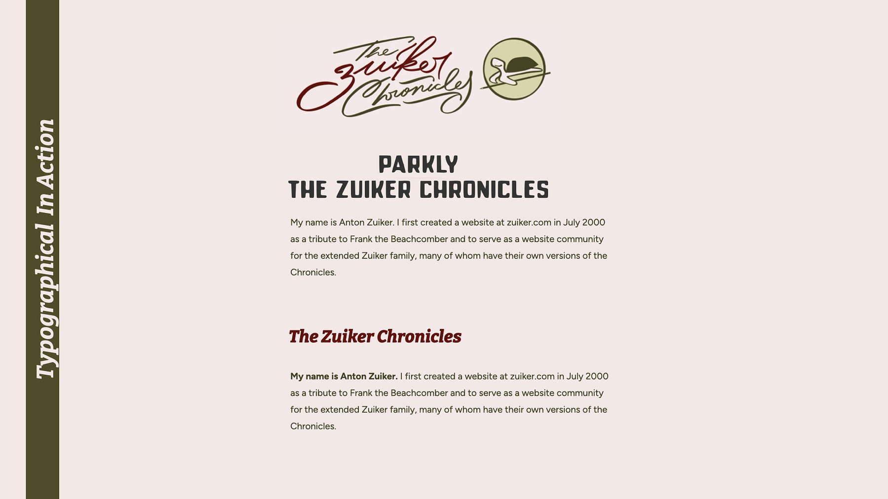
The final decision in action
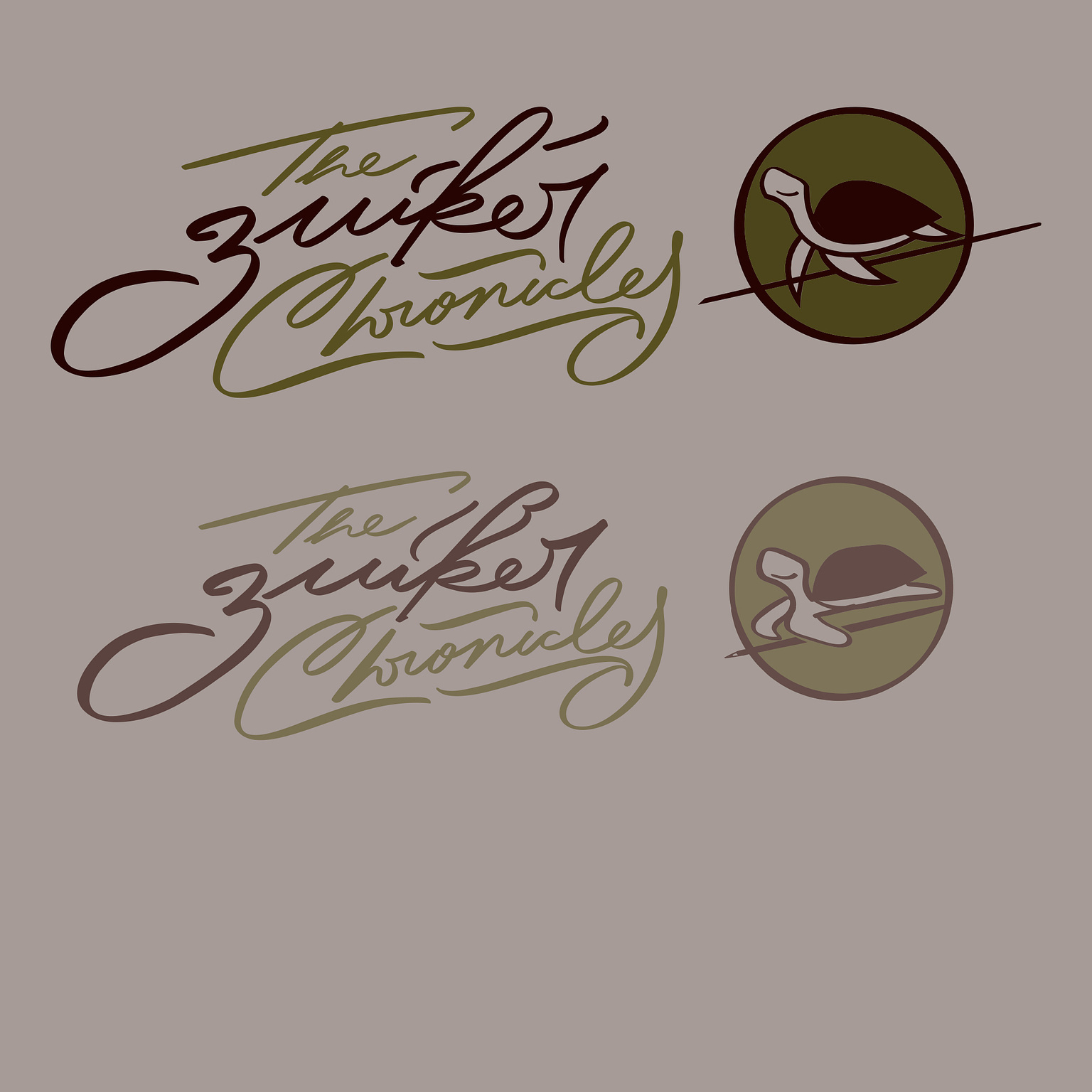
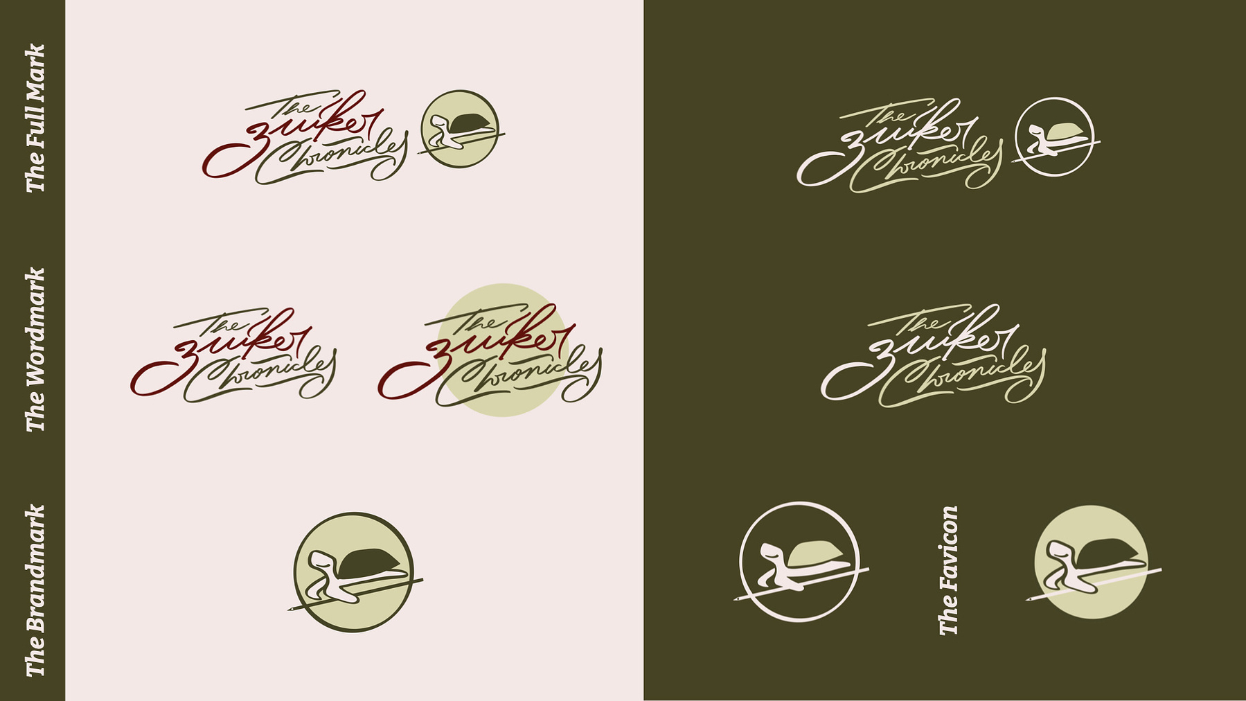
Final Designs
The final deliverable was a comprehensive brand package that included a website header, wordmark, logo, turtle icon, and usage guidelines for logos, colors, and typography.
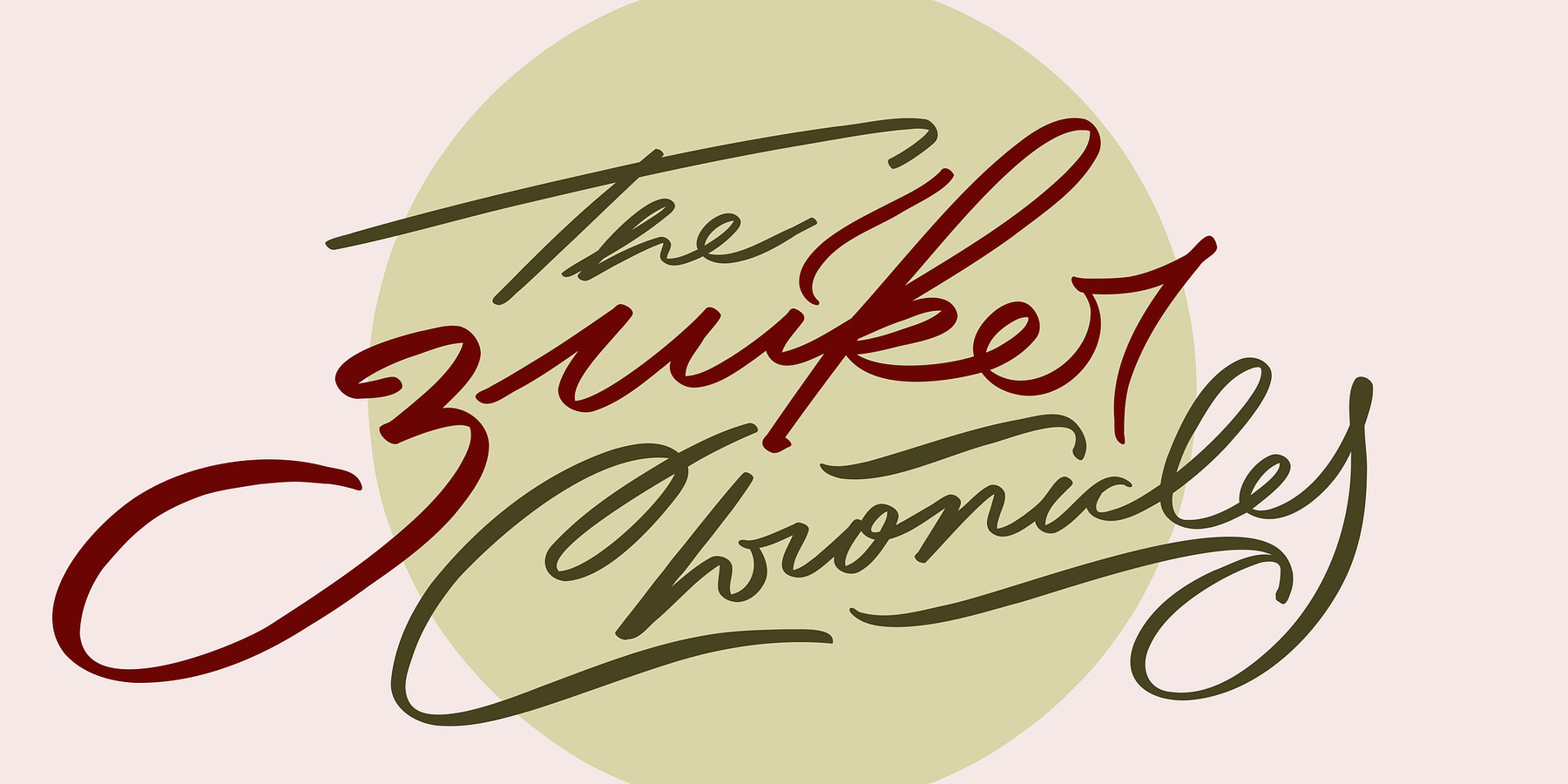
The whole variations of the Zuiker Chronicles logo
This project, my longest and most detailed to date, was incredibly fulfilling to see come together. I am proud of the work’s rhythmic elegance and visual imagery, which truly represent the brand identity.
The favicon version for The Zuiker Chronicles
The turtle adds a playful touch, evoking the sensation of walking in nature with your family. The circle around the turtle icon and the wordmark-only version evoke the imagery of the moon and the circle of life.
The wordmark for The Zuiker Chronicles
The handwritten logo has a nostalgic quality that captures the essence of legacy through its signature-like appearance, adapted from the authentic signature of the Zuiker family, honoring the tradition, with a more rhythmic flow and expressive style.
Together, the full mark deeply resonates with the brand identity by emphasizing nature’s wonder and family warmth.
The nature-inspired color palette blends refreshing bright backgrounds with warm red hues. Light green evokes natural landscapes, while dark green mirrors the turtle’s shell, and rich red-brown tones capture the essence of autumn. Together, they create a meaningful composition that narrates the story of "The Zuiker Chronicles" through color.
The whole brand identity now conveys friendliness while remaining true to nature, traditions, and history—a modern interpretation of Anton’s “The Zuiker Chronicles” legacy.
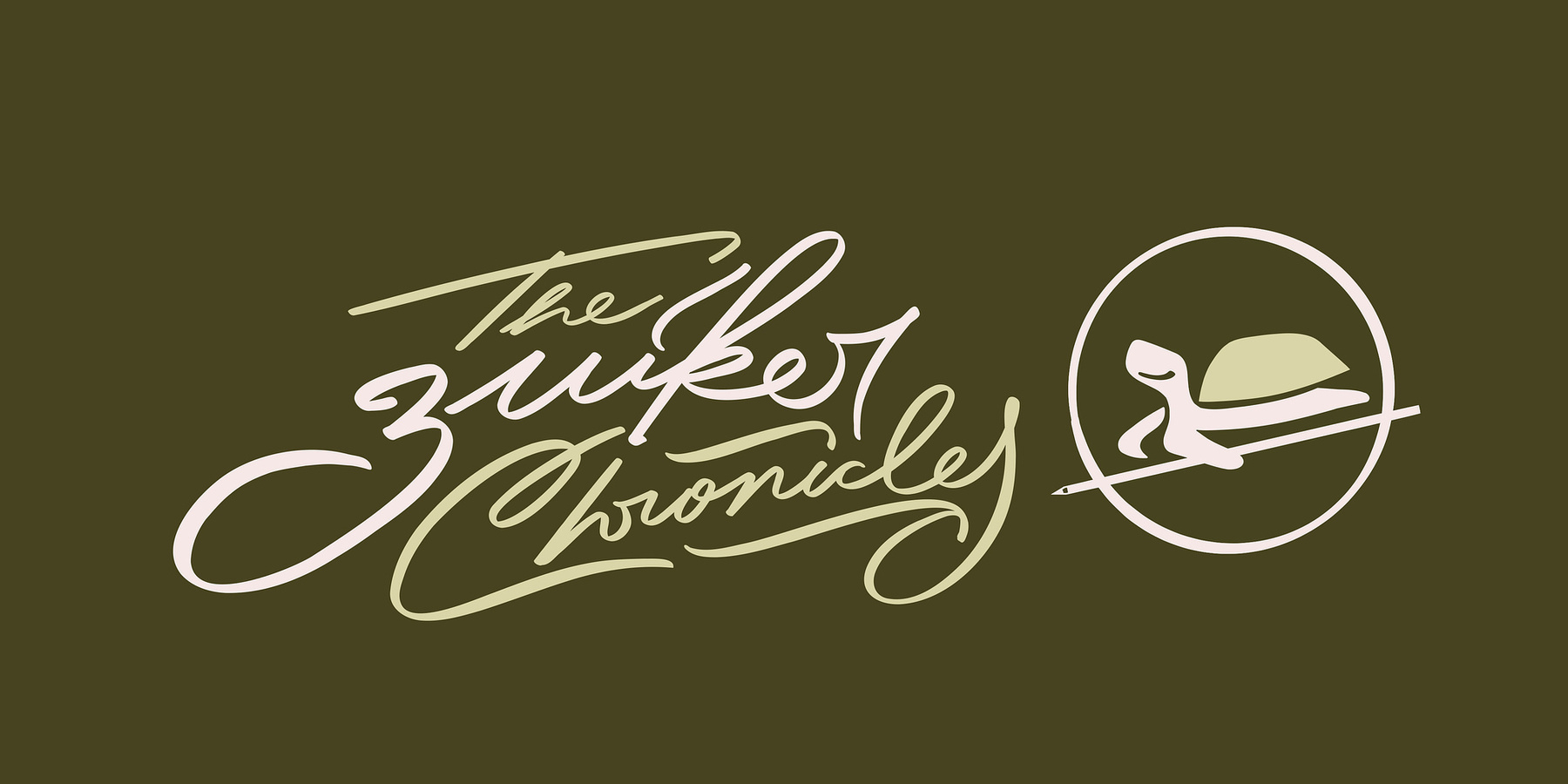
The dark background version of The Zuiker Chronicles