Pride Month Music 05-I’m Coming Out by Diana Ross
Happy Pride Month! 🌈🏳️🌈
As we approach the end of Pride Month, I’m creating lettering pieces
celebrating music related to LGBTQIA+ community. My goal is to expose
people to good music and artists while also help bringing the community
filled with diversity together, since music is like a universal language
that can touch anyone’s heart.
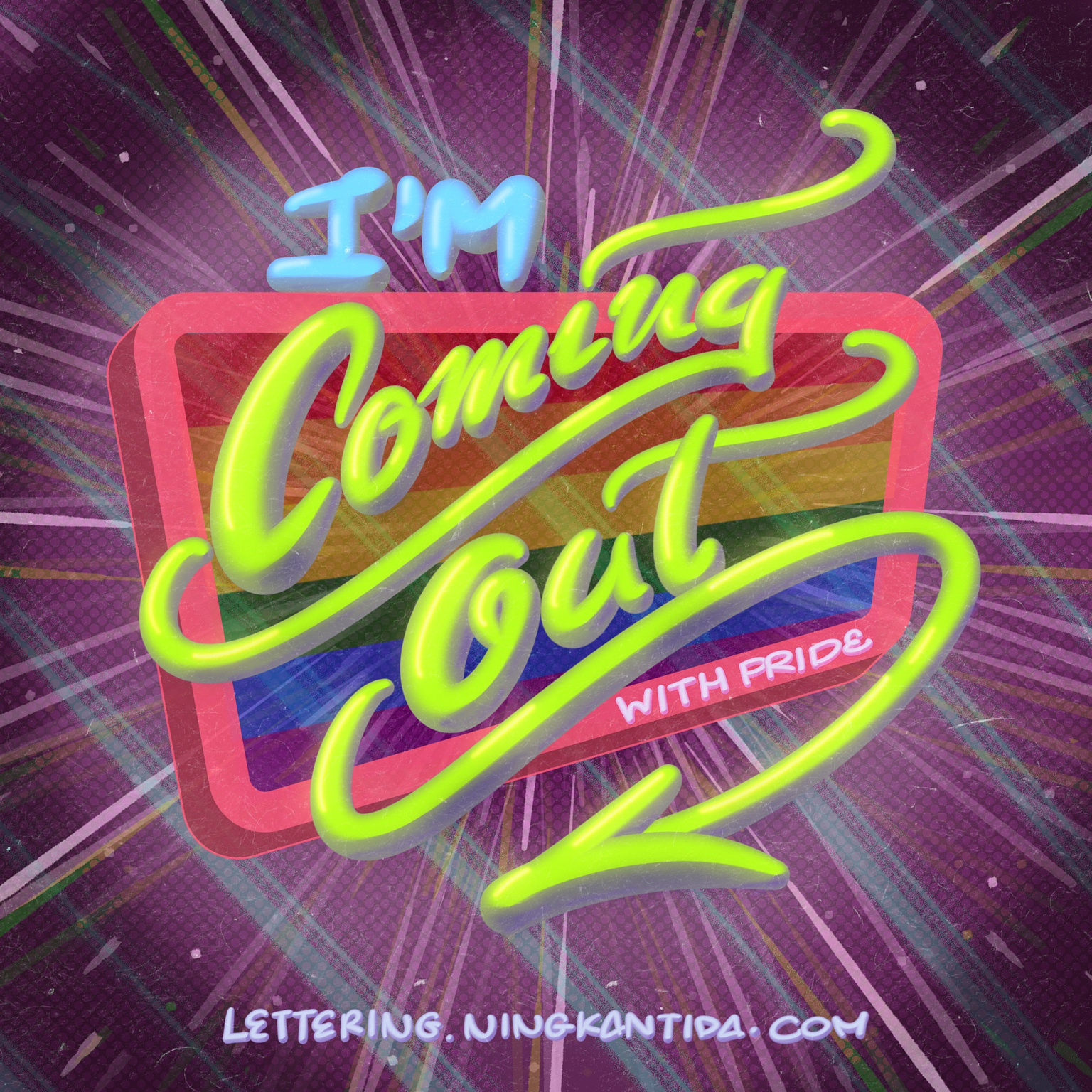
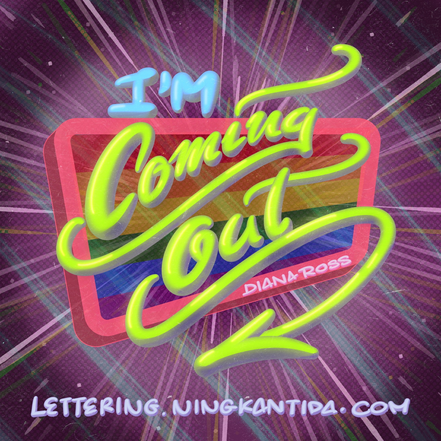
I wanted to create a lettering piece as a tribute to Diana Ross’s iconic song, “I’m Coming Out.” This song perfectly captures the spirit of liberation and the pride of expressing one’s true self. The phrase “come out of the closet” holds deep significance within the LGBTQIA+ community and resonates with many individuals. That’s why I believe this artwork will be meaningful and fitting for Pride Month.
Since there are a lot of details on this lettering piece that I'm proud of, I'd like to elaborate on my process for this one.
Process
Step 1: Ideation and Sketching
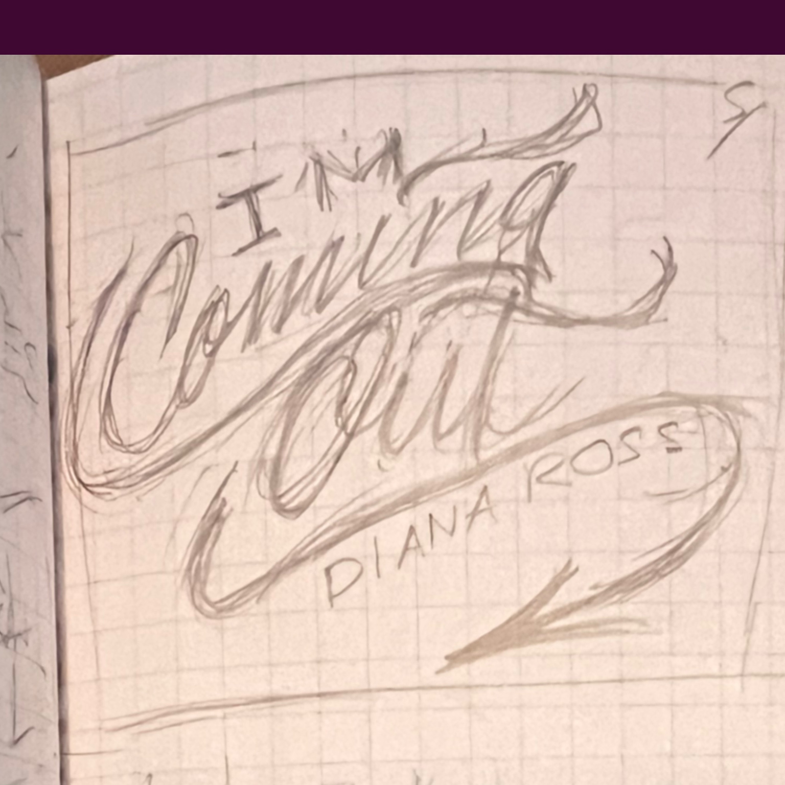
I aimed for the lettering to be stylish, playful, and not strictly adhering to guidelines to symbolize individuality and personal flair, and the free spirit of liberation that’s ready to show off one's identity without societal constraints.
I arranged the phrase in an upward alignment, with fluid and expressive hand-lettering with slightly tilt and curve letters and some bounce between letters and words, to symbolize rising and breaking free from the norms.
I wanted to ground the visual tone a bit by using a bold, uppercase for “I’m”, and for the artist’s name.
I, then, added swashes and decorative elements that posses a
free flow yet align harmoniously to create a visual rhythm,
similar to how everyone in the community has their own distinct
personality while flowing with their unique character.
Step 2 Digitize the First Draft
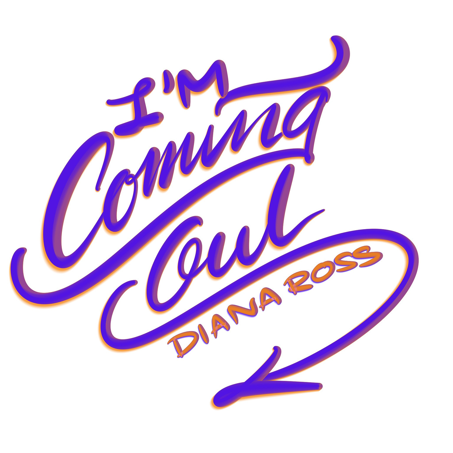
I digitized the sketch using the Procreate app and experimented with various lettering brushes from my catalog. My focus was on finding brushes that offered 3D depth and texture to visualize a deep understanding of one's unique identity. I wrote the phrases freely, using the sketch as a guideline underneath, to determine what fit best.
Step 3 Create a Visual Style

I decided to go for a retro disco/funk style since it seems to fit with the song and the theme of a vibrant life after deciding to flaunt off your unapologetic self.
Since my lettering alignment leans towards the upright, I added an opposite line pattern in the background to create subtle visual balance.
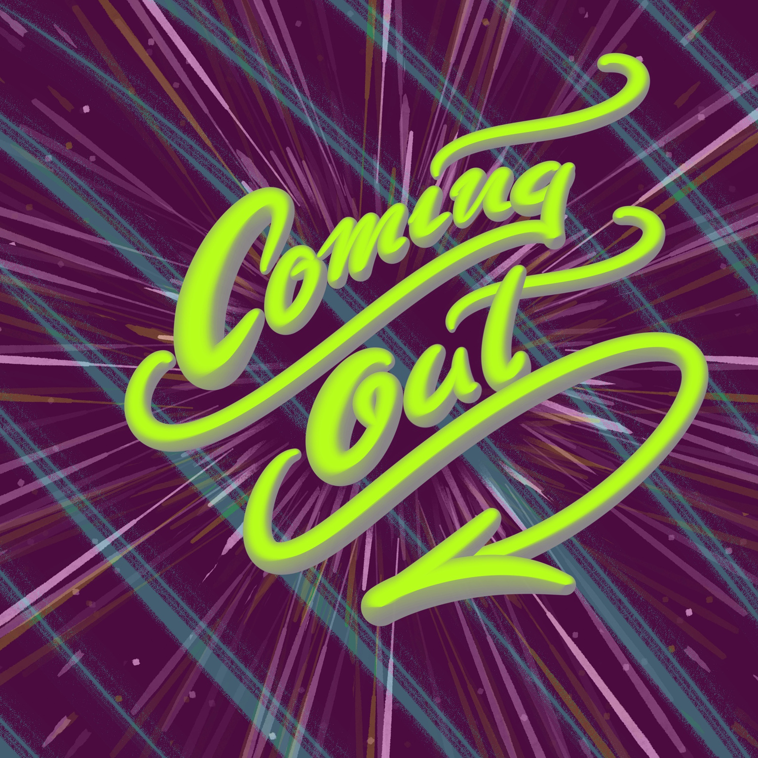
For the lettering, I chose a retro disco aesthetic with neon green and vibrant colors. This approach enhances the fun element and aligns with the tone of liberating one’s true self.
After experimenting with the brush for a while, I settled on the brush that has a metallic feeling to add depth and tactile energy.
I then added rays of light burst around the lettering to symbolize the feeling of emerging and coming out to the world, adding dimension and excitement from self-expression.
Step 4 Added a Retro Sign
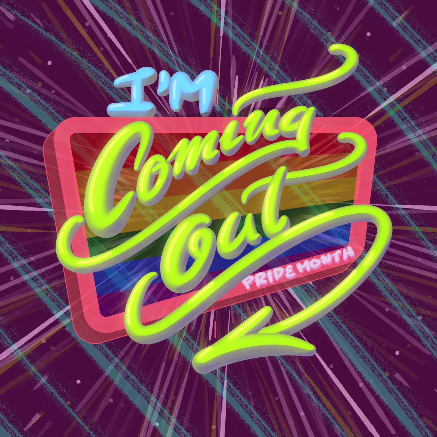
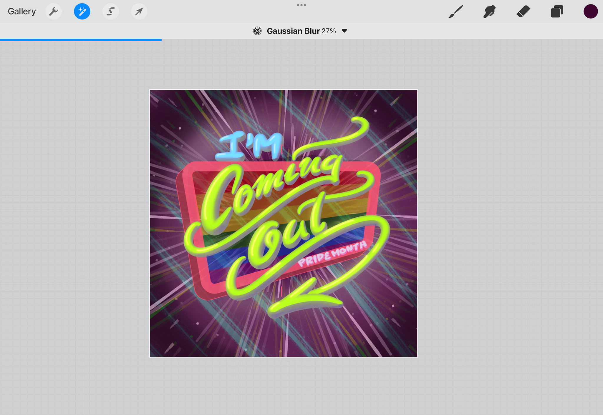
To enhance the retro vibe, I added a retro sign beneath the lettering, symbolizing breaking free from societal norms by making it look like the lettering are bursting out of a sign frame. This also helps drawing the viewer's eyes to the focal point. I included the pride flag inside the sign to represent visibility and inclusion of the LGBTQIA+ community, using a distortion tool in the app for a perfect fit with the retro sign.
Step 5 Add Light and Shadow
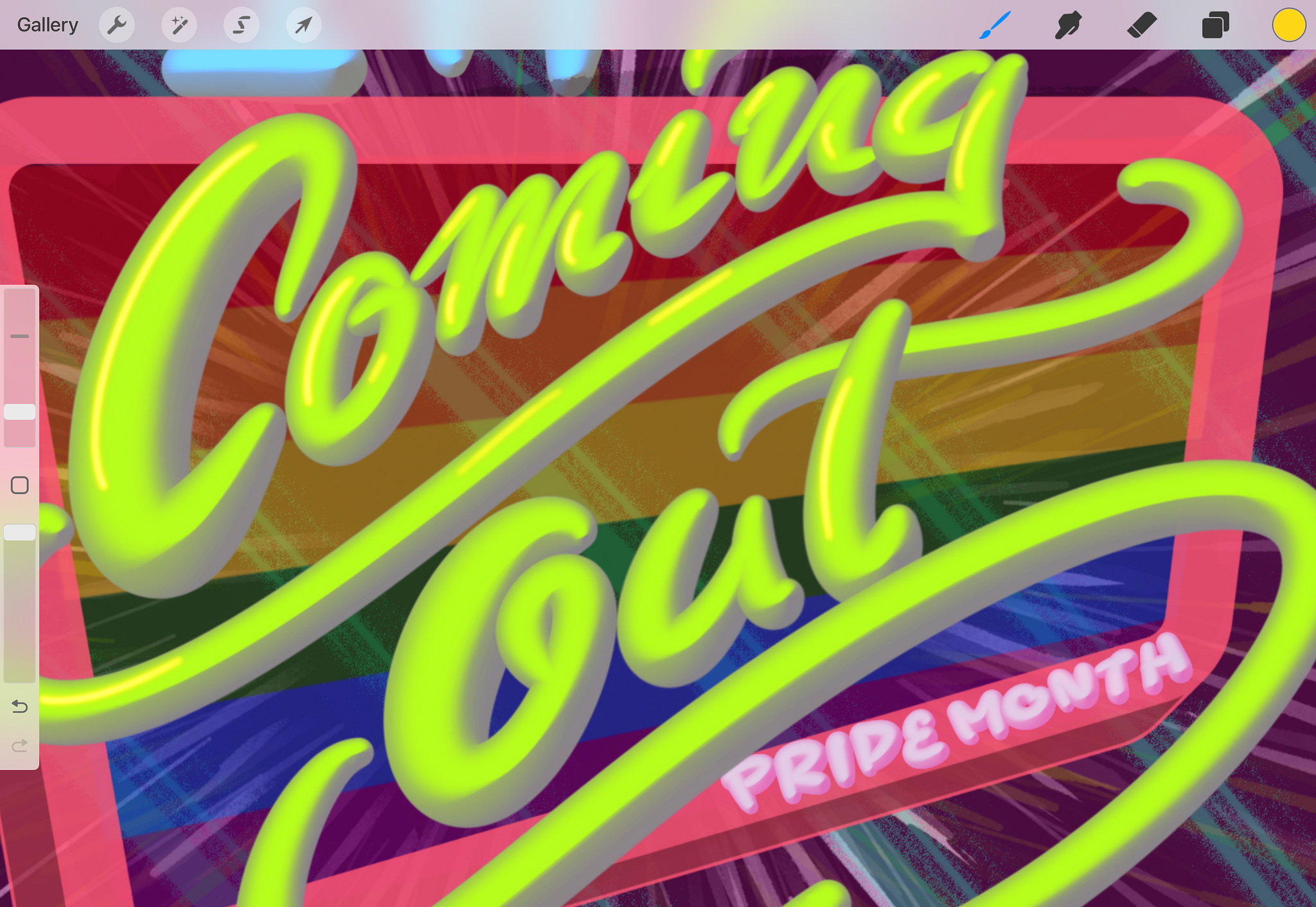
I added light and shadow to each letter, creating a
radiant effect like a neon sign, evoking a sense of shining brightly and
standing proud. I used a neon brush on the top left of each
letter, as the light originates from this direction, and blended it
with the lettering base using a Gaussian Blur. Shadows were
created similarly but on the opposite side on each letter.
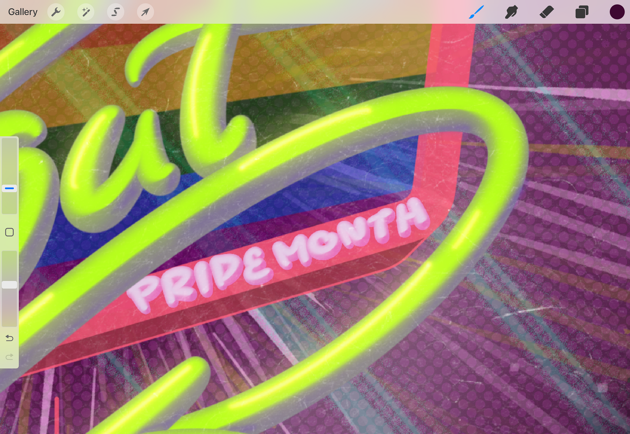
Step 6 Finish the Background Details
