I decided to expand my skills in icon mark and typography to broaden my
design range, especially for logo design. While exploring this journey,
I came across a daily logo challenge from Logo
Core and decided to take it on. So, I will showcase the results of
my logo practice based on the provided briefs.
Think of this post as a presentation of the initial concept to an imaginary client. It's my way of discussing my thought process and my design choices before exchanging feedback and revisions.
Please keep in mind that creating a polished logo design typically
requires more than just a few days. Therefore, consider everything from
this challenge as a rough draft that will need further feedback from
clients for refinement to truly shine.
While these designs may not be fully refined, I believe they will offer
us a general idea of the concept.
That being said, let's kick things off with the brief from the
challenge:
The Brief from LogoCore
Hey, team!
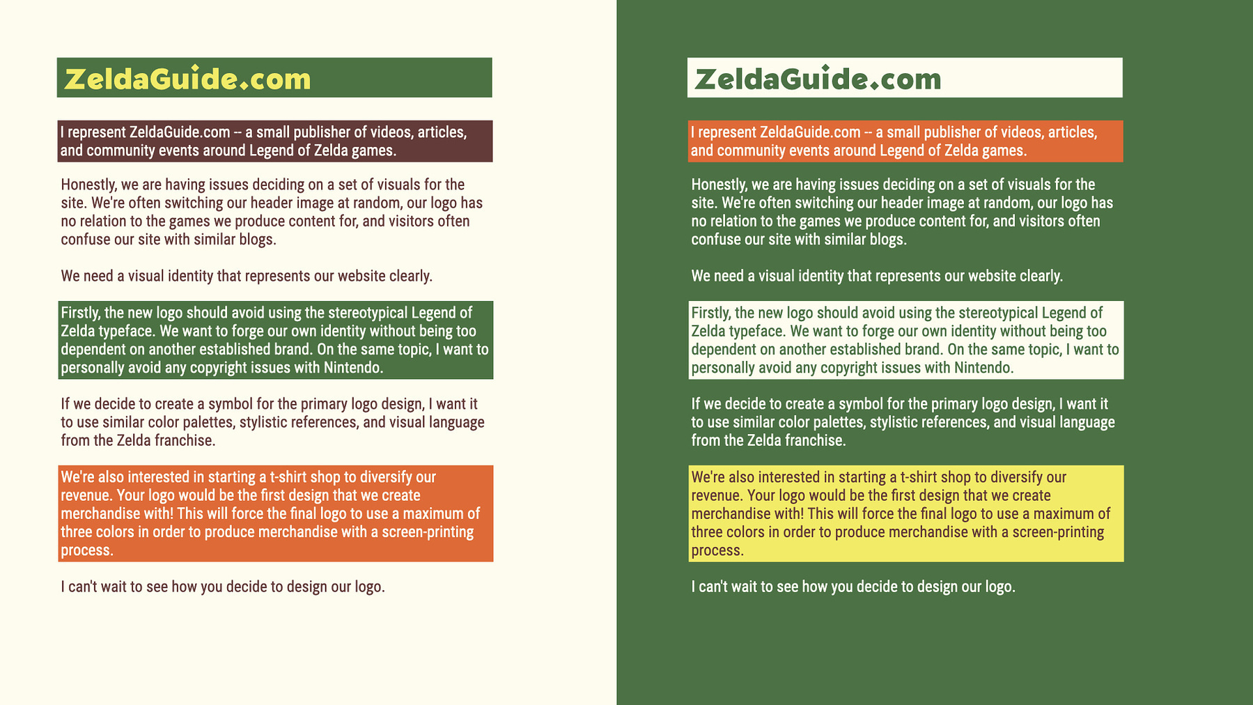
I represent ZeldaGuide.com--a small publisher of videos, articles, and
community events around Legend of Zelda games.
Honestly, we are having issues deciding on a set of visuals for the
site. We're often switching our header image at random, our logo has no
relation to the games we produce content for, and visitors often confuse
our site with similar blogs.
We need a visual identity that represents our website clearly.
Firstly, the new logo should avoid using the stereotypical Legend of
Zelda typeface. We want to forge our own identity without being too
dependent on another established brand. On the same topic, I want to
personally avoid any copyright issues with Nintendo.
If we decide to create a symbol for the primary logo design, I want it
to use similar color palettes, stylistic references, and visual language
from the Zelda franchise.
We're also interested in starting a t-shirt shop to diversify our
revenue. Your logo would be the first design that we create merchandise
with! This will force the final logo to use a maximum of three colors in
order to produce merchandise with a screen-printing process.
I can't wait to see how you decide to design our logo.
Best, Masha Kait
Brief Interpretation
The brief is somewhat challenging due to specific expectations for the
visual identity stemming from a website dedicated to a well-established
game franchise. At the same time, diverge from these expectations enough
to forge a distinct path and establish a new visual identity.
Additionally, this new logo and visual identity must be striking enough
for merchandise while also being accessible and scalability for website
usage.
The best approach I could think of is to adopt a distinctly
different personality for the wordmark, aiming to evoke a sense of fun
and exploration. Then, by incorporating visual elements
and symbolism from the franchise, we can ensure that people
recognize the association with Zelda without any copyright issues.
I first need to familiarize myself with Zelda’s visual
language before moving forward with the project.
Researching
The Original Zelda logos
I began researching to grasp the visual identity of the Zelda world. As
I only ever played Zelda: Breath of the Wild for about 30 minutes before
giving up, LOL!
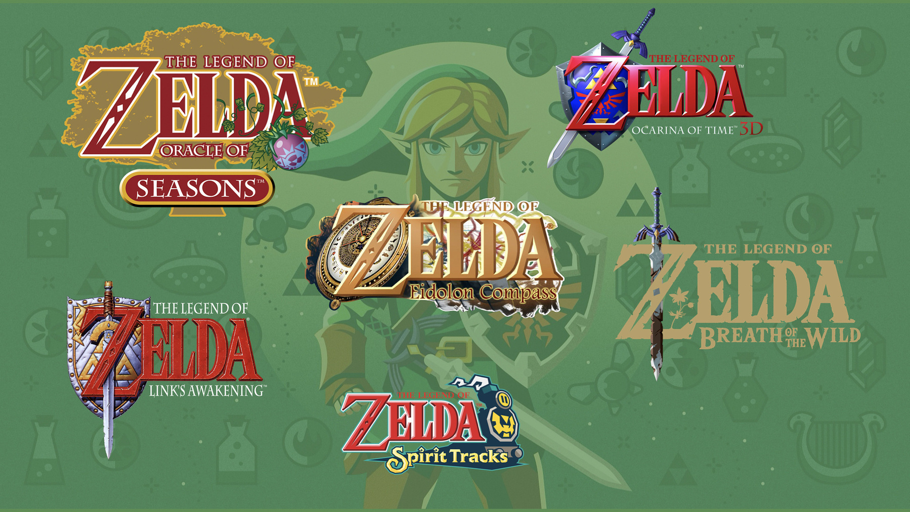
I started with the Zelda logos. The wordmark has been
consistently used throughout the franchise. Since the client
specifically requested not to use a similar style, I was thinking of
going in a totally different direction, aiming for fun instead of the
historical style like the original version. The only element I’d borrow
would be the embellishment inside the “Z,” which feels perfect
to use as a compass needle. There was one logo version with the
compass, so I thought aligning both of them together might be worth
exploring.
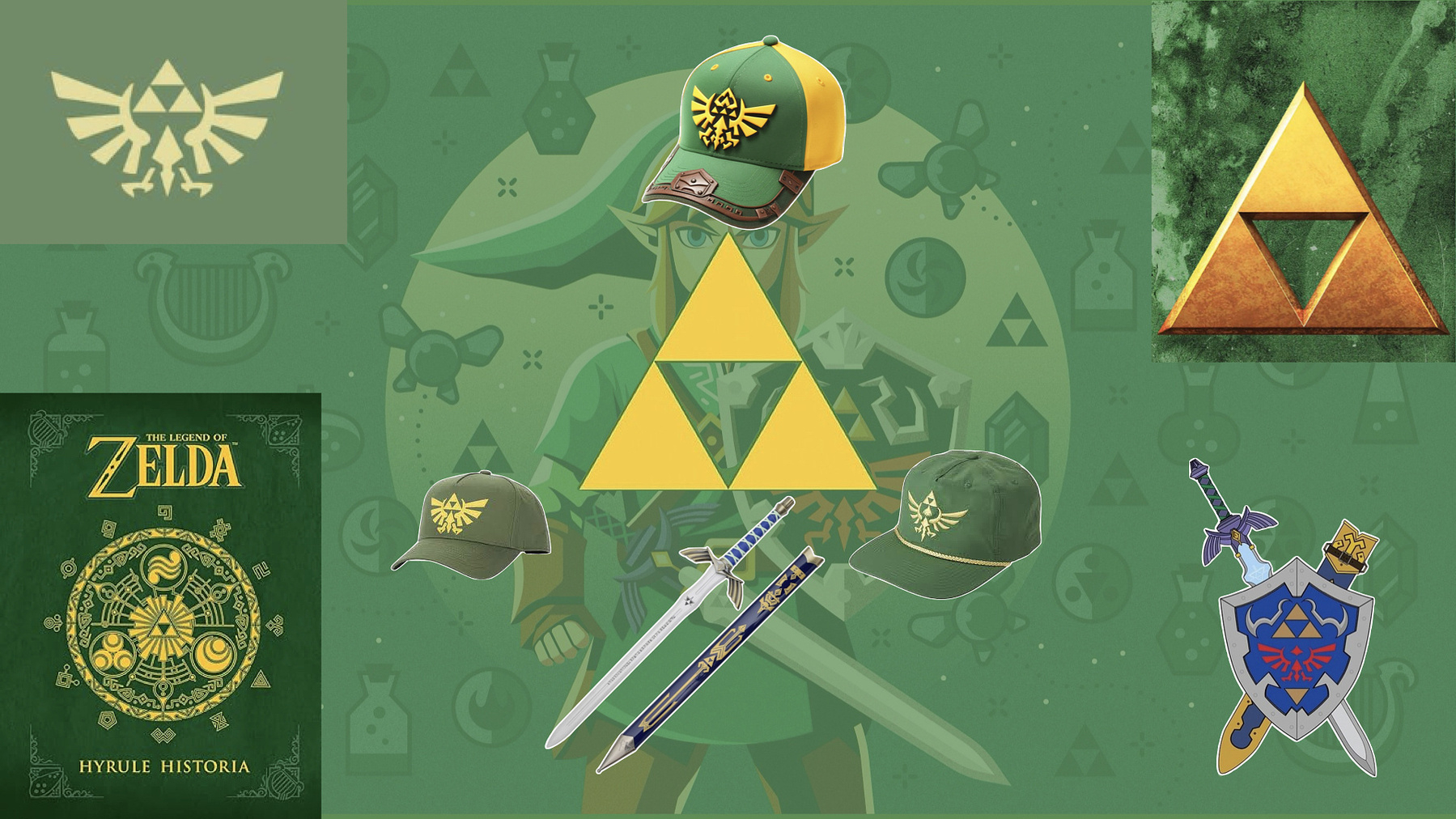
Merchandise with Zelda's symbols and visual elements
Next, I examine the symbols commonly used in the games to better
understand Zelda’s visual style. Many geometric shapes, wings,
and swords are present. Therefore, we should aim to emulate
these themes in this logo concept.
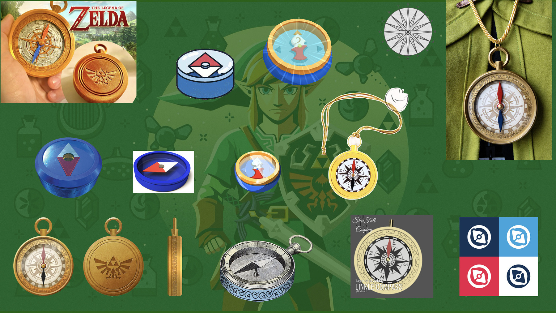
Compass designs used in Zelda's games
Lastly, I specifically searched for a compass designed for the games
because I wanted to use it as a symbol to guide users through tips and
tricks on the "Zelda Guide" website. A pocket compass design certainly
felt promising.
Keeping all these images, colors, and styles in mind, I began
conceptualizing.
Conceptualizing
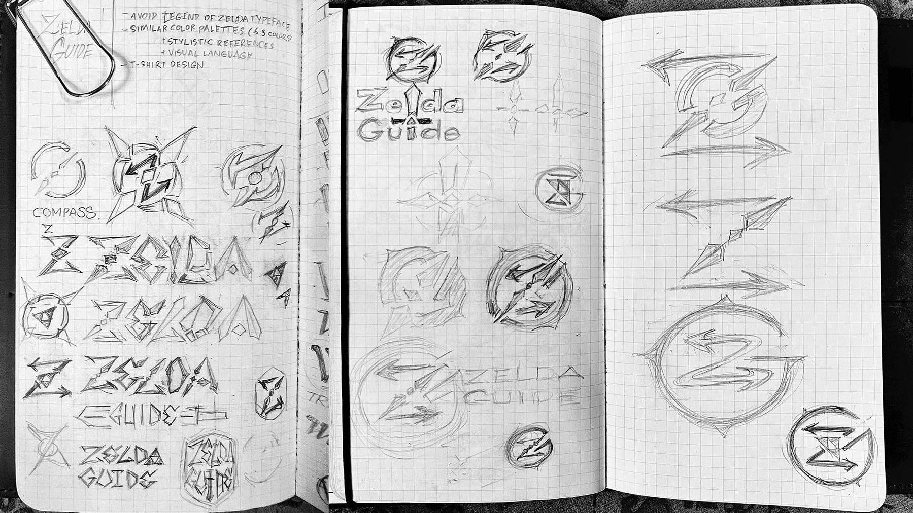
My Sketches for Zelda Guide Logo Concepts
During the conceptualization phase, I began shaping and exploring
various concepts based on my research to identify unique characteristics
that could be integrated into the Zelda Guide logo.
One promising idea emerged during the research process: using a compass
for the logo mark. Given the name 'Zelda Guide,' a compass perfectly
symbolizes 'guidance.' Initially, I considered shaping the pocket
compass into a "G"—the initial for "Guide" in Zelda Guide— and having a
“Z” as a part of compass needle but it disrupted the symmetry, so I
decided against it.
While analyzing various Zelda wordmarks, I realized that the
embellishment in the 'Z' could be transformed into a compass icon. With
enough creativity, it could represent both a compass and the
letter "Z" for Zelda. I then experimented with various ways to
incorporate all my ideas while steering clear of the original wordmark
during my brainstorming session.
Developing the wordmark involved a trial-and-error approach to balance
aesthetics and functionality. I debated whether to use all caps or title
case for "Zelda Guide." Eventually, I conceived the idea of
transforming the "L" in Zelda and the "I" in Guide into a
sword—a common symbol in Zelda logos—making it the focal point of the
wordmark.
Ultimately, however, the compass was chosen as the central
element to better represent the theme of a guidance website.
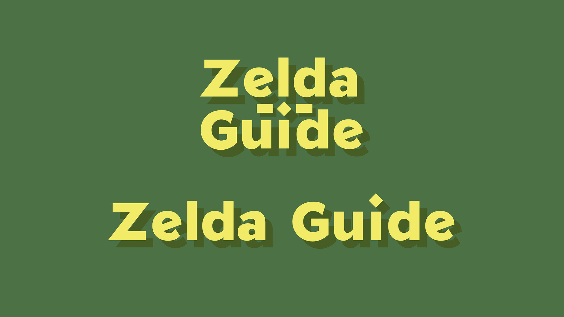
Typography
Zelda Guide with Gnomon* font
The next step was to digitize the concept, starting with the typeface. I
aimed for a slightly wider style to keep the words "Zelda" and
"Guide" proportionate so I could incorporate my compass/sword idea into
the wordmark.
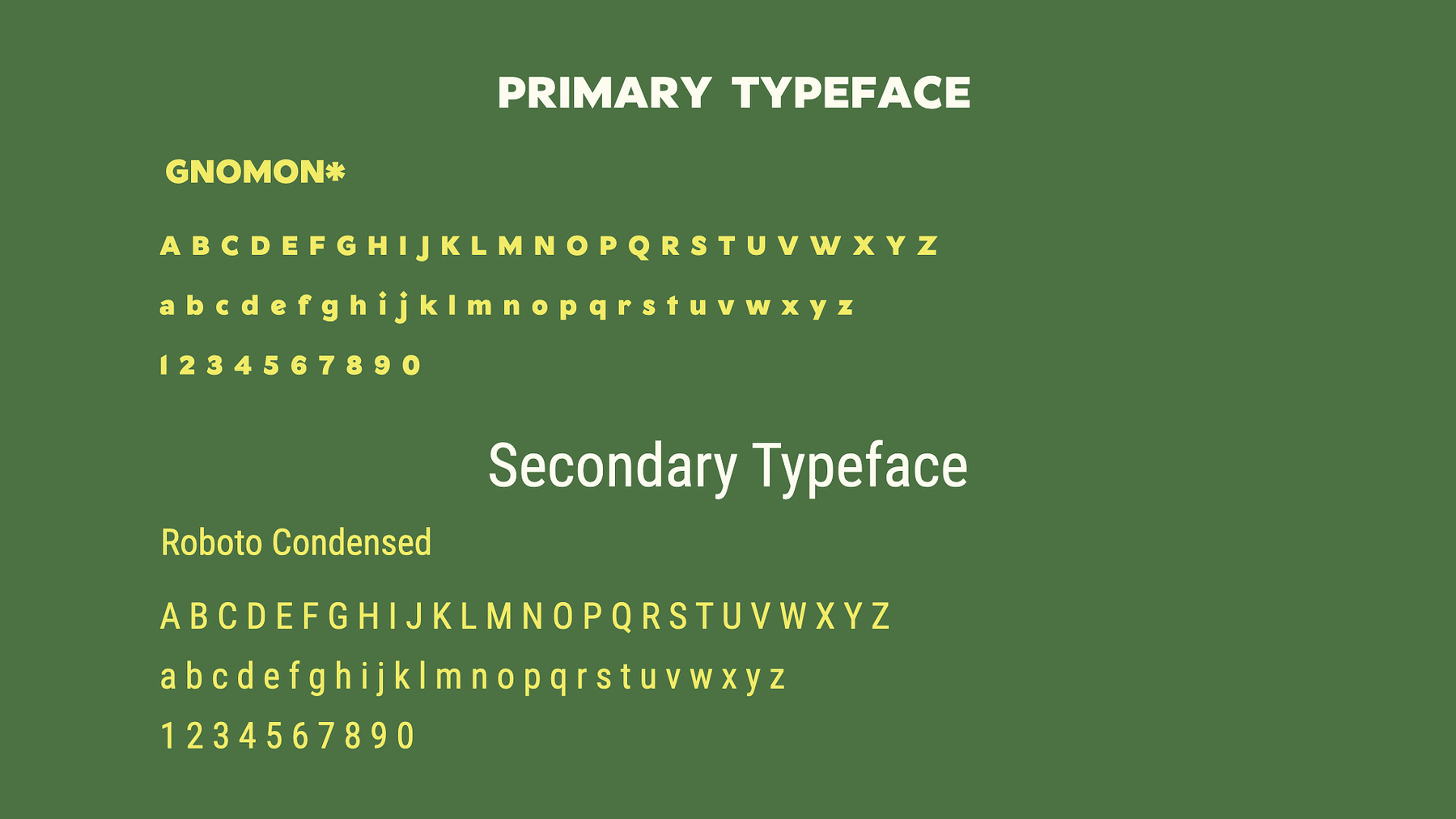
My Typography Choice, Gnomon* and Roboto Condensed
The GNOMON* font emerged as an ideal choice—fun and
friendly, and distinct from the original Zelda typeface. Uniquely, it
includes a foreground font that allows you to create a drop
shadow effect with ease. I found this feature perfect for
creating assets for a gaming website like this.
The secondary typeface is Roboto Condensed, as I
envisioned the Zelda Guide to be an information-dense website.A reliable, highly readable, and compact font style would
help readers access the information they seek more
efficiently.
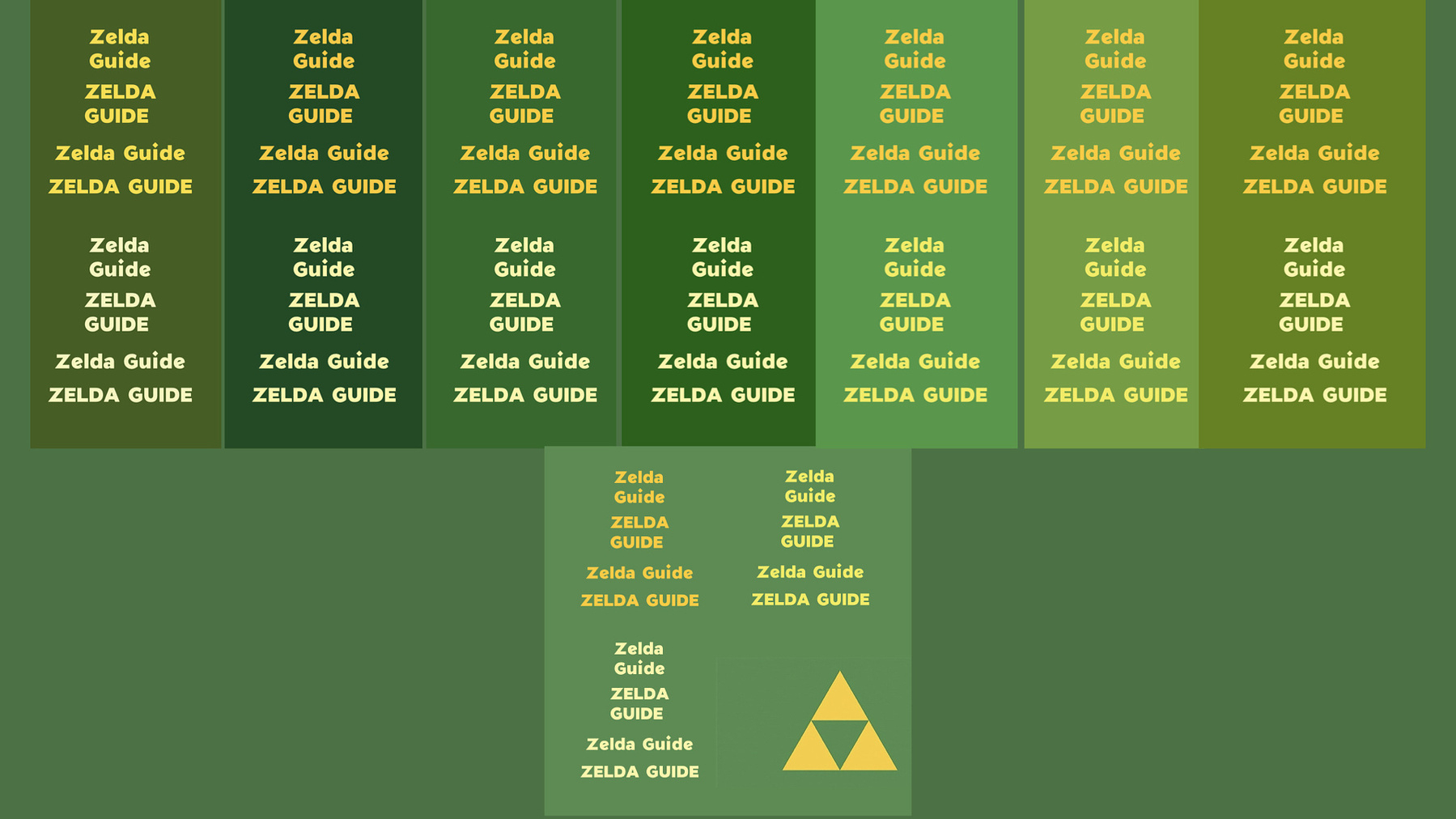
Color Palette
Color Experimentation Process
Now, onto the color experimentation. Numerous shades of green and
yellow—the most distinct combination for Zelda—were tested, balancing
between dark and bright tones to ensure good color accessibility and
visual contrast on the website. After several attempts, I settled on a
complementary combination.
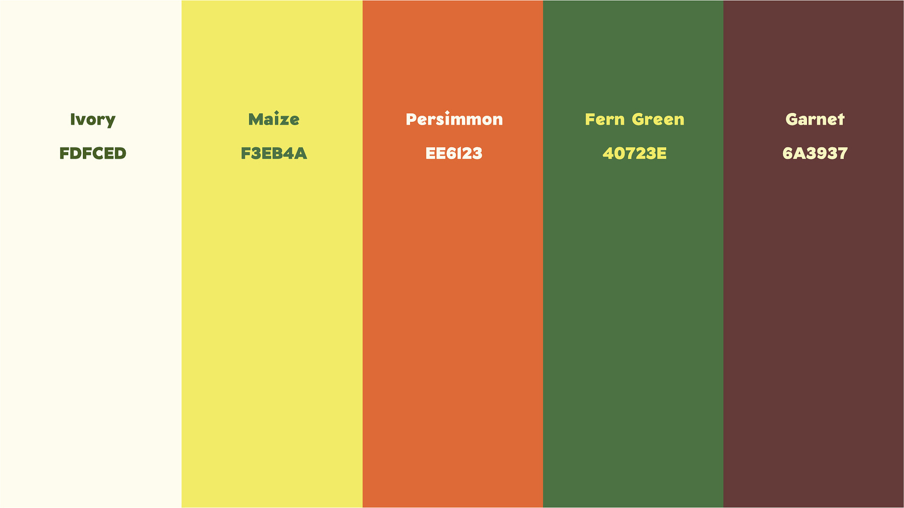
My proposed color palette: using Fern Green and Maize colors as primary colors, and Ivory, Persimmon, and Garnet for complementary colors
After settling on the primary colors, I explored the color scheme that
could be used for the entire website. My proposed color palette: using
Fern Green and Maize colors as primary colors, and Ivory,
Persimmon, and Garnet for complementary colors
Typography and Color Mockup
I also created a simple mockup demonstrating how to implement the color
scheme.
Logo Mark
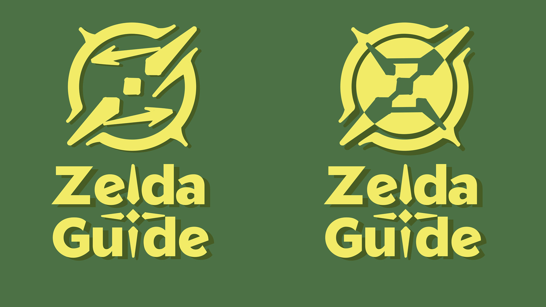
My first and a bit improved icon mark
My initial decision was to prioritize combining a compass and the letter
Z to emphasize the guiding nature of the website. However, crafting the
logo mark that effectively represented both elements presented its own
set of challenges.
I struggled to make it resemble both a compass and the letter Z
simultaneously, causing both messages to become lost in
translation. The concept of a Z-shaped and compass was not
immediately clear and lacked a defined hierarchy.
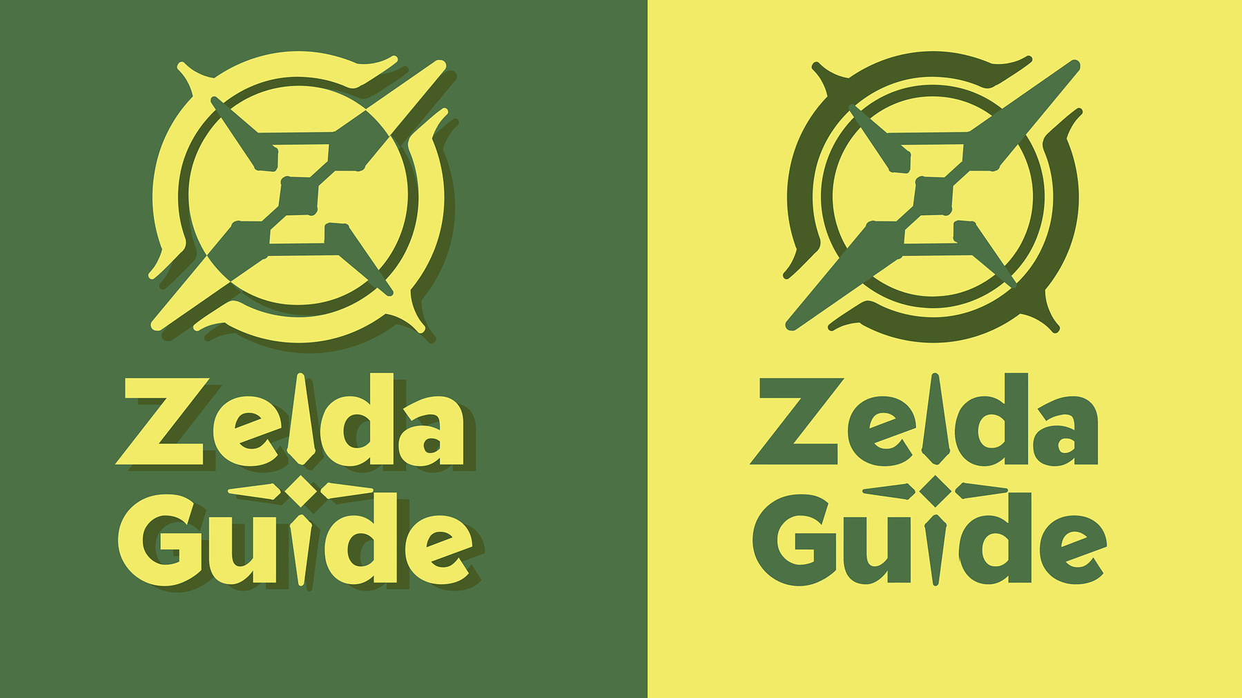
The color treatment for my dropped icon mark
I decided to alter my approach, creating Z in a negative space to
establish a visual hierarchy centered around Z as a focal point.
Unfortunately, it no longer resembled Zelda's visual
aesthetic. I still wasn’t satisfied with this concept and would
like to explore another direction.
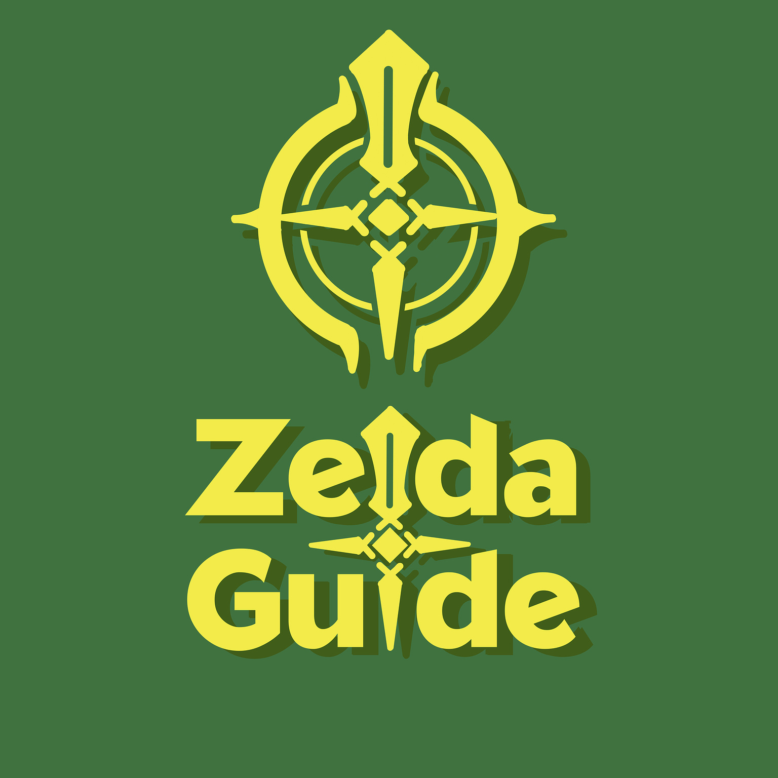
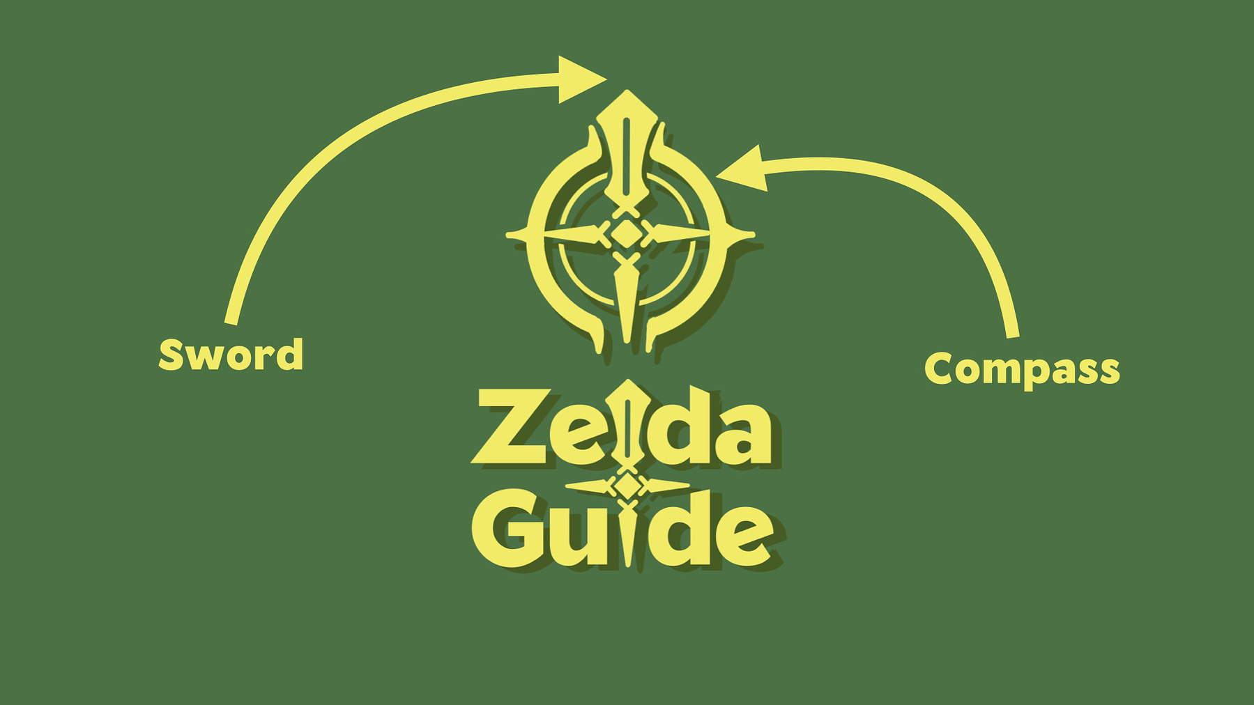
The final concept for Zelda Guide's icon
I decided to remove the "Z" from the icon and focus on the sword
symbol, revisiting my original idea. I incorporated the sword into the
wordmark. For the icon, I placed a pocket compass around the sword,
positioning the sword as the compass needle pointing north. This design
better connects Zelda Guide with the Zelda community by borrowing visual
language from the official logo.
Final Words
Zelda Guide Final Concept
Although the current design is still a work in progress, it showcases a
strong concept with the potential to evolve into a memorable brand
identity. It deviates from Zelda’s typeface while incorporating familiar
Zelda elements, allowing people to easily identify and associate
ZeldaGuide.com with Zelda.
Both the wordmark and the logomark possess visually appealing
and memorable qualities, transforming them into marketable merchandise
that fans would be proud to wear. I believe this logo concept lays a
solid foundation, ready for refinement and future development.