I decided to expand my skills in icon mark and typography to broaden my
design range, especially for logo design. While exploring this journey,
I came across a daily logo challenge from Logo Core and
decided to take it on. So, I will showcase the results of my logo
practice based on the provided briefs.
Think of this post as a presentation of the initial concept to an imaginary client. It's my way of discussing my thought process and my design choices before exchanging feedback and revisions.
Please keep in mind that creating a polished logo design typically
requires more than just a few days. Therefore, consider everything from
this challenge as a rough draft that will need further feedback from
clients for refinement to truly shine.
While these designs may not be fully refined, I believe they will offer
us a general idea of the concept.
That being said, let's kick things off with the brief from the
challenge:
The Brief from LogoCore
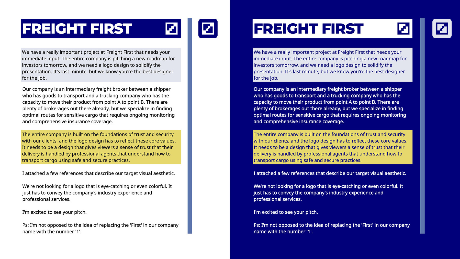
Hiya, Bill!
We have a really important project at Freight First that needs your
immediate input. The entire company is pitching a new roadmap for
investors tomorrow, and we need a logo design to solidify the
presentation. It's last minute, but we know you're the best designer for
the job.
Our company is an intermediary freight broker between a shipper who has
goods to transport and a trucking company who has the capacity to move
their product from point A to point B. There are plenty of brokerages
out there already, but we specialize in finding optimal routes for
sensitive cargo that requires ongoing monitoring and comprehensive
insurance coverage.
The entire company is built on the foundations of trust and security
with our clients, and the logo design has to reflect these core values.
It needs to be a design that gives viewers a sense of trust that their
delivery is handled by professional agents that understand how to
transport cargo using safe and secure practices.
I attached a few references that describe our target visual aesthetic.
We're not looking for a logo that is eye-catching or even colorful. It
just has to convey the company's industry experience and professional
services.
I'm excited to see your pitch.
Ps: I'm not opposed to the idea of replacing the 'First' in our company
name with the number '1'.
Paul Atreides Fright First
Brief Interpretation
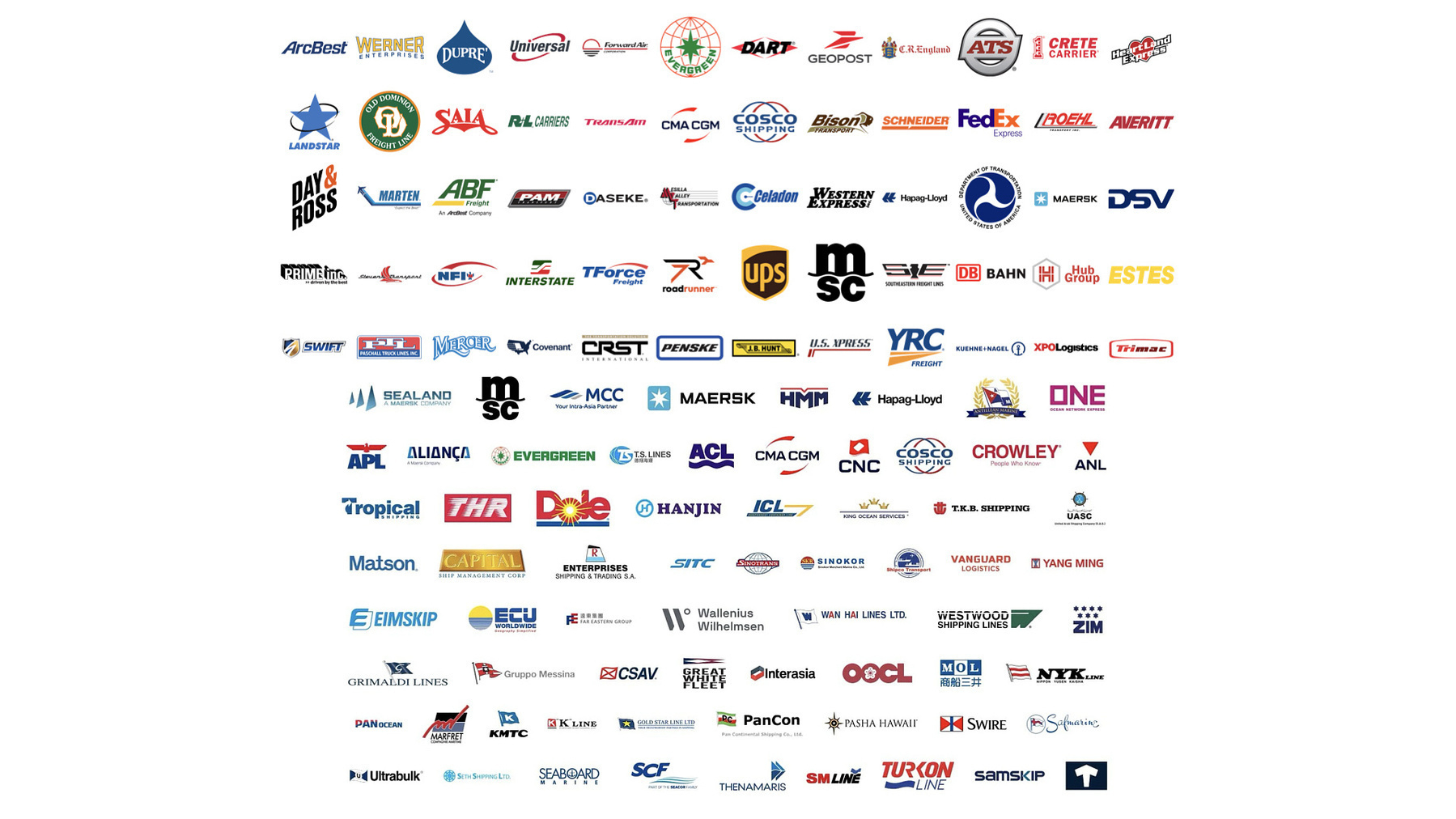
Popular Transportation and Logistics Brands
According to the brief, the company specializes in identifying optimal
routes. Therefore, we need to visually represent the brand's core
values, not literally but through thoughtful design elements. The brief
also highlights trust and security as key priorities. Consequently, we
require a design that conveys strength and reliability—nothing overly
clever, just something that feels strong, solid and dependable.
I conducted some research on popular transportation brands to identify
logo trends. Logos designed for transportation and logistics mostly use
blue, as it represents trust, so I believe we should also adopt blue for
this logo concept. Another common color is red, symbolizing energy and
speed; however, since Freight First's core values prioritize trust, blue
is the more suitable choice.
Another trend is the use of bold typefaces, which we should consider as
well. Most brands employ either a wordmark or a combination mark, with
the wordmark typically serving as the focal point.
Therefore, for this brand logo concept, we need it to be strong, bold,
and blue.
Conceptualizing
My plan is to create a logotype that appears strong and conveys meaning
of reliability. I believe a rectangular or square shape would be ideal,
as it implies cargo and shipping. I jumped straight into creating an
icon to convey meaning. I experimented with a monogram, aligning the
initials "FF" from Freight First into a visually appealing design.
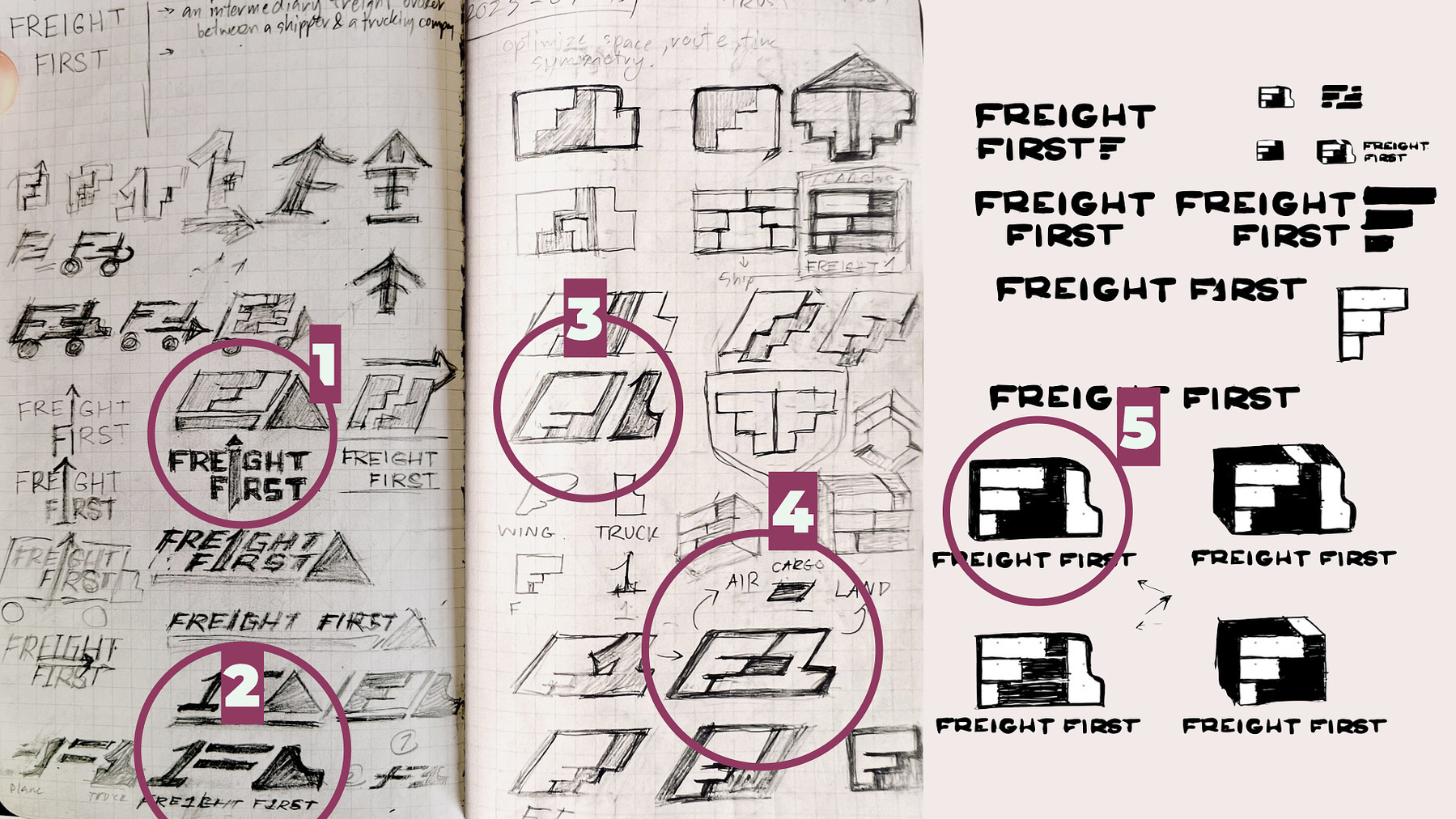
Initial Concepts for Freight First
I have five concepts to explore, each worthy of consideration in its own
way.
The first concept appears strong without being overly playful. In this design, I incorporated the initials “FF” into the shape of a truck, creating an attractive and appealing visual.
The second concept combines the number one and the letter F to form a compelling visual. I considered shaping the number one into an airplane, but ultimately decided against it due to its playfulness against the brand core values.
In the third concept, I transformed the letter F into a wing. While it looked great, it felt inappropriate since we focus on brokerage rather than air transport. Although I still appreciate the idea, it doesn’t align with the brand's purpose.
The fourth concept is one I absolutely love. It features an F shaped like a wing and the number one resembling a truck with cargo inside. However, it emphasizes speed over trustworthiness and reliability, failing to convey the brand's core values. If the brand focused on fast delivery, this could be a strong mark. Additionally, it reads as "F1," commonly associated with car racing, which might be unsuitable for a brand that prioritizes reliability and trust. As much as I love this concept, I need to drop it.
In the fifth and final concept, I simplified the "FF" even more than in the first design. While it looks great, something still feels off, and not that appropriate to the brand identity.
Wordmark
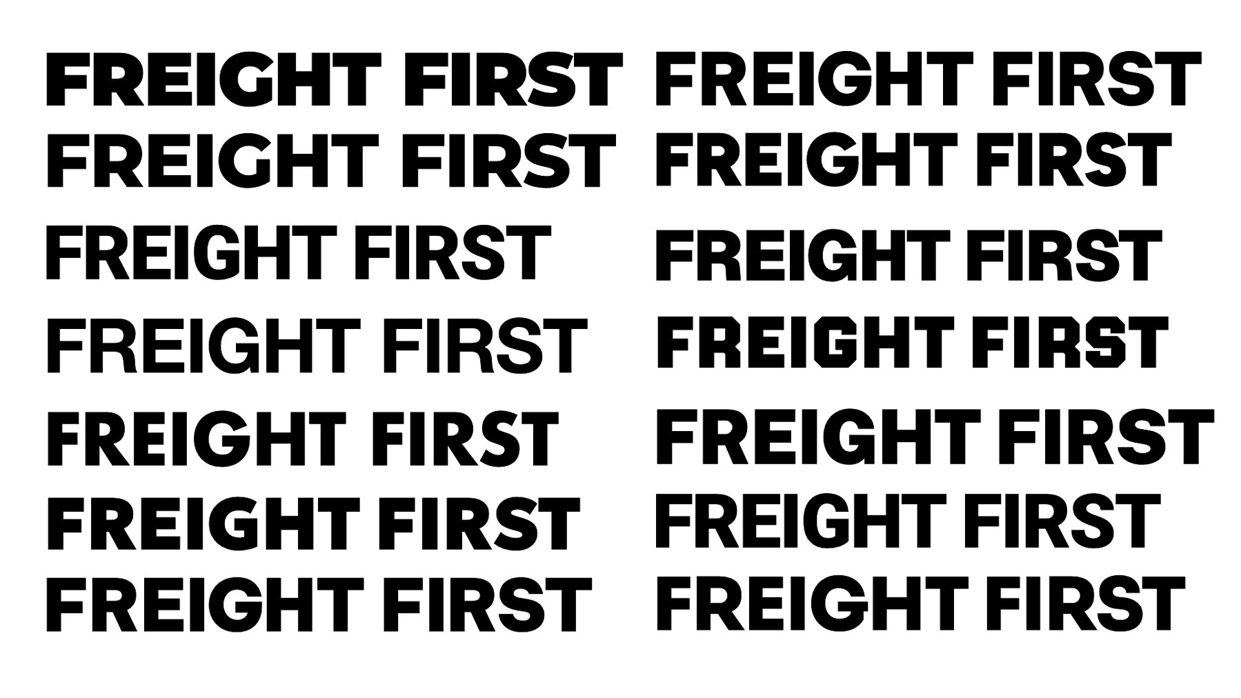
Font Shortlist for Freight First
I decided to start with a wordmark to evaluate how these concepts would
integrate with it. I experimented with various bold fonts to find one
that appeared strong, bold, and trustworthy. Aiming to avoid a plain
look and distinguish it from other brands, I explored geometric typeface
styles, believing they would convey strength and reliability.
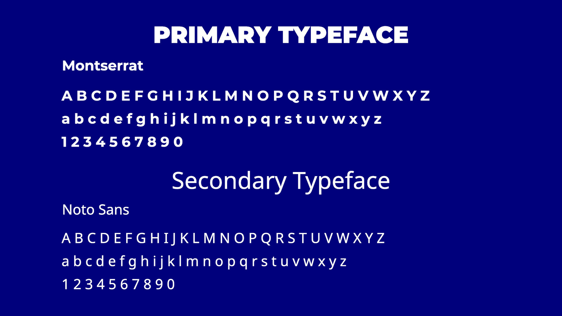
The typography choice for Freight First
From the shortlisted fonts, I selected Montserrat because, in black or
extra bold, it conveys strength and reliability feeling while remaining
approachable.
Montserrat became one of the most popular fonts that people entrust for
this last few years, so I think it’s suitable for Freight First, a
company that will gain popularity and trustworthy within short period of
time.
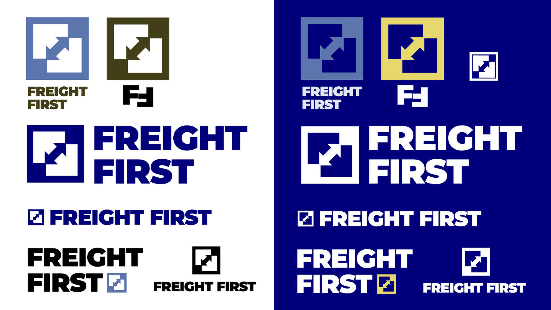
Final Concept
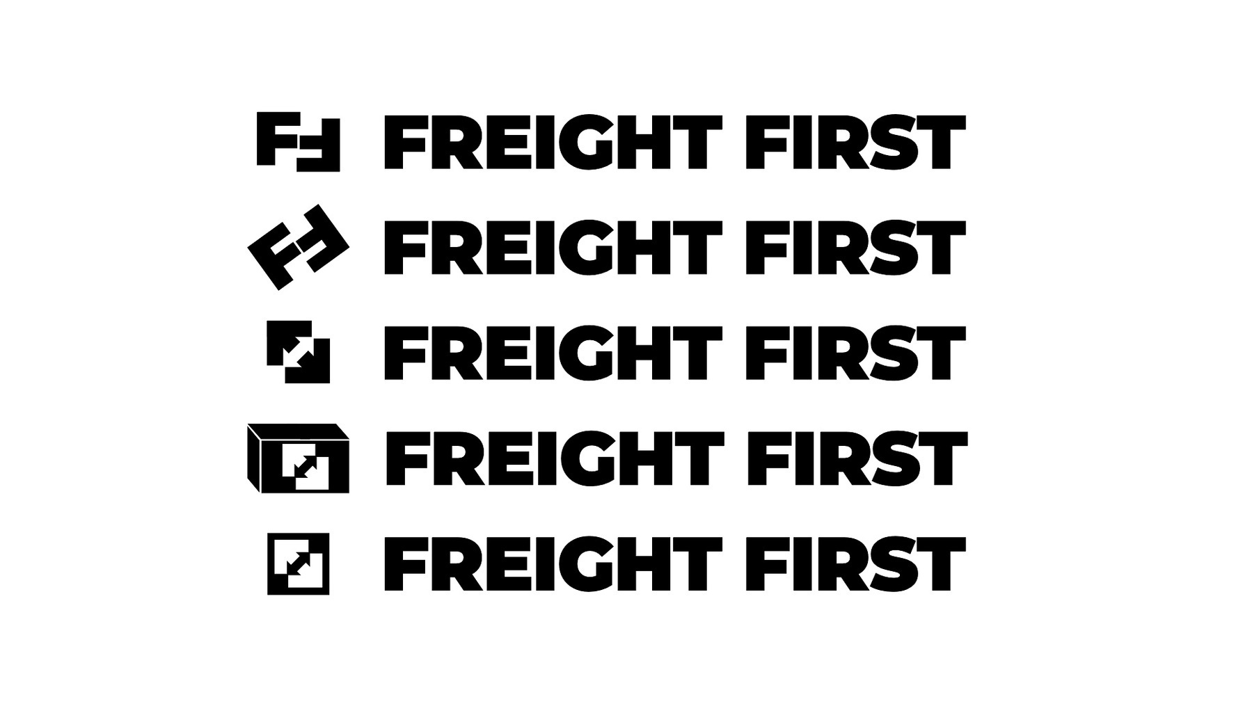
The Development Process of Freight First Final Concept
After settling on the wordmark, I tried to shape the F from the font
into an icon.
I first tried aligning the FF initials into arrows and considered
tilting them for added visual interest. Then, I realized I should flip
the mindset, and aimed to create an arrow that also resembled the letter
F, rather than just using the letter itself. When I positioned
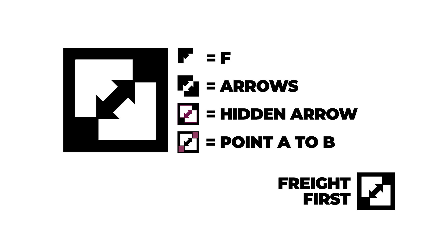
two F-shaped arrows together, they formed a hidden arrow in the center,
which I felt made for a strong, impactful mark. The cherry on top was
realizing that the endpoints of this hidden arrow could flawlessly
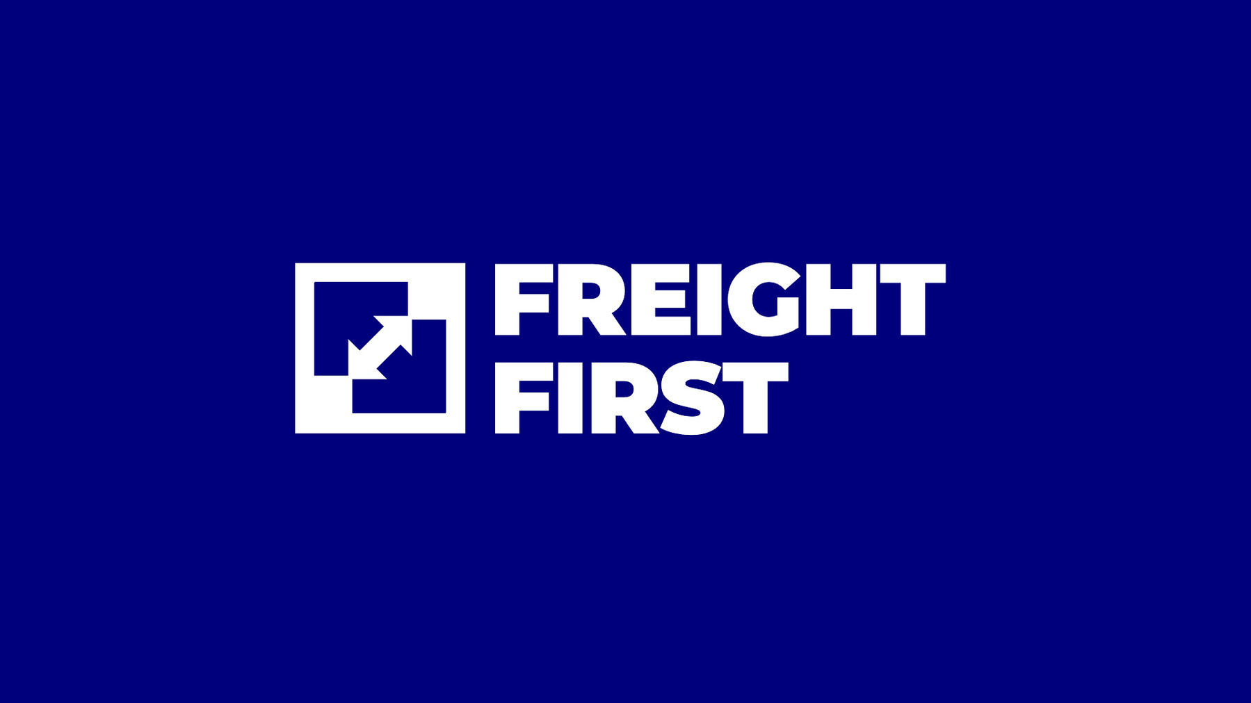
represent the optimal route from point A to B!
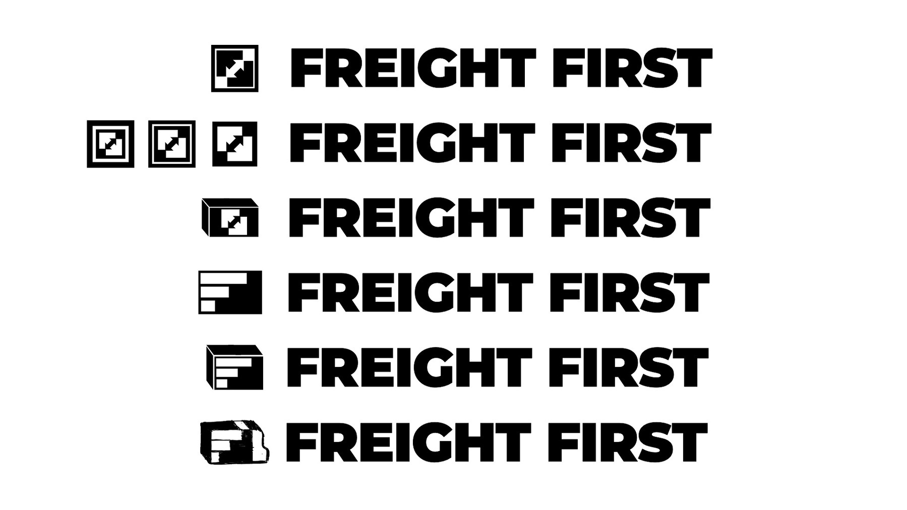
The Final Concept for Freight First Logo
I continued refining the concept by creating arrows through negative
space. This use of negative space helps provide clear directional
cues—pointing from A to B and vice versa—which is highly appropriate for
a logistics company. Without incorporating negative space, the A-to-B
concept might be lost in translation, and unnecessary borders could
emerge. However, presenting both options to the client might be better
in this situation.
My Trial and Error for Freight First Logo Concepts
I assembled the most potential concepts and evaluated how they fit with
the wordmark, and I came to the conclusion that the box design held the
greatest potential. This logo is strong, bold, and simple enough to be
featured on a truck or any other form of transportation. It would look
great printed anywhere—on trucks, in logistics applications, or on any
cargo-related items.
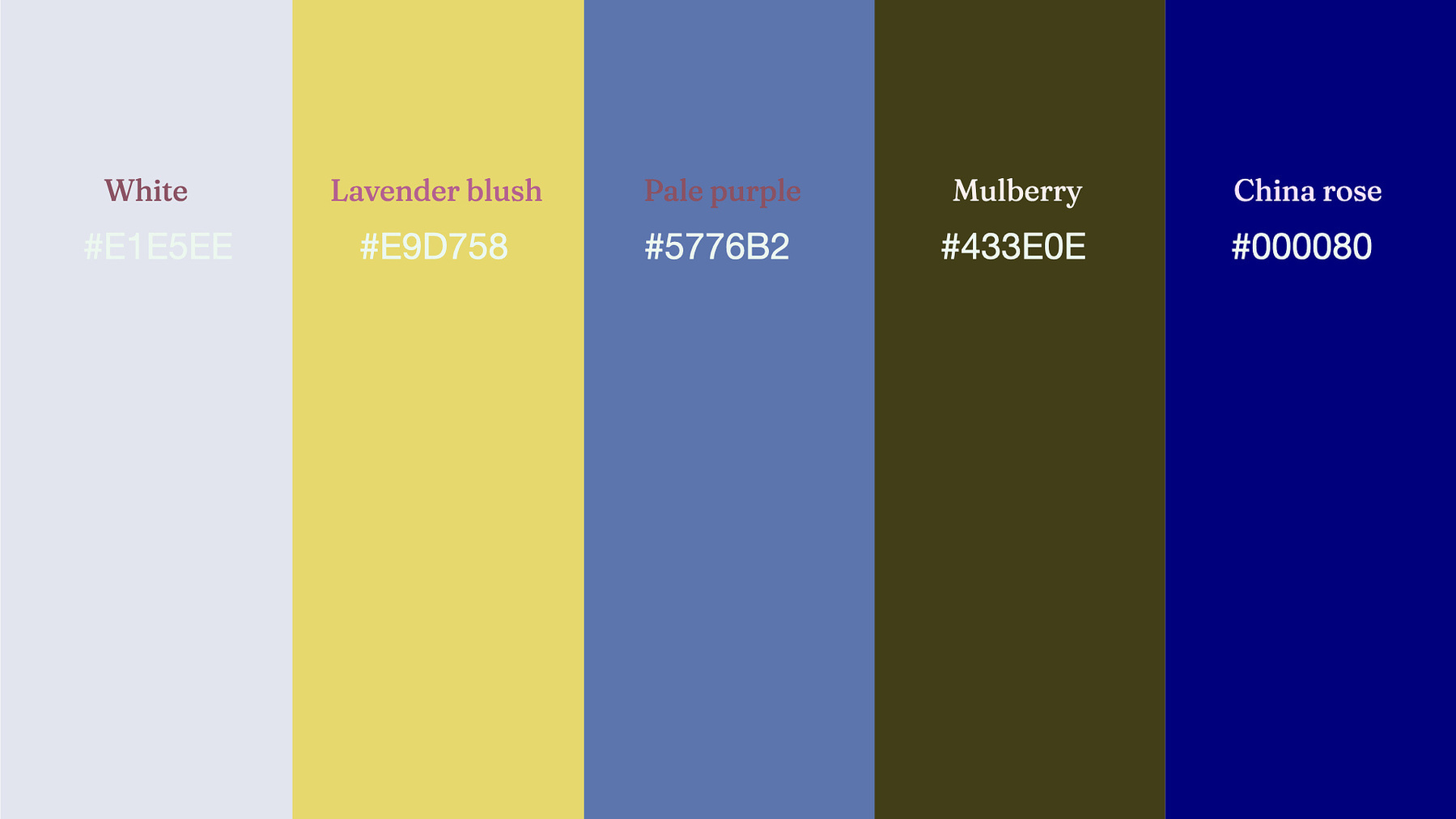
Color Palette
The color palette for Freight First
For the color palette, I chose Navy Blue as the main color, because it
appears strong without seeming overly traditional, exuding reliability.
Additionally, I added shades of blue and gray, accented with a touch of
yellow. This conveys Freight First's commitment to finding the optimal
way to transport goods with utmost reliability and security.
The color palette in use
Final Words
The Lock Up, and Color Treatment for Freight First
The concept for the Freight First logo effectively fulfills the client's
brief by highlighting trust, security, and professionalism. The use of
Montserrat in black or extra bold conveys a strong and reliable
presence, aligning with the company's emphasis on dependable service.
The icon, formed by two F-shaped arrows, subtly creates a hidden arrow
in the center, symbolizing optimal route finding from point A to point
B, which is a key specialization of Freight First. The selection of
navy blue as the primary color further enhances the sense of trust and
reliability, commonly associated with the transportation and logistics
industry.
The overall design—strong, bold, and simple—ensures versatility across
various applications, from trucks to logistics documents, reinforcing
the company's industry expertise and professional services.
I really like this logo design concept for its simplicity and
effectiveness. If this concept is approved, I would definitely refine
the color palette to make it more suitable for print.