💻 Adding Fallback Fonts on My Main Blog
The issue with my fonts not loading properly on my main blog still persists,
and I don't have the energy or effort to troubleshoot it.
While I aim to fill my website with personality, I opted to select
excellent fallback fonts instead.
I just stumbled upon this fantastic resource for
incorporating a system font stack organized by typeface classification
into a CSS code.
This approach allows me to at least control
the typeface classifications, ensuring a relatively consistent style for
all readers of the blog.
So, after my embedded fonts, I added
stacks of Geometric Humanist for the body text and Humanist for the
headings. I also added some Thai system fonts and called it a day.
It'd go like this:
h1, h2, h3, h4, h5, h6 {
font-family: 'Bricolage Grotesque', 'Fraunces', 'Mitr', ‘Seravek, 'Gill Sans Nova', Ubuntu, Calibri, 'DejaVu Sans', source-sans-pro, ‘Geneva’, ‘Verdana’, ui-rounded, 'Sukhumvit', 'Noto Sans Thai Looped', 'Noto Sans Thai', 'PSL Ornanong', 'Ayuthaya', 'Silom', 'FreesiaUPC', 'CordiaUPC', 'BrowalliaUPC', sans-serif !important;
font-weight: bold;
}
Super quick and easy.
Overall, I am quite pleased
with the result.
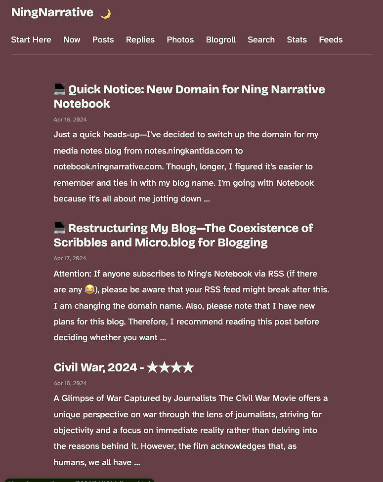
The blog displays a combination of Bricolage Grotesque and Atkinson Hyperlegible fonts.

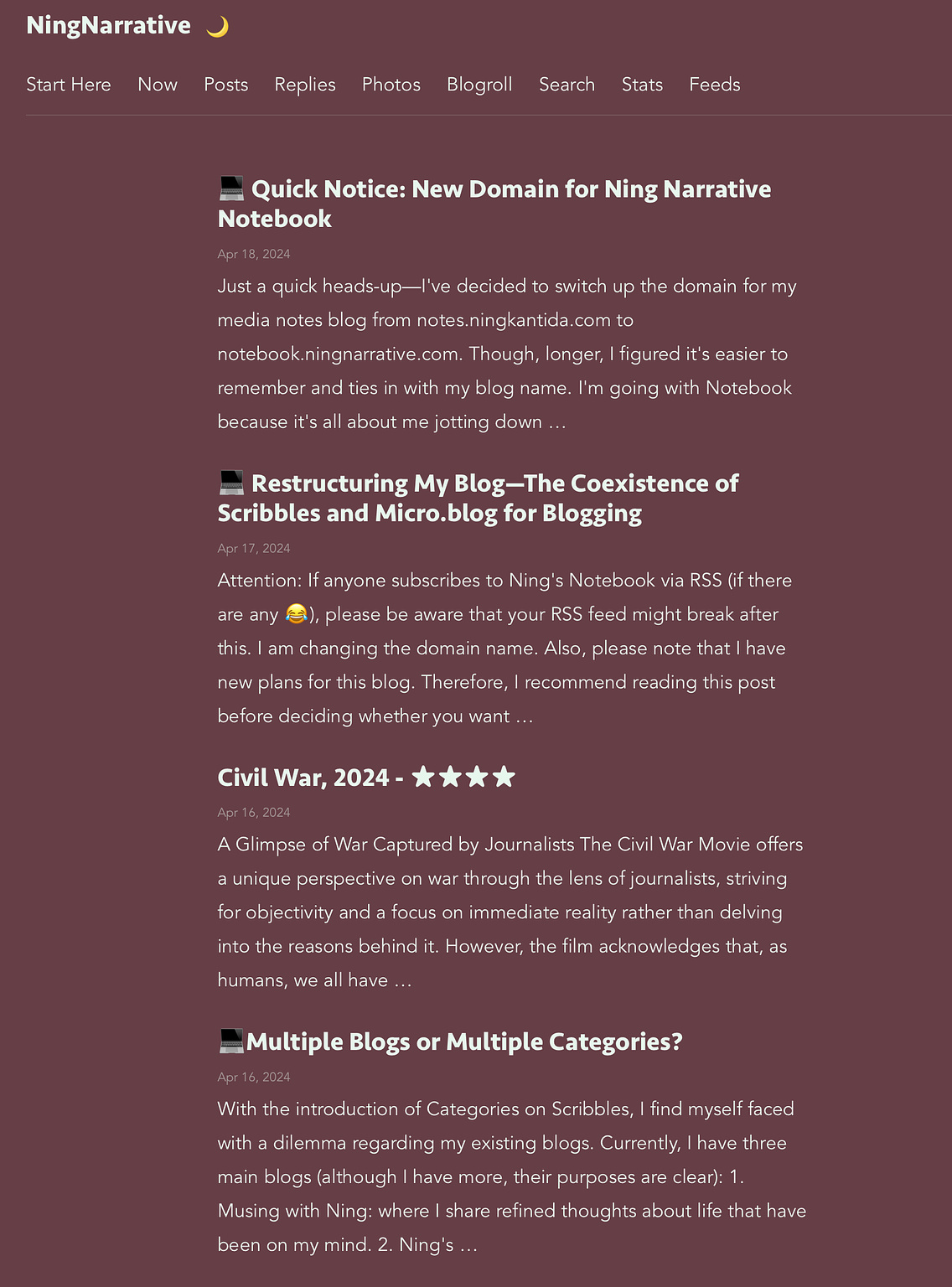
The blog displays fonts from the Geometric Humanist and Humanist
typefaces based on the device being used.
Now, I can focus on refining categories to ensure compatibility across all sections of my Scribbles blogs. ✌️